Branding Projects
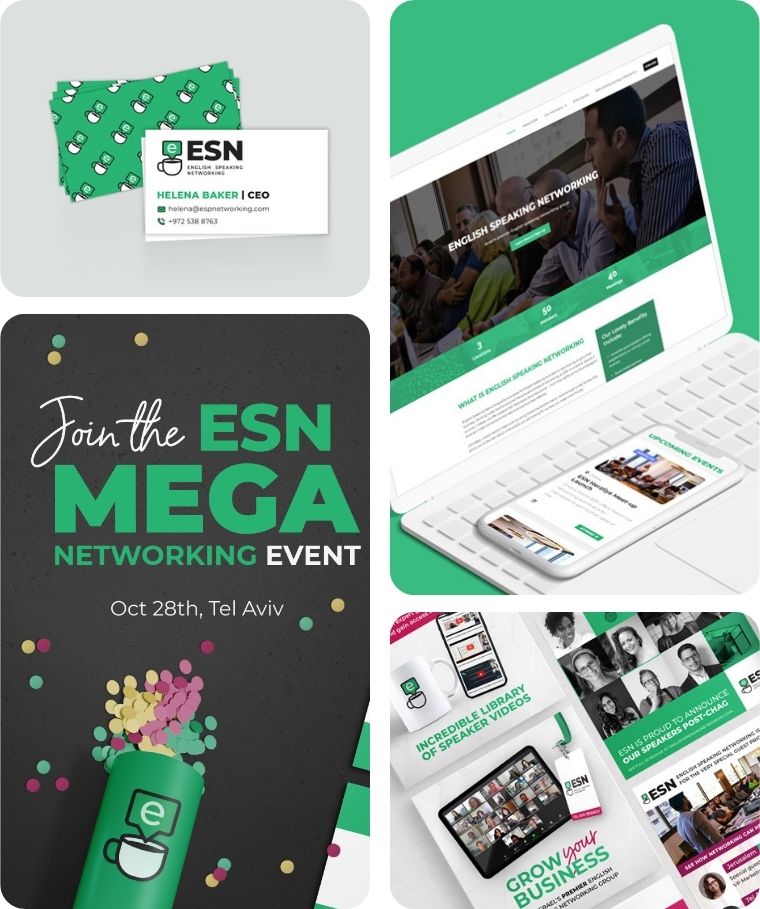
English Speaking Networking
ESN connects English-speaking professionals in Israel through community-focused business networking.
Branding Challenge: To create a brand that feels dynamic and professional while standing apart from typical corporate visuals.
The logo — a coffee cup with an “E” inside a speech bubble — captures the heart of the brand: genuine connection, not just business. A lively, elegant green serves as the main brand color, helping ESN stand out on social media and in digital spaces.
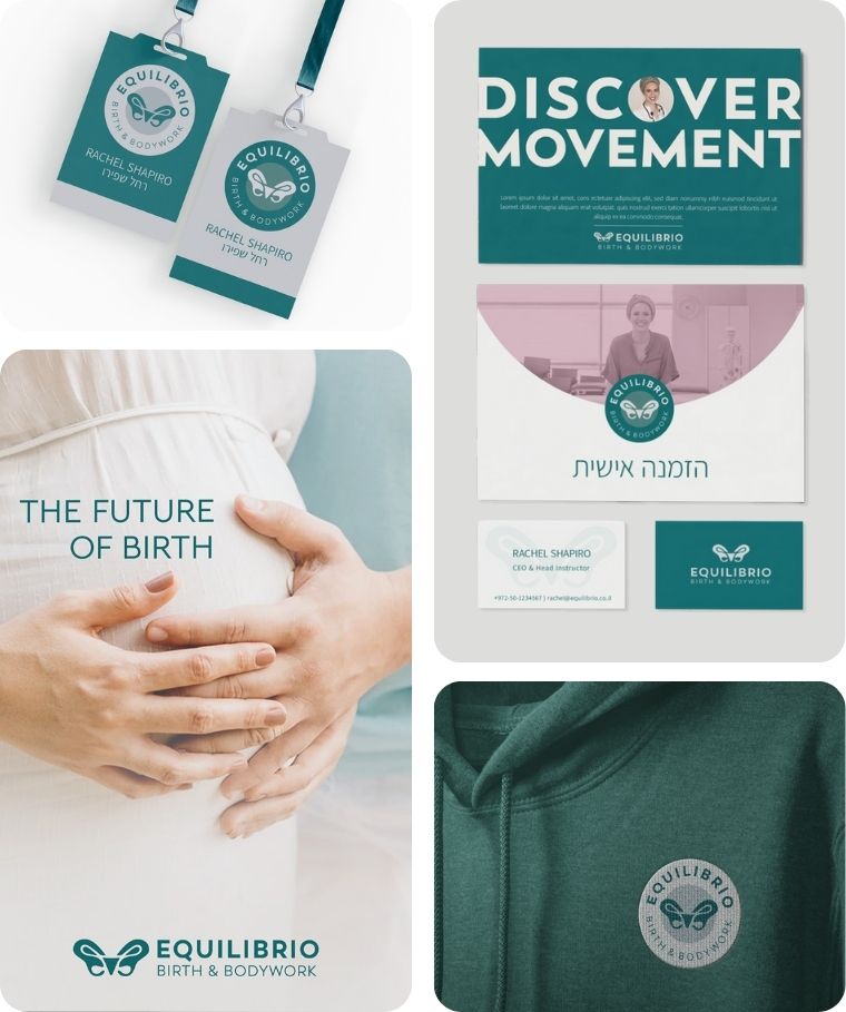
Equilibrio
Equilibrio is a movement method that restores pelvic balance and body awareness for women around childbirth.
Branding Challenge: To move away from generic “mom & baby” aesthetics and reflect the depth of this movement-based method.
The logo features a butterfly-shaped pelvis, symbolizing ease and transformation, with a natural green that evokes grounded vitality.
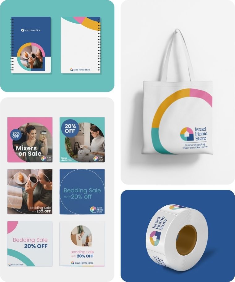
Israel Home Store
Israel Home Store is a one-stop online shop helping English-speaking families in Israel furnish their homes with comfort and ease.
Branding Challenge: To build a brand that feels trusted and reliable while still reflecting warmth and the excitement of setting up a new home.
The visual identity combines a friendly house icon with a clean, modern aesthetic and a vibrant yet homey color palette.
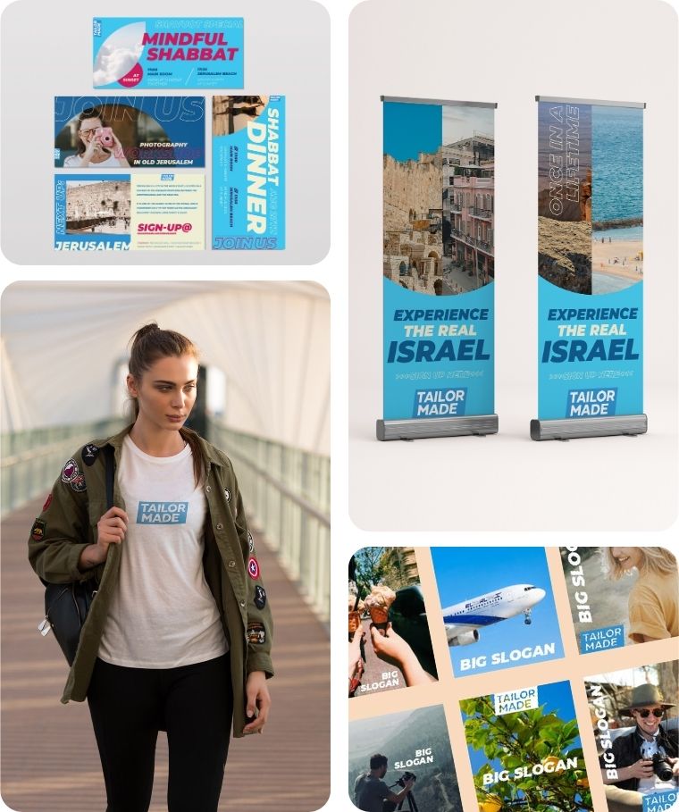
Tailor Made
Tailor Made organizes immersive Birthright trips designed specifically for Gen Z and millennial Americans.
Branding Challenge: To create a brand that feels young, modern, and high-quality while still communicating cultural depth.
The resulting brand pairs bold typography with sleek, Instagram-friendly design – appealing to a digitally native audience seeking both fun and meaning.
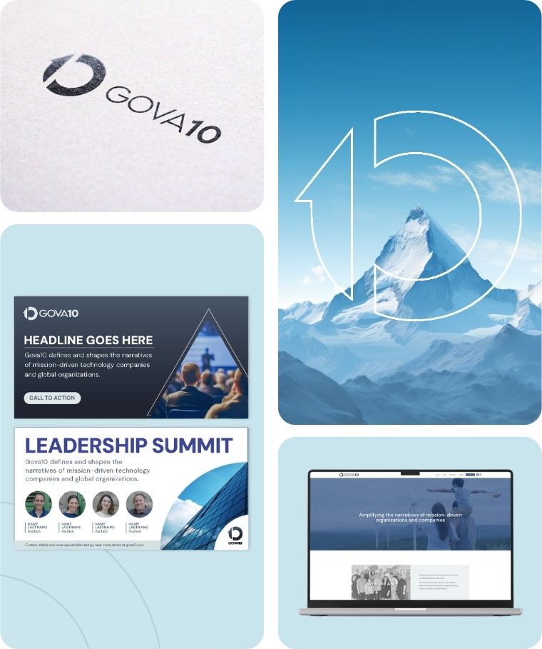
Gova10
Gova10 is a global boutique communications agency that helps startups and organizations tell their story clearly, credibly, and effectively.
Branding Challenge: To create a brand that feels both high-level and approachable — appealing to C-suite clients while standing out from typical corporate styles.
I developed a bold, streamlined visual identity that reflects their clarity-driven mission and positions them as both strategic and creative.
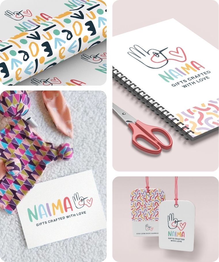
NAIMA
Naima is a handmade gift brand offering colorful, practical items for babies, children, and parents — crafted with love and Dutch design sensibility.
Branding Challenge: To build a brand that captures both the joyful creativity and the thoughtful functionality behind each product.
The playful logo combines a hand gesture with a heart to represent handmade care, while the vibrant palette and whimsical patterns bring warmth and personality to every touchpoint.
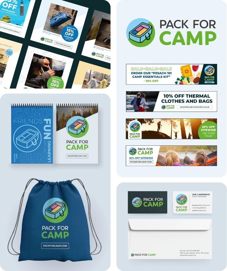
Pack for Camp
Pack for Camp is an e-commerce brand that makes it easy for parents to get their kids camp-ready with curated, pre-packed gear bundles.
Branding Challenge: To create a brand that feels fun, organized, and trustworthy — appealing to busy parents while exciting kids.
The visual identity features a bold, outdoorsy color palette, playful typography, and nature-inspired elements that capture the spirit of summer camp.
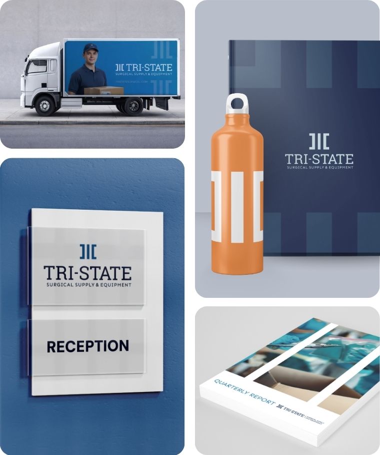
Tri-State Surgical
Tri-State Surgical is a US-based medical supply distributor serving hospitals and long-term care facilities nationwide since 1976.
Branding Challenge: To mark 50 years in the industry with a refreshed identity that honors the company’s legacy while signaling a modern, forward-facing operation.
The rebrand retained the original logo and color palette but gave both a contemporary twist, paired with a clean, efficient visual system that reflects the precision and reliability the company is known for.
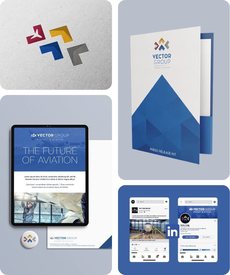
Vector Group
Vector Group is an aviation-focused business group made up of four specialized companies.
Branding Challenge: To design a sleek, professional logo that unifies the group’s diverse services under a single, memorable brand.
The final mark combines the letter V with the concept of vectors — visualized through directional lines that evoke movement and precision in the sky.
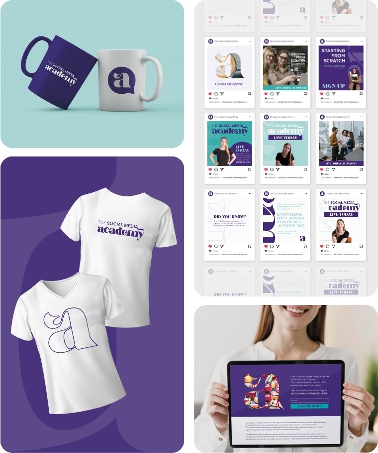
The Social Media Academy
The Social Media Academy teaches entrepreneurs and small business owners how to grow their brands through smart, strategic social media.
Branding Challenge: To create a brand that feels educational yet energetic — professional without being stiff.
The visual identity uses bold colors and clean, modern design to position the academy as approachable, current, and results-driven.
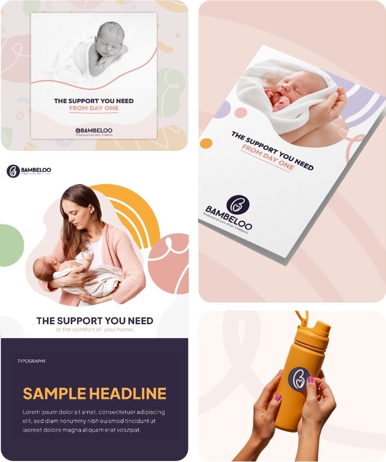
Bambeloo
Bambeloo is a modern baby brand inspired by Dutch postpartum care traditions, offering thoughtfully designed products for new parents.
Branding Challenge: To create a warm and contemporary visual identity that avoids the cliché baby pastels, while still feeling gentle and nurturing.
The brand features clean typography, Nordic-inspired motifs, and a soft yet sophisticated color palette — positioning Bambeloo as a calm, stylish alternative in a market often filled with overly sweet or conventional visuals.
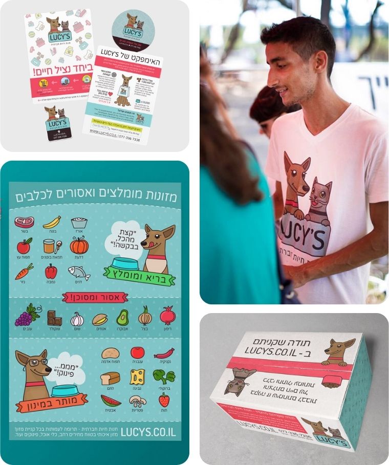
Lucy’s Pet Store
Lucy’s Social Pet Store is a playful, personality-driven pet brand inspired by the co-founders’ adopted dog, Lucy, and her sidekick Herzel the cat.
Branding Challenge: To create a brand that’s professional enough for e-commerce while still warm, fun, and community-centered.
I designed custom illustrated mascots that became central to the brand identity – bringing heart, recognition, and a lovable face to every touchpoint, from packaging to social media.
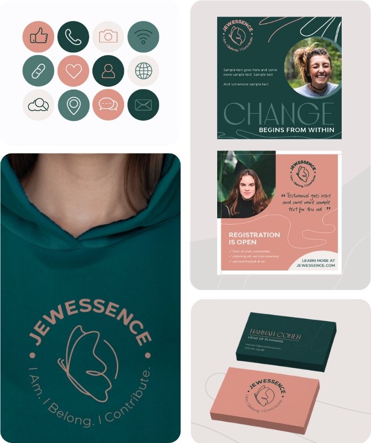
Jewessence
Jewessence is a Jerusalem-based program that helps women reconnect with Jewish wisdom through learning, community, and personal growth.
Branding Challenge: To create a brand that feels meaningful and modern — rooted in tradition without looking dated.
The visual identity blends elegant florals with warm, earthy tones, reflecting both the richness of Jewish heritage and the freshness of a new community.
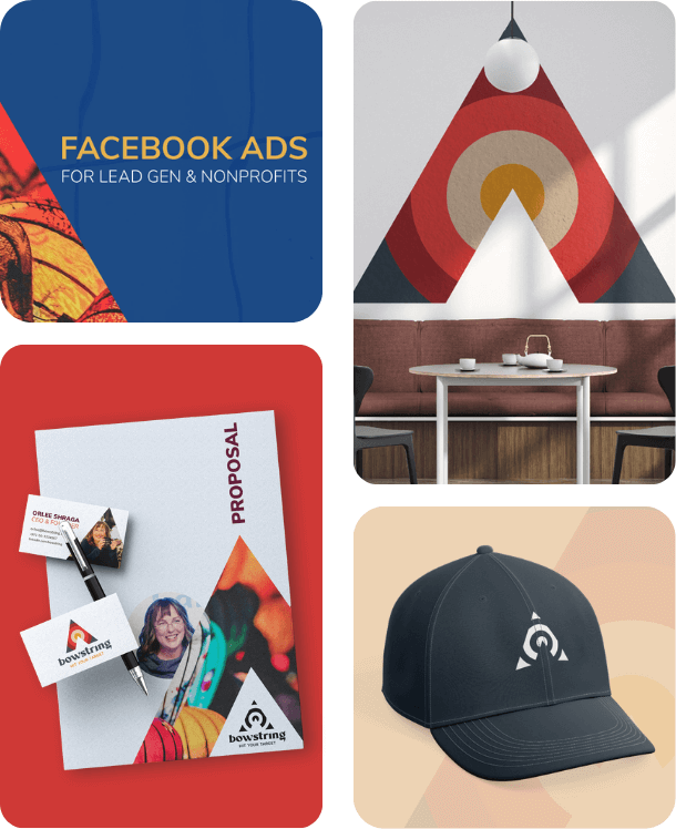
Bowstring
Bowstring is a digital advertising agency that helps businesses grow through creative strategy, media planning, and performance-driven campaigns.
Branding Challenge: To craft a visual identity that feels bold, smart, and creative – something that stands out without relying on overused marketing visuals.
Instead of the typical target icon, the logo flips the idea: turning the goal into an arrow, subtly referencing the “A” in “AD.” The result is a confident and memorable mark that speaks to sharp direction and impact.
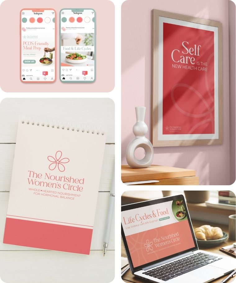
The Nourished Women’s Circle
The Nourished Women’s Circle is a year-long program empowering women to achieve hormonal balance through personalized nutrition, natural medicine, and community support.
Branding Challenge: To create a brand that conveys trust, clarity, and warmth.
The visual identity features a soft, earthy palette and a delicate floral logo that symbolizes growth, connection, and natural wellness.
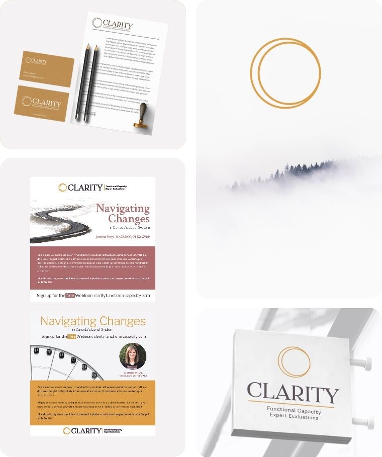
Clarity
Clarity is a legal consultancy that helps individuals and families navigate complex legal matters with confidence and ease.
Branding Challenge: To create a brand that feels approachable and human — breaking away from the stiff, intimidating tone typical of the legal world.
The visual identity uses warm, grounded colors and clean typography to communicate trust, professionalism, and accessibility.
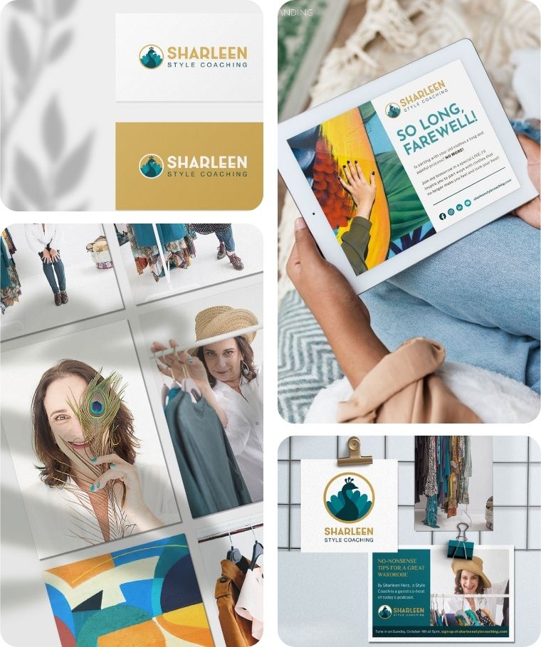
Sharleen Herz
Sharleen Herz is a personal stylist and image consultant who helps women feel confident and aligned through intentional style choices.
Branding Challenge: To create a brand that feels elevated and personal — reflecting both fashion expertise and warmth.
The visual identity combines refined typography with a rich, golden palette that communicates sophistication, confidence, and a personal touch.
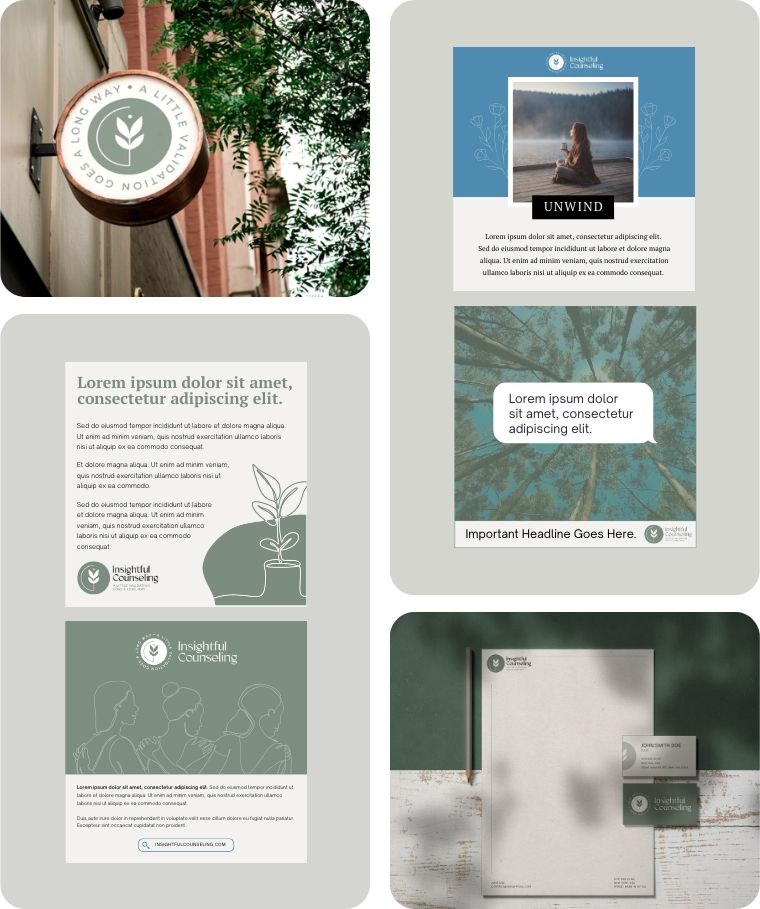
Insightful Counseling
Insightful Counseling is a US-based therapy practice offering personalized, trauma-informed counseling for children, teens, adults, and couples.
Branding Challenge: To create an identity that feels warm and inviting without falling into the overused “calm blue therapy” look — something simple and memorable that builds trust before a client ever walks through the door.
The brand pairs a soft sage-and-cream palette with botanical line illustrations and a plant-inspired logomark, grounding the practice in imagery of growth and care while keeping the overall feel approachable, non-clinical, and human.
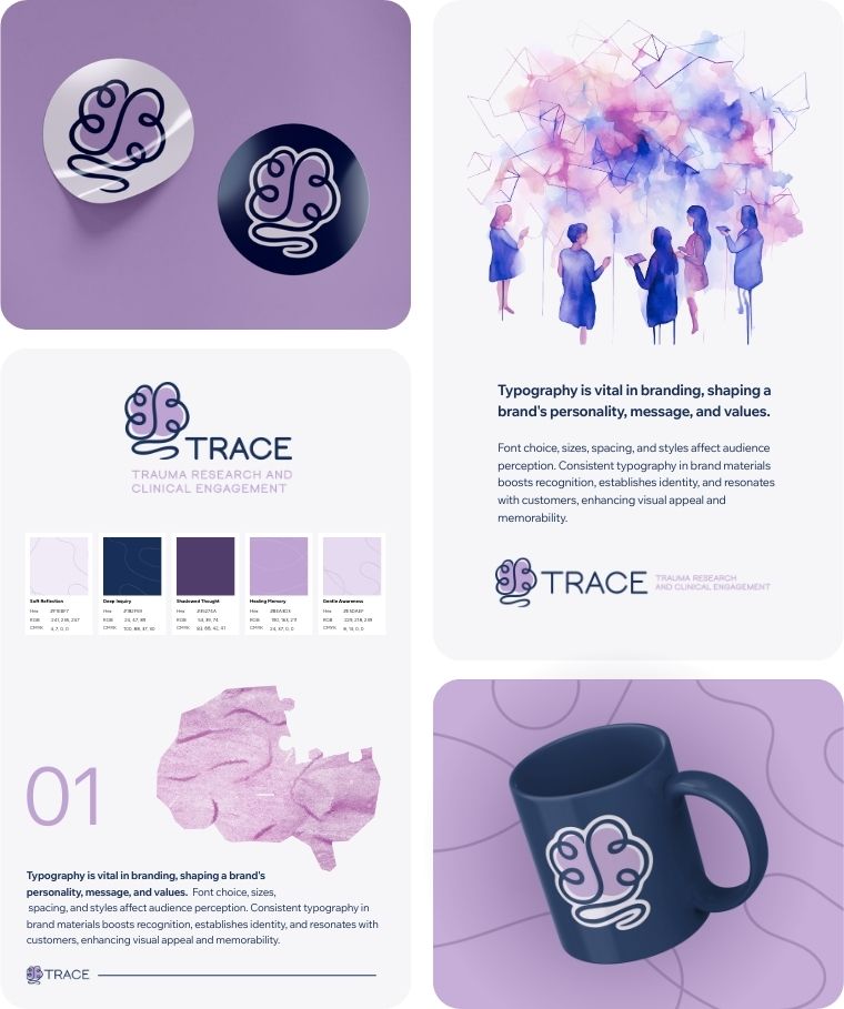
TRACE Trauma Research
TRACE is a research lab focused on trauma, resilience, and community engagement through psychology and public policy.
Branding Challenge: To develop a brand that feels grounded in science while still warm and human-centered.
The logo features a custom line-art illustration of a brain shaped like a ball of yarn gently unraveling – symbolizing complexity, healing, and understanding.
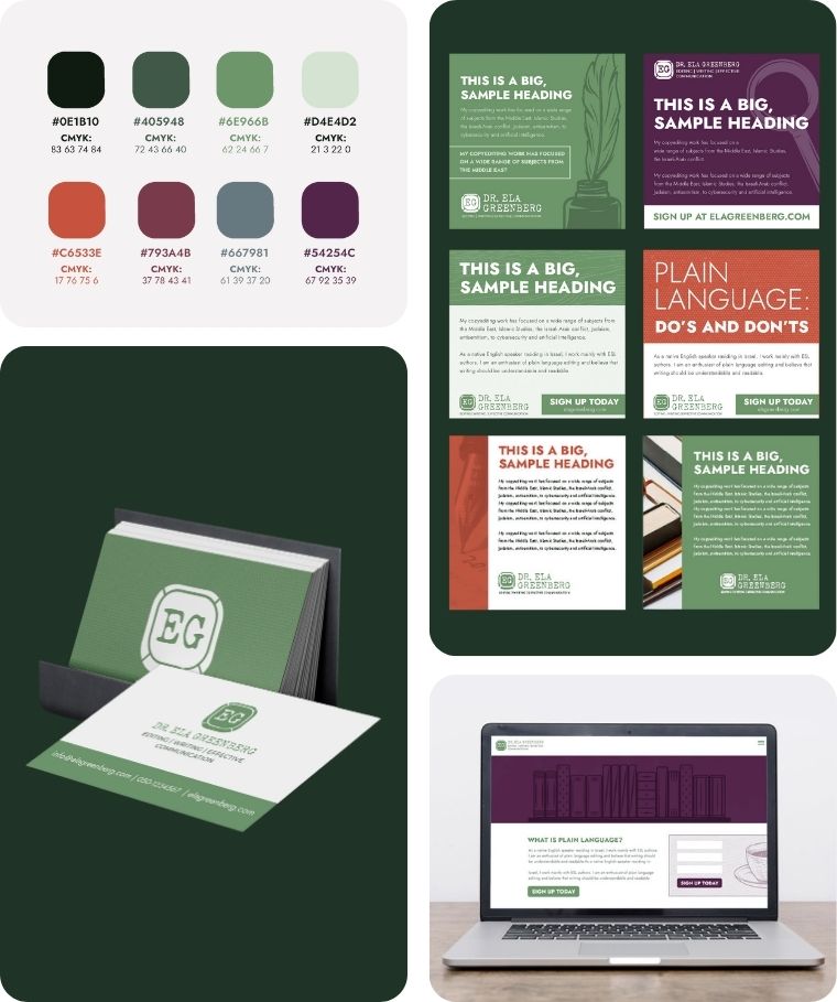
Dr. Ela Greenberg
Dr. Ela Greenberg is a Jerusalem-based editor and writer specializing in academic publishing, policy research, and non-profit communications across the Middle East studies space.
Branding Challenge: To move away from the typical “corporate blue with a pen” look and create an identity that feels as literate and layered as the work itself.
The brand uses a rich jewel-tone palette — deep greens, burgundy, and warm neutrals — paired with book-inspired imagery and typography that feels scholarly without being stiff, giving the brand a warm, distinctive presence that stands apart from generic editorial branding.
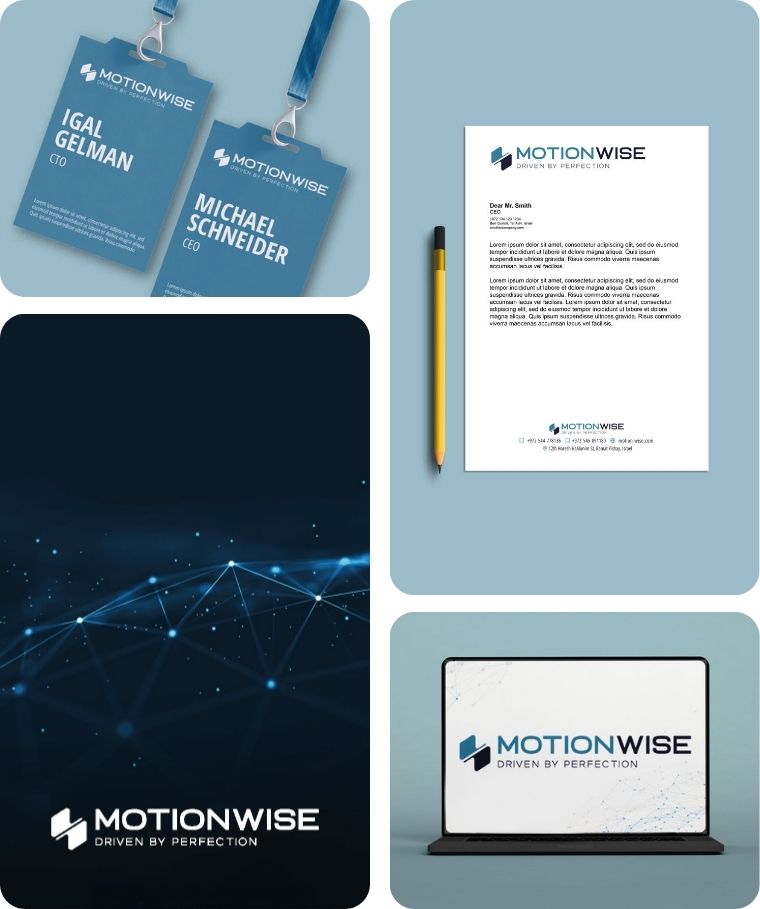
Motionwise
Motionwise designs and manufactures custom motion control systems and servo actuators for defense, aerospace, robotics, and unmanned platforms.
Branding Challenge: To stand out without straying too far from the industry norm, while commanding the technical credibility the sector demands — and to merge the concept of moving parts with the initials MW in a subtle, intentional way.
The identity pairs a refined steel blue with clean, geometric typography and a dynamic logomark that suggests precision in motion — serious enough for defense catalogs and trade shows, distinctive enough to not blend into the crowd.
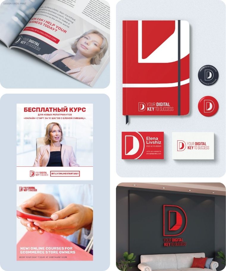
Your Digital Key to Success
Your Digital Key to Success is a trilingual digital marketing consultancy helping startups and small businesses across Israel and Russia build their online presence and attract customers.
Branding Challenge: To create an identity that works seamlessly across three languages and markets — English, Hebrew, and Russian — while feeling confident enough for tech startups and approachable enough for new entrepreneurs just getting started.
The lettermark subtly merges the initials into the shape of a door, working cleanly in both positive and negative colorways, anchored by a striking red-and-white palette that cuts through the noise regardless of language or platform.
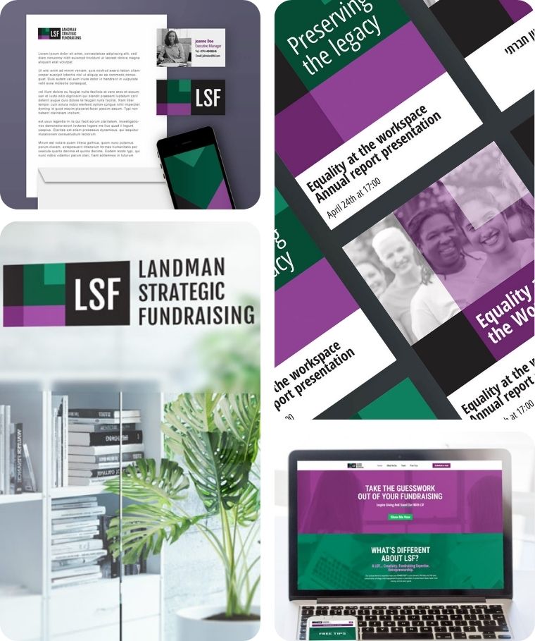
Landman Strategic Fundraising
LSF is an Israel-based fundraising consultancy helping nonprofits build strategic, sustainable donor pipelines — from planning through hands-on implementation.
Branding Challenge: To look institutional and credible enough for the nonprofit sector without defaulting to the expected blues and grays — and to steer clear of any money-related imagery while still clearly communicating fundraising expertise.
The brand pairs deep purple with emerald green and sharp geometric accents, giving LSF a distinctive, confident presence that reads as strategic and values-driven, with the LSF lettermark designed to work seamlessly across English and Hebrew materials.
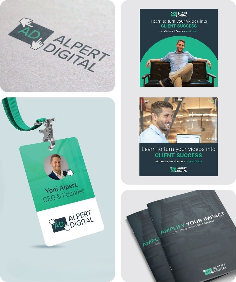
Alpert Digital
Alpert Digital is a paid media agency helping businesses, educational institutions, and nonprofits get discovered through strategic ad campaigns across Facebook, Google, LinkedIn, and YouTube.
Branding Challenge: To build a brand that feels results-driven and credible enough for clients with serious marketing budgets, while keeping the personable, hands-on energy that sets the agency apart from faceless competitors.
The AD monogram doubles as a clickable icon — a cursor tapping the initials, with hands that also frame the scene like a photographer finding the right angle — tying the logo directly to the idea of zeroing in on the perfect fit for each client, set against a bold teal-and-charcoal palette.
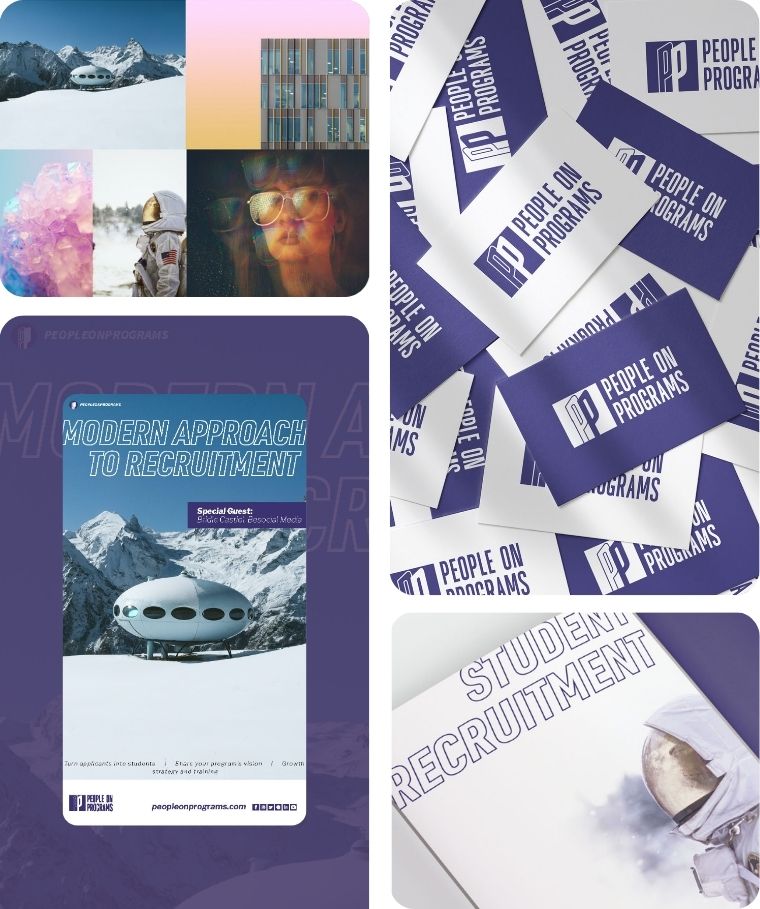
People on Programs
People on Programs is a growth consultancy helping education and travel-abroad programs attract more participants through custom strategy, sales training, and modern recruitment methods.
Branding Challenge: To carve out a brand in a niche that barely existed — program growth consulting — and look credible enough for major institutions and university international programs, while communicating energy and forward momentum.
The PP monogram embeds a subtle human silhouette within the letterforms, reinforcing the “people” promise at the core of the brand, set against a bold indigo palette with aspirational imagery and condensed typography that feels modern, ambitious, and built for scale.
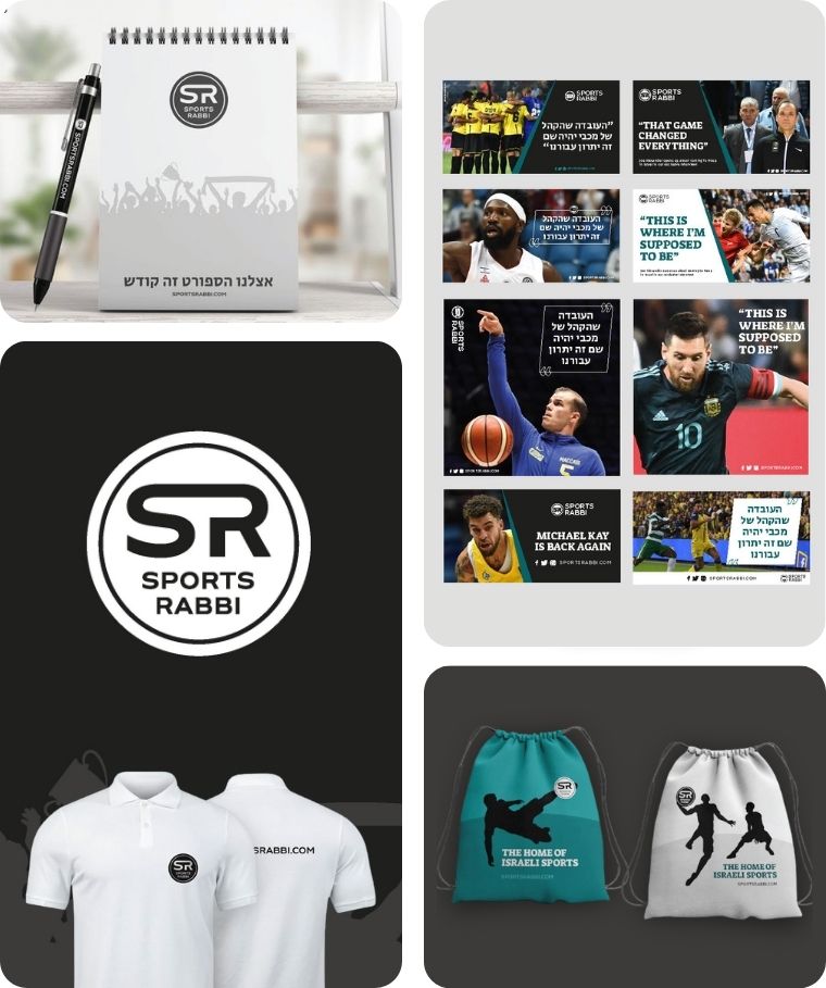
Sports Rabbi
Sports Rabbi is a bilingual Israeli sports platform delivering in-depth basketball and soccer coverage in both English and Hebrew to fans in Israel and worldwide.
Branding Challenge: To refresh an already-recognized SR logo without losing the brand awareness it had built, while creating a visual system that works across two languages and audiences — energetic enough for sports content, clean enough to appeal to Israeli readers without any religious connotation on the Hebrew side.
The rebrand preserved the iconic black-and-white SR monogram and introduced a teal accent to set it apart from the red-blue-white palette dominating Israeli sports media, with sport-figure silhouettes and a flexible template system built for fast-paced bilingual content.
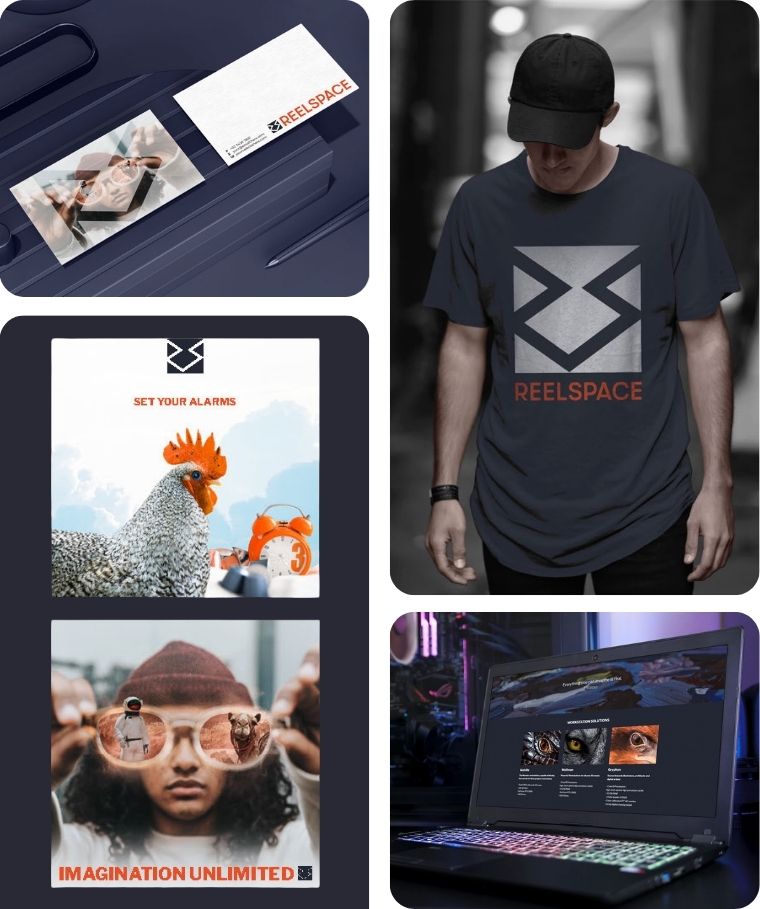
ReelSpace
ReelSpace is a creative hub in Jerusalem offering co-working space, high-end workstations, and production facilities — from motion capture studios to VR labs — for animators, game developers, and VFX artists.
Branding Challenge: To build a brand for a space that didn’t have a direct competitor or category to reference, while avoiding every Hollywood cliché in the book — no film reels, no megaphones, no director’s chairs — and still speaking fluently to a tech-savvy creative audience.
The geometric logomark weaves the RS initials into an abstract maze-like path that suggests both collaboration and dimension, set against a deep navy palette with a burnt orange accent that feels industrial, cinematic, and unmistakably sci-fi — right at home on a t-shirt, a dark-mode website, or the wall of an underground studio.
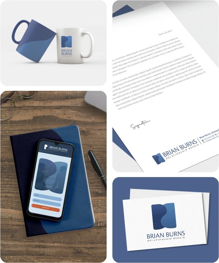
Brian Burns
Brian Burns helps long-married couples and parents navigate high-conflict relationships with clarity, strength, and straightforward tools for connection.
Branding Challenge: To create a brand that feels grounded, professional, and emotionally intelligent – without being cold or clinical.
The BB monogram in the logo doubles as a yin-yang-inspired form, representing two individuals in relationship: distinct yet deeply connected. A structured, masculine palette supports the brand’s tone of directness, growth, and trust.
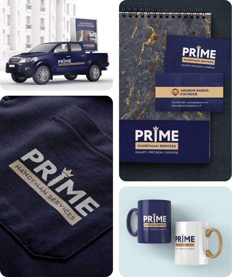
Prime Handyman Services
Prime is a Jerusalem-based handyman service offering high-quality repairs, custom shelving, and home improvements to English-speaking families across the city.
Branding Challenge: To position a handyman business as premium and trustworthy in a market where competitors all default to the same hammer-and-wrench imagery — and to attract affluent Anglo clients who expect American-style service standards.
The logo swaps the I in PRIME for a subtle nail element topped with a crown, paired with a deep navy-and-gold palette and marble textures that signal quality craftsmanship — closer to a luxury home brand than a typical trades logo.
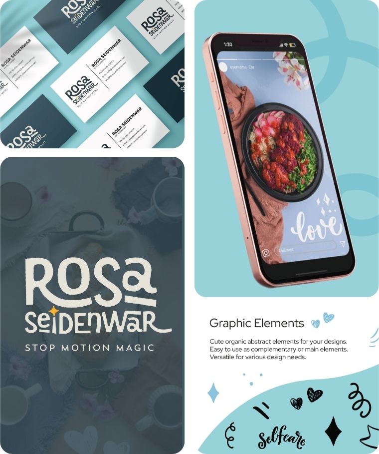
Rosa Seidenwar
Rosa Seidenwar is a stop motion animator creating scroll-stopping video content that helps product-based brands sell more by making their products move like magic.
Branding Challenge: To build a personal brand that feels high-end and creative enough to attract big-name clients, while capturing the playful, kinetic energy of stop motion itself — all without relying on clichéd video or film imagery.
The fully typographic logo uses hand-drawn letterforms with built-in bounce and movement, punctuated by a sparkle nod to “magic,” set against a fresh turquoise-and-white palette with organic doodle elements that feel clean, minimal, and unmistakably in motion.
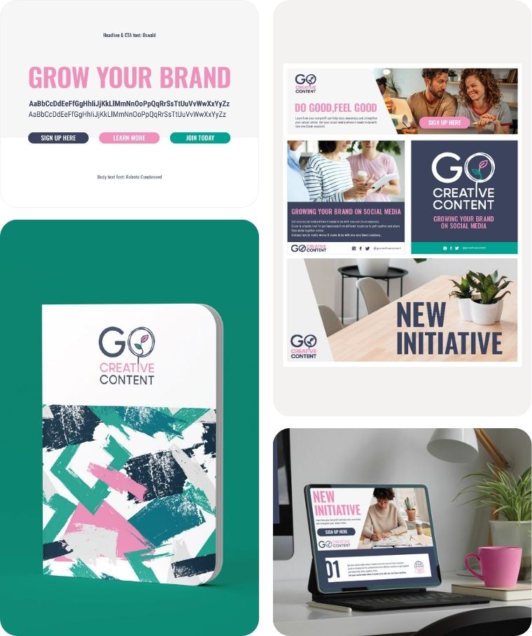
GO Creative Content
GO Creative Content is a one-woman content agency run by British-Israeli strategist and illustrator Gila Orkin, serving nonprofits, startups, and organizations with a positive social or environmental impact.
Branding Challenge: To reflect the full range of what Gila brings — strategy and creativity, writing and illustration — in a brand that feels as original and multi-talented as she is, without looking like a typical freelancer or a generic agency.
The logo plays on Gila’s initials with a leaf tucked into the O, nodding to her impact-driven clients, while a bold navy-teal-magenta palette and abstract brushstroke patterns bring an artistic energy that sets the brand apart from the safe, minimalist look most content agencies default to.
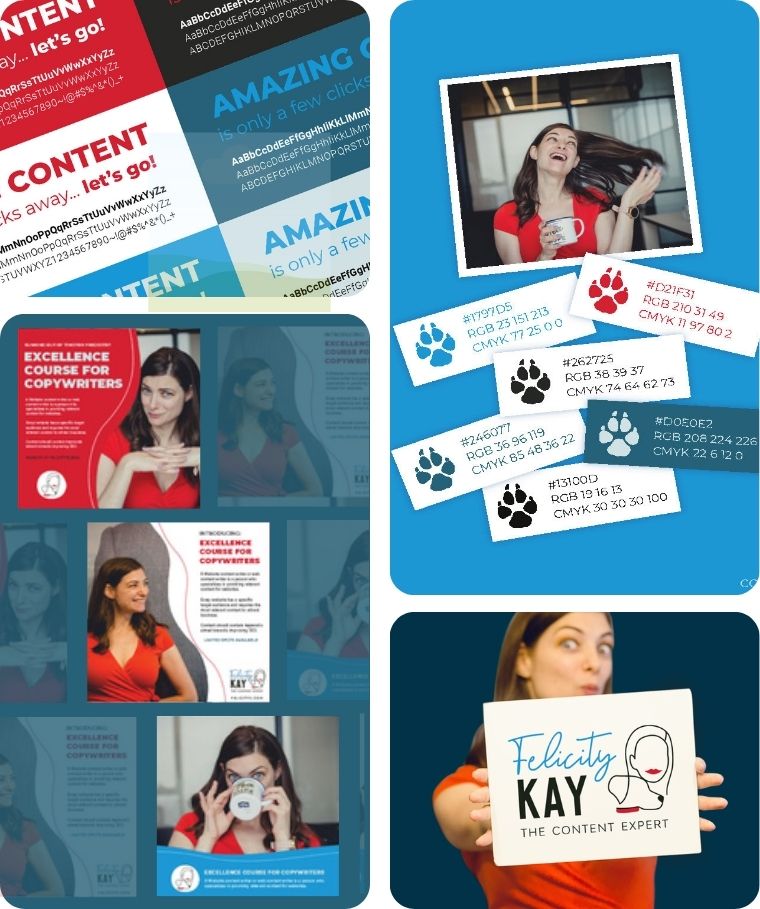
Felicity Kay
Felicity Kay is a content expert and mentor who teaches freelance writers to scale their businesses and entrepreneurs to write copy that actually converts.
Branding Challenge: To build a personal brand that feels energetic and approachable without losing professional credibility — and to weave in her dog Bella as a signature brand element without it feeling gimmicky.
The hand-drawn logo pairs playful script with bold type and a subtle Bella silhouette, sitting on a vibrant blue-and-red palette with paw-print motifs throughout — personal, high-energy, and impossible to mistake for generic coaching branding.
Curious? Let's chat!
Leave a Message or Book a Call