Doing the work before the words
In wellness, a logo doesn't introduce a brand — it tunes the room before the practitioner walks in. Type weight, color temperature, the amount of white space on a homepage: all of it sets a nervous system before any copy lands.
That's why so many wellness brands lose people in the first three seconds. The visuals signal "I'm not the practitioner you need" before there's a chance to explain otherwise. Trust isn't built by what's said. It's built by what's already showing.
"Trust isn't something you say — it's the gap between what you put out and what people decide to feel about it."
The brands in this category were designed with that gap in mind. The visual identity does the trust-building so the practitioner can do the actual work.
Case studies
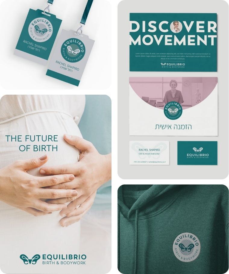
Equilibrio
Equilibrio is a movement method that restores pelvic balance and body awareness for women around childbirth.
Branding Challenge: To move away from generic “mom & baby” aesthetics and reflect the depth of this movement-based method.
The logo features a butterfly-shaped pelvis, symbolizing ease and transformation, with a natural green that evokes grounded vitality.
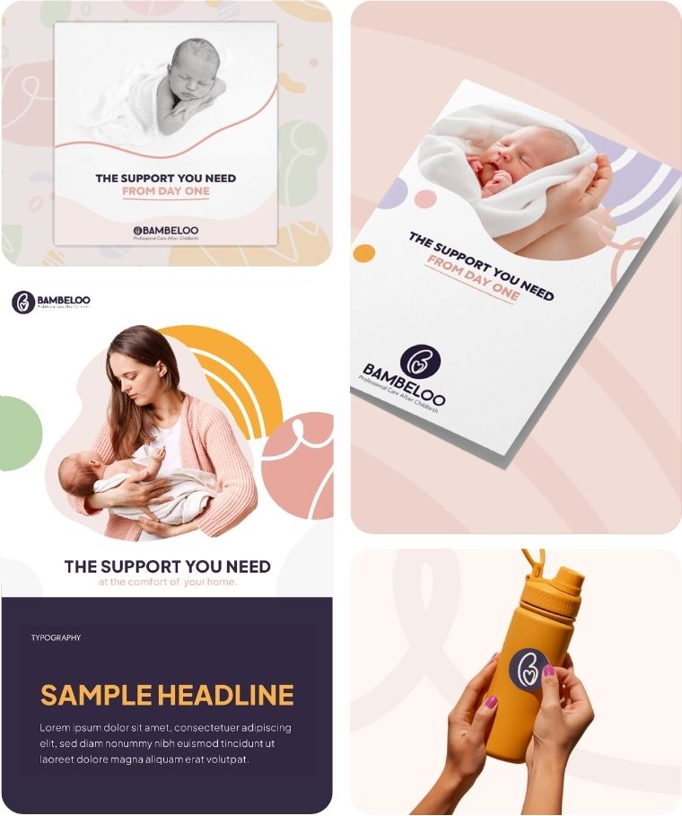
Bambeloo
Bambeloo is a modern baby brand inspired by Dutch postpartum care traditions, offering thoughtfully designed products for new parents.
Branding Challenge: To create a warm and contemporary visual identity that avoids the cliché baby pastels, while still feeling gentle and nurturing.
The brand features clean typography, Nordic-inspired motifs, and a soft yet sophisticated color palette — positioning Bambeloo as a calm, stylish alternative in a market often filled with overly sweet or conventional visuals.
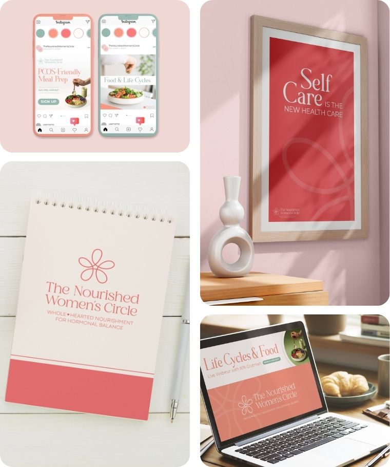
The Nourished Women’s Circle
The Nourished Women’s Circle is a year-long program empowering women to achieve hormonal balance through personalized nutrition, natural medicine, and community support.
Branding Challenge: To create a brand that conveys trust, clarity, and warmth.
The visual identity features a soft, earthy palette and a delicate floral logo that symbolizes growth, connection, and natural wellness.
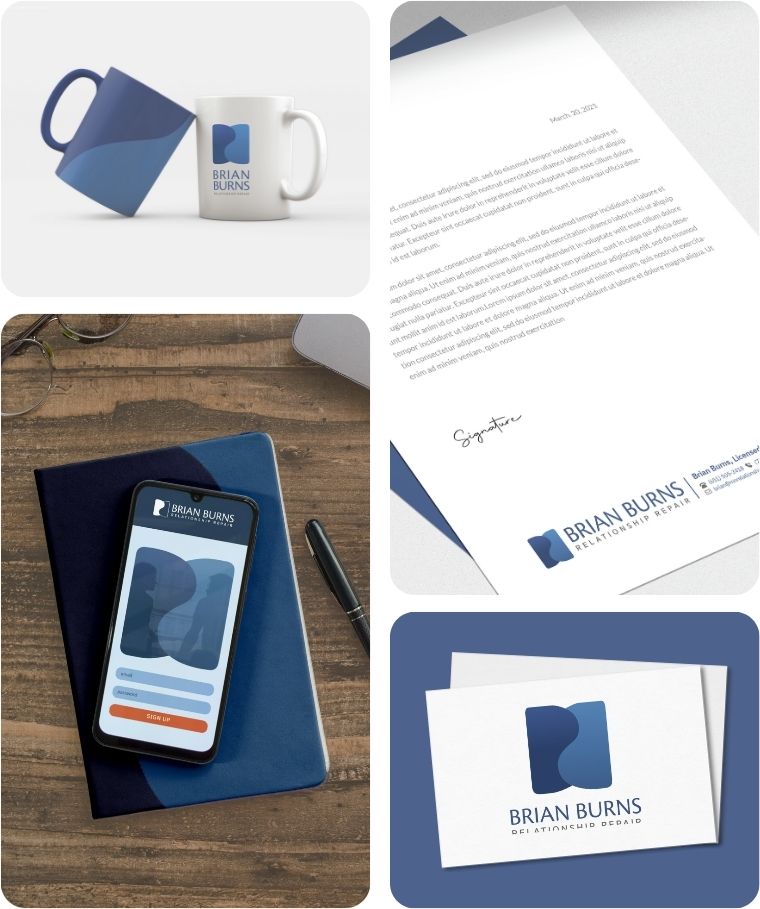
Brian Burns
Brian Burns helps long-married couples and parents navigate high-conflict relationships with clarity, strength, and straightforward tools for connection.
Branding Challenge: To create a brand that feels grounded, professional, and emotionally intelligent – without being cold or clinical.
The BB monogram in the logo doubles as a yin-yang-inspired form, representing two individuals in relationship: distinct yet deeply connected. A structured, masculine palette supports the brand’s tone of directness, growth, and trust.
The takeaway
If you're in this category, your hardest design constraint isn't standing out — it's not tipping into the wrong register. Soft enough to feel safe, sharp enough to feel paid for. Wellness brands fail when they look like wellness brands. The goal is to look like the specific practice you actually run.