
Jewessence
- Client:
- Jewessence
- Niche:
- Jewish Women’s Education
- Year:
- 2022
Jewessence is a Jerusalem-based program that helps women reconnect with Jewish wisdom through learning, community, and personal growth.
Branding Challenge: To create a brand that feels meaningful and modern — rooted in tradition without looking dated.
The visual identity blends elegant florals with warm, earthy tones, reflecting both the richness of Jewish heritage and the freshness of a new community.
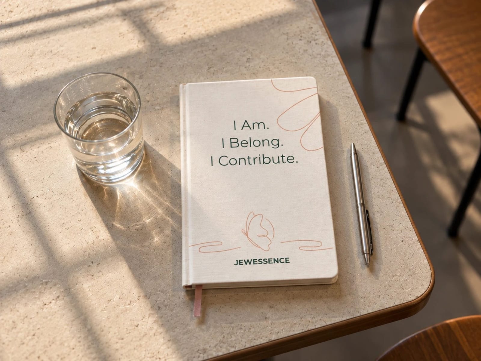
01 — From concept sketch
to vector logos



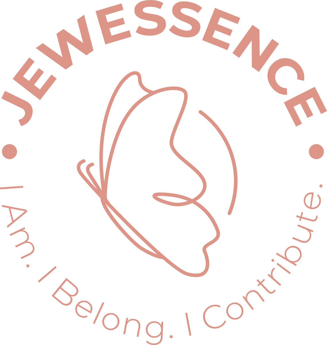
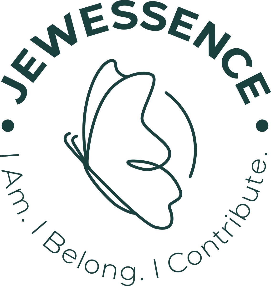

02 — Color & type
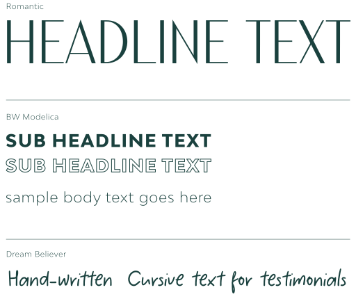
- Peach
- Hex
- #DD9587
- RGB
- 221 149 135
- CMYK
- 12 50 42 2
- Light Green
- Hex
- #507875
- RGB
- 80 120 117
- CMYK
- 69 35 46 21
- Dark Green
- Hex
- #1A403F
- RGB
- 26 64 63
- CMYK
- 85 48 59 57
- Off White
- Hex
- #F3EEEC
- RGB
- 243 238 236
- CMYK
- 6 7 7 0
03 — Design Grid + Media Toolkit





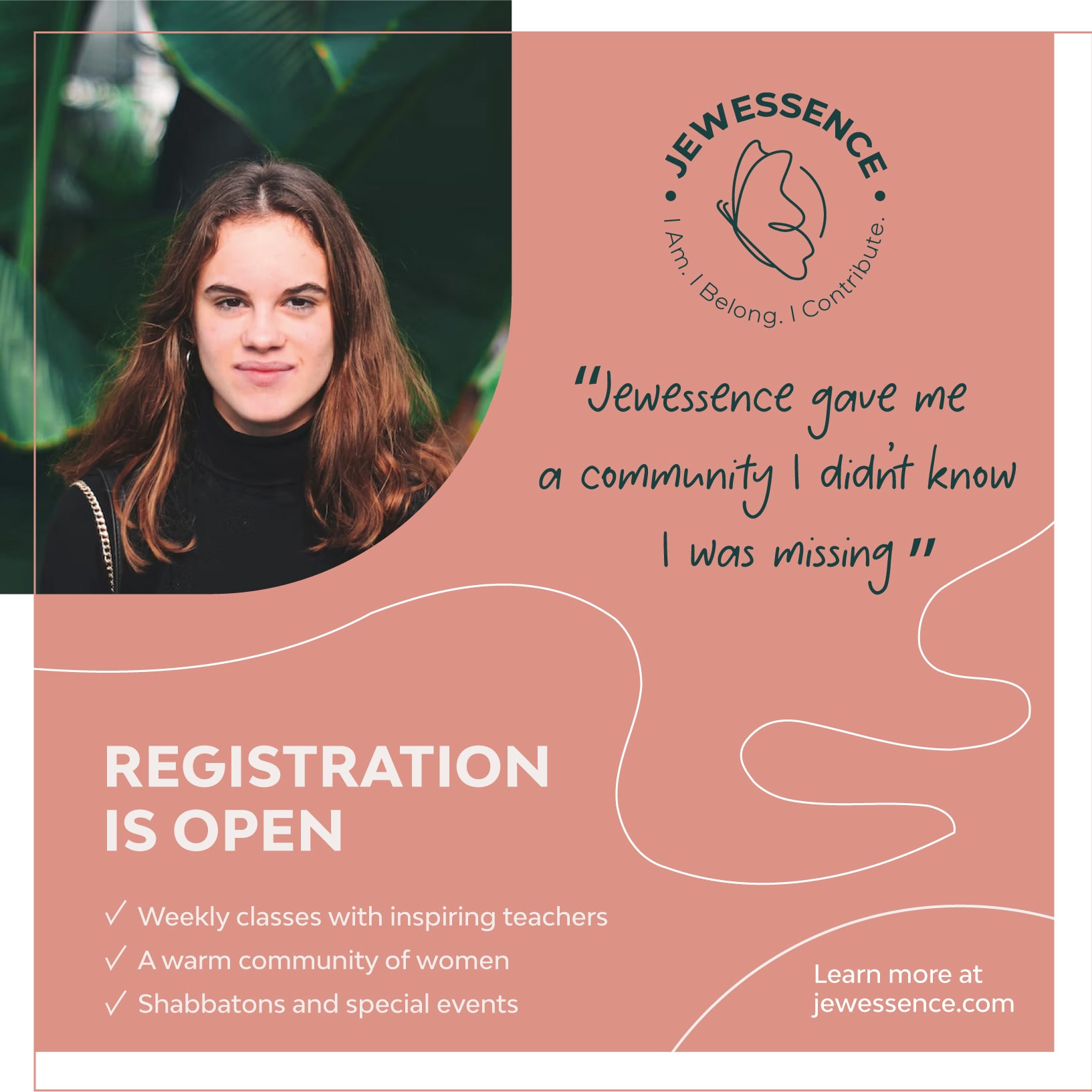
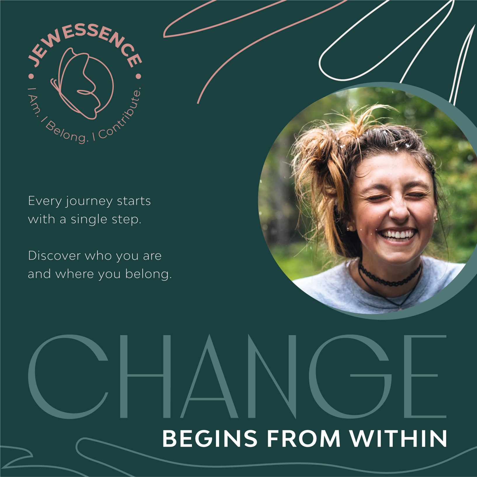
04 — Applied

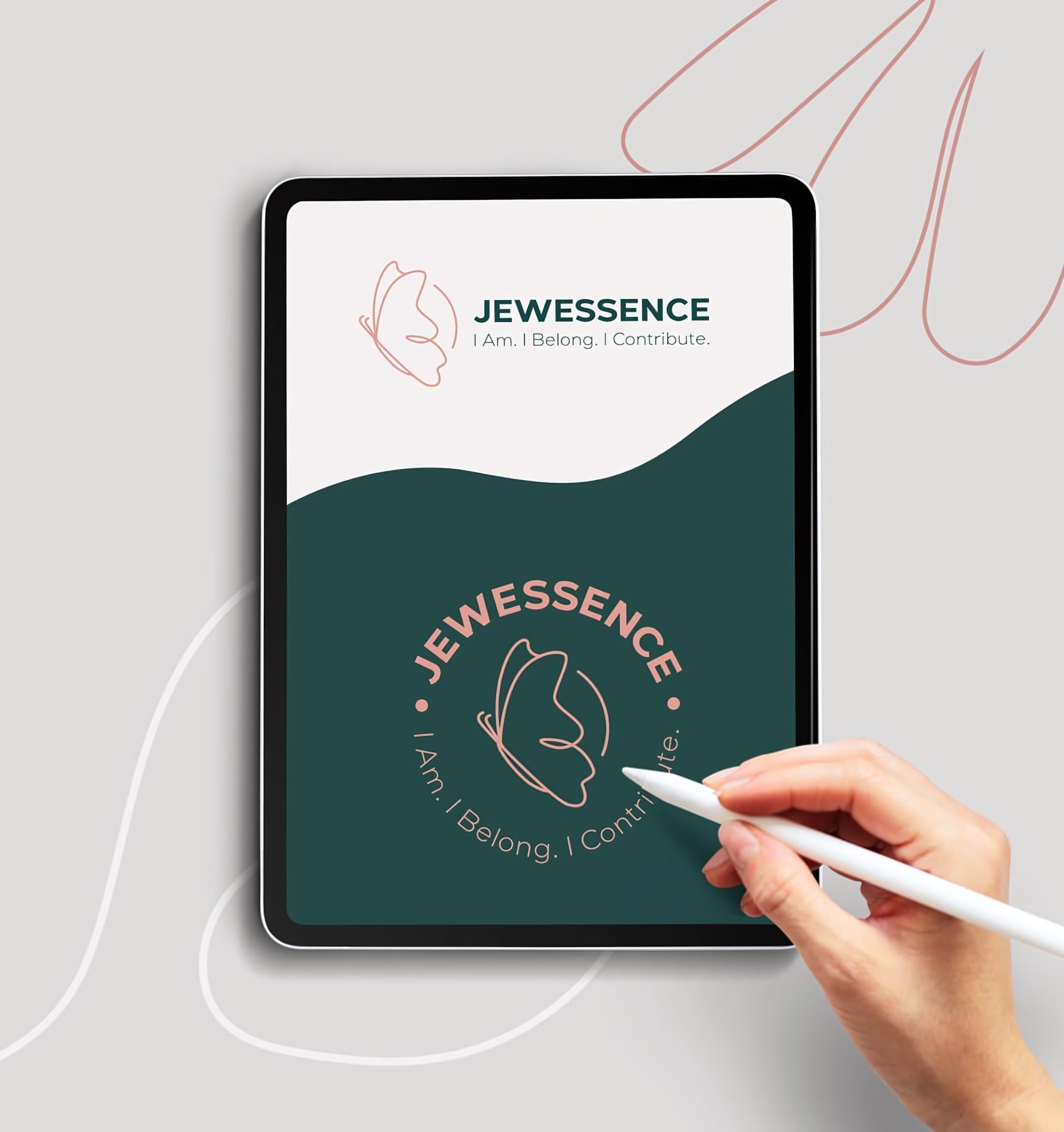
Next case study