
Blog
Branding, explained
in plain words.
Which logo file goes to the printer, why your brand color has three codes, what a brand guide is for. Answers from the questions clients ask me mid-project, written for people who aren’t designers.
Color
Accessible brand colors: can people actually read yours?
Accessibility in branding starts with contrast. The WCAG ratios to aim for, real color pairs from Mosaic and two other brands that pass or fail, and do's and don'ts.

How many colors does a brand need?
Two colors run out by the third week of posts. How a palette is built from main colors, supporting colors, tints and neutrals, and how many is enough.
Why your brand color has three codes: HEX, RGB and CMYK
RGB and HEX are for screens, CMYK is for print. Is a HEX code RGB or CMYK, which code a printer needs, and why the printed color can come back duller.
Logo
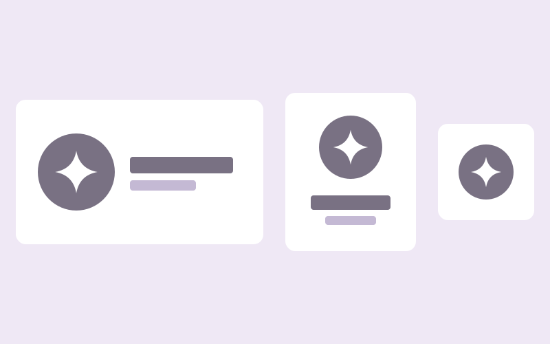
Logo variations: what they are and why you need more than one
One logo can't fit a profile picture and a wide banner. Primary, secondary, horizontal, stacked and submark: what each variation is for, and which you need.

What a logo can hide: details only your business would have
A butterfly that's also a pelvis, a speech bubble dipped in coffee. Where a logo's details come from, and why a specific mark is easier to remember.
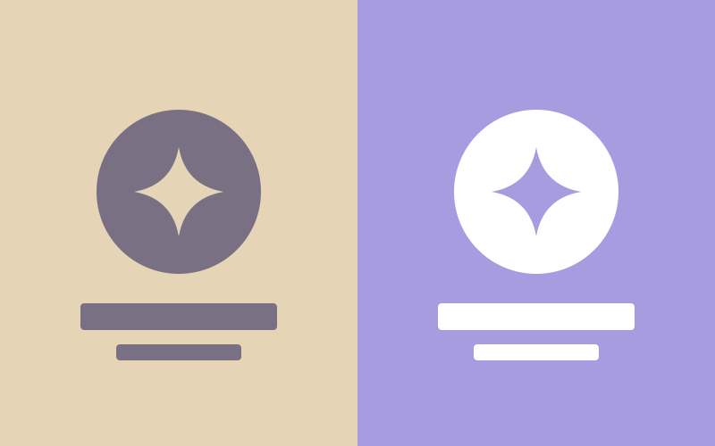
Which logo goes on which background?
How to pick the right logo version for light, dark, colored and photo backgrounds, and the mistakes that make a logo hard to see.
Files and guides

Logo file formats explained: PNG, JPG, SVG, PDF and EPS
Which logo file goes to the printer, merch supplier, embroidery shop, Canva or a developer. What PNG, JPG, SVG, PDF and EPS do, and why a JPG has a white box.

Vector vs. pixel: why your logo needs to scale
Why a vector logo stays sharp from a favicon to a billboard, why a pixel logo goes blurry, and what "can you send it bigger?" really means.
What goes in a brand guide, and who it's really for
A brand guide isn't a rulebook for the owner. It's for the freelancer, the printer and the new assistant. What goes in one, and how it gets used.
Type and photos
Free fonts vs. licensed fonts: what a small business should know
Yes, Google Fonts are free for commercial use. What a font license covers, when a paid font is worth it, and what to check before your brand picks a typeface.

Your photos are part of your brand
A post can look off because of the photo alone. How to choose or shoot photos that sit with your palette, and what stock photo licenses allow.
Working together
Brand Kit vs. Media Kit: which one do you need first?
A Brand Kit is your logo, colors, type and guide. A Media Kit is Canva templates built on them. What each includes and which one comes first.
What the brand questionnaire is for
Every branding project starts with a questionnaire. What it asks, why the answers set the visual direction rather than a designer's taste.

Why every logo starts as a sketch
Sketch first, vector last. Why hand-drawing is the fastest way to find a logo idea, how a sketch becomes a vector file, and what AI and stock marks skip.
Templates
How many social media templates does a small business need?
Fewer than a template shop suggests. Count the kinds of posts you put out, not the sizes Instagram offers, and build one template for each.

What is a design grid, and why do templates need one?
A design grid fixes where the logo, type and photos go, so a post can change its words and still look like the brand. What a grid holds and leaves open.
Industries
Branding for consultants: same industry, five different logos
Five consultant brands from my studio, from an inclusion practice to a communications firm, and how they ended up looking nothing alike.

Branding for founders: four logos, four different answers
A communications agency, a networking group, an online store and a handmade gift shop. Four founder brands from my studio, and why none of them looks like the others.

Wellness branding without the lotus: four logos, four moods
A birth school, a nutrition program, a counseling practice and a postpartum service. How wellness brands can be calm without looking alike.
Audiences

Jewish branding for a young audience: tradition that doesn't look dated
A Birthright trip organizer, a Jerusalem program for young Jewish women and Go with Yo: three Jewish brands for a young audience, in three different styles.

Pro bono logos: a blind-cat rescue, a toy library and a shield
Three free logos for causes in Israel, from a charity for blind cats to Magen. What a nonprofit needs from a logo when there's no budget behind it.

Women's health branding that skips the pink
A birth and bodywork school, a hormonal-balance program and a postpartum service, and how each avoided the pink, the silhouette and the mom-and-baby cliché.
Letters, symbols or a character: how a logo gets built

Brand colors by industry: what each field uses, and when to break it
Tech goes blue, consulting blue and green, feminine brands pink, finance gold and gray. What each default color says, and how real brands step around it.
Brand mascots: when your logo should have a face
A pet store fronted by a real dog and cat, and a charity's calm blind cat. When a mascot is right for a small business, and what it does that a symbol can't.
Typographic vs. illustrative logos: which one fits your business
Wordmarks, monograms and lettermarks on one side, drawn symbols and characters on the other. Real examples of each, and how to tell which one your business needs.
Have a project in mind?
Book a free call.