Branding for consultants: same industry, five different logos
Five consultant brands from my studio, from an inclusion practice to a communications firm, and how they ended up looking nothing alike.
 Vic Ulsh
Updated Oct 21, 2026 · 2 min read
The short answer
Consultant logos default to blue and green because those colors read as trustworthy, which is exactly why so many consultants look interchangeable.
The five consultants below each got a mark built from how they actually work: five shards for five services, a line that untangles, a monogram for two people.
Takeaways
- Consultants sell something invisible, so the logo often carries more of the first impression than it would for a product.
- The default consultant look (blue, a swoosh, a sans serif) is safe and hard to tell apart.
- A mark built from the method, not the industry, is easier to explain on a discovery call.
- Structure can live in the system: Mosaic's five service lines each take one shard of the logo.
Consultants sell something nobody can hold. There's no product photo, no storefront, often no in-person meeting. Before a discovery call, a potential client has a profile picture, a post and maybe a proposal cover. That's the brand.
The category's answer to that is a blue logo with a swoosh. Here's what five consultants got instead.
Mosaic
Thru Process
Brian Burns
Bowstring

Gova10
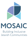
Mosaic: the business, drawn as its logo
Mosaic is an inclusion consultancy with five service lines and, before this, no visual form at all. The mark is five shards, one per service. Each service line takes one shard and one palette color, so a workshop flyer and a consulting proposal look like separate offers and the same company at once. Nothing new had to be drawn for it.
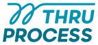
Thru Process: a line that untangles
Thru Process sorts out how businesses run. The mark is one hand-drawn line that loops twice, then straightens out. That's the job description, in one stroke. It's teal, not corporate blue, and the hand-drawn line keeps it from reading like software.
Brian Burns: two people, one shape
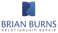
Brian Burns works with long-married couples and parents in high-conflict relationships. His monogram is two Bs that settle into a yin-yang form: two separate people, clearly connected. The palette is structured and steady, because his tone is direct.
Bowstring: a target that's also a letter
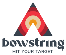
Bowstring is a Facebook ads agency run by Orlee Shraga. The mark is a bullseye inside an arrowhead, and the arrowhead is also an A. It's a deep red, where most ad agencies reach for blue.
Gova10: an arrow in the name
Gova10 is a communications firm for C-suite clients. The 1 in its name became an arrow inside the 0. It's the most corporate of the five, and it still couldn't belong to anyone else.
The pattern
Each of these came from the same question: what does this consultant actually do differently? The answer became the mark. That makes it easy to talk about on a call, and easy to build on in a deck, where a shape or a line from the logo can frame a slide.
If you're a consultant comparing directions, look at who reads your materials, not at what other consultants use. More on color choices in brand colors by industry.
The three logo concepts in a Brand Kit come from how you actually work, not from what other consultants use. For the decks and posts that come after, a Media Kit puts your colors and fonts into Canva templates.
Questions people also ask
Blue and green are the industry default because they read as calm and reliable. They work, but they're crowded. A deep red, a teal or a muted plum can carry the same seriousness and stand apart. More in the post on brand colors by industry.
If clients hire you for you, your name is the brand, and a monogram or signature-style wordmark fits. If you plan to hire, a company name with its own mark leaves room to grow.
Most consultants live on LinkedIn posts, proposals and decks, so the colors, fonts and templates matter as much as the mark. A logo alone tends to get improvised around.