Branding for founders: four logos, four different answers
A communications agency, a networking group, an online store and a handmade gift shop. Four founder brands from my studio, and why none of them looks like the others.
 Vic Ulsh
Updated Oct 21, 2026 · 2 min read

The short answer
A founder's logo has to work before the business has a reputation to lean on, so it needs one idea that's specific to the company and holds up at profile-picture size.
The four founder brands below share that brief and ended up nothing alike, because the idea came from each business, not from the category.
Takeaways
- Founder brands get judged on very little: a profile picture, a deck cover, a business card.
- One specific idea per mark beats a symbol the whole industry already uses.
- Same brief, different businesses, different logos. The category doesn't decide the style.
- Plan the small version first. Most founders see their logo at 40 pixels long before they see it on a sign.
Founders tend to ask for the same thing: look established, look like us, and don't look like every other startup. The last part is the hard one, because the shortcuts every founder reaches for are the same shortcuts. A gradient, a geometric sans, an abstract swoosh.
Here's what that brief turned into for four founder-led businesses.

Gova10
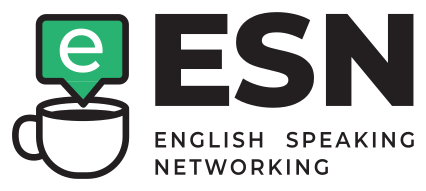
English Speaking Networking

Israel Home Store
NAIMA
Gova10: a number that points somewhere
Gova10 is a boutique communications agency whose clients sit in the C-suite. The name already had a number in it, so the mark is built from it: a 1 and a 0, where the 1 is an arrow. It reads as one shape at small size and as two characters once you look again.
The palette stays cool and controlled, Marian Blue running into a gradient, because the people reading it are executives who see a lot of agency pitches.
English Speaking Networking: coffee and conversation
English Speaking Networking is a group for English-speaking business owners in Israel. The mark is a speech bubble dipped in a coffee cup: conversation, over coffee. Nothing about it says "corporate networking", which is the point.
Israel Home Store: a pin with a house in it
Israel Home Store is an online home goods store for English speakers in Israel. The icon is a map pin cut into four colors with a house in the middle: a place, and a home in that place. Four colors is more than most brands need, but a store full of different products can carry it.
NAIMA: the maker's hand in the mark
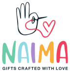
NAIMA sells handmade gifts for babies, kids and parents on Etsy. The mark is a hand threading a needle, and the thread ends in a heart. On a marketplace where every shop gets the same small square, a mark that shows the making is what separates one seller from the next.
What the four have in common
Not a style. One is a gradient, one is a cup in a bubble, one is four flat colors, one is a hand-drawn needle and thread. What they share is the process: a questionnaire first, then hand sketches, then the one idea that belonged to that company and no other.
That's also the useful thing to know if you're a founder choosing a direction. "Startup" isn't a style. Your audience is. A logo for C-suite readers and a logo for expats furnishing an apartment should not look alike, even if both companies are three people and a laptop.
More on where those ideas come from in what a logo can hide, and on the versions a founder brand needs in logo variations.
Starting a business and need all of it at once? The Brand Kit covers it: three logo concepts drawn from your questionnaire, then the colors, fonts, logo files and a guide.
Questions people also ask
Once the name is settled and you're about to show it to people who don't know you yet: investors, first clients, a launch post. Before that, a clean wordmark in one typeface does the job.
Rarely. A detail that says something specific about how the company works is easier to remember than a literal picture of the product, and it still fits when the product changes.
Yes. The whole process runs remotely, in English, with clients in Israel and the US.