#Logo
Logo variations: what they are and why you need more than one
One logo can't fit a profile picture, a wide banner and an embroidered shirt. The standard logo variations, what each is for, and which ones you need.
Picture a logo with a round icon on the left and a three-word name on the right. On a business card it's perfect. In a round Instagram profile picture it becomes a thin strip with unreadable text. On a tall roll-up banner it floats in the middle of all that empty space. Same logo, three bad fits.
That's what logo variations fix.
What are logo variations?
They're versions of one logo, rearranged or recolored for different spaces. The drawing, the typeface and the colors stay the same. What changes is the layout, how much of it shows, and what color it's printed in.
Designers also call them lockups (fixed arrangements), a responsive logo, or primary and secondary logos. It all means the same thing: one brand, several shapes, each one ready to use.
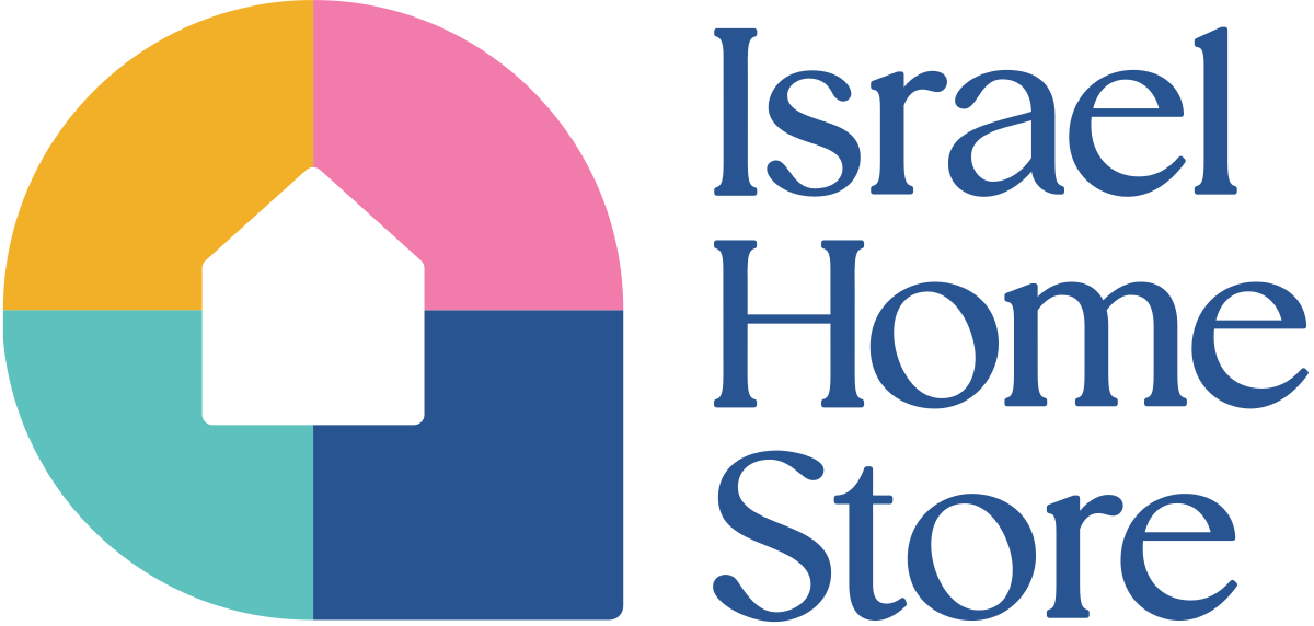
Main logo

Horizontal
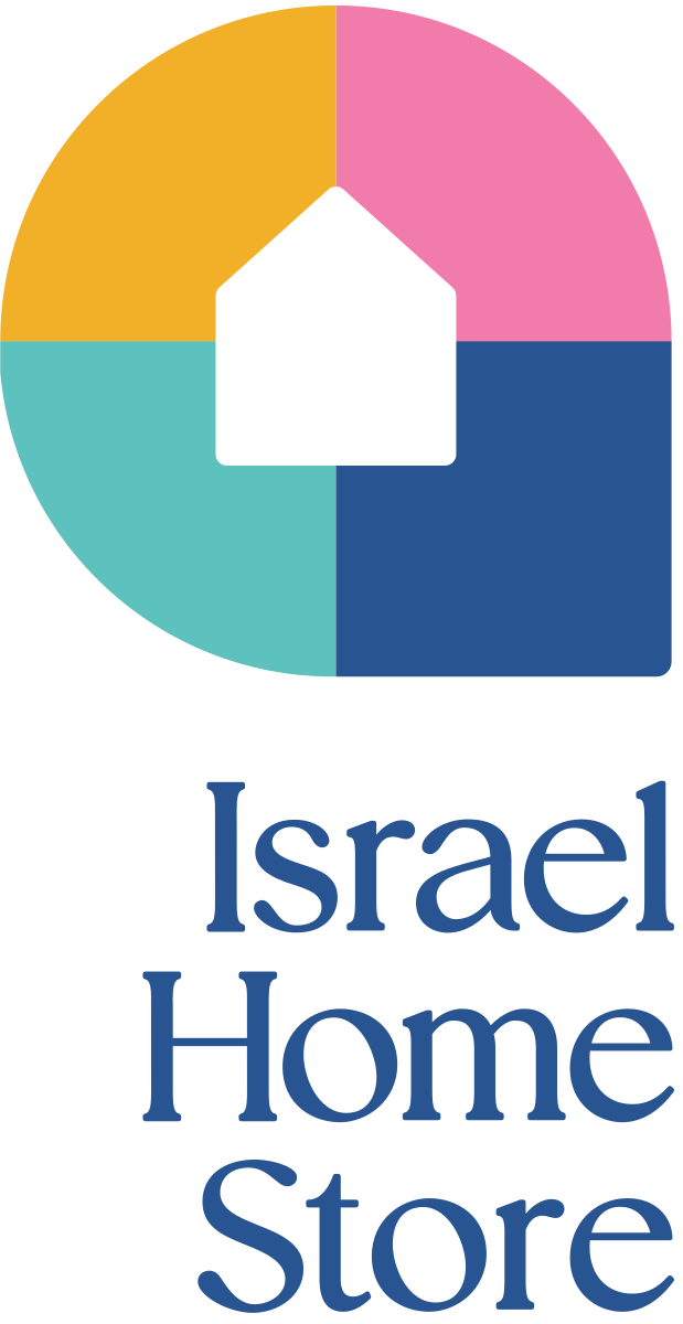
Stacked
Icon

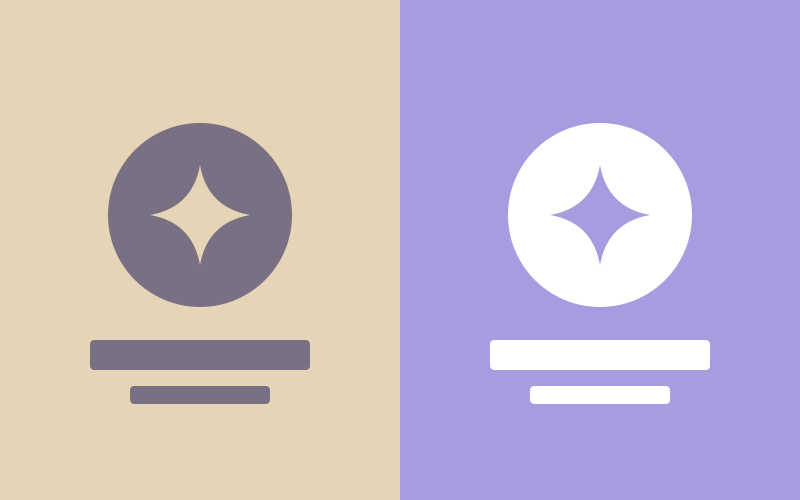
Reversed, for dark grounds

Icon above, for banners
What are the common logo variations?
| Variation | What it looks like | Where it goes |
|---|---|---|
| Main logo | The full version: icon, name, sometimes a tagline | Business cards, proposals, the cover of a deck |
| Horizontal | Icon beside the name on one line | Email signatures, headers, banners, slide footers |
| Stacked | Icon above the name | Square posts, stickers, tall signs, merchandise |
| Icon or submark | The mark alone, or initials in a shape | Profile pictures, favicons, app icons, watermarks |
| Wordmark | The name alone, no icon | Narrow spaces, co-branded pieces, text-heavy layouts |
| With and without tagline | The same lockup, tagline on or off | Tagline when there's room, none when it would be too small |
| One-color | Solid dark, solid white | Photos, dark backgrounds, stamps, embroidery, engraving |
Not every brand needs every row. A name that's one short word might not need a separate wordmark. A brand that never prints might skip some color versions. The set is built around where the logo will actually appear.
Why is the icon version so important?
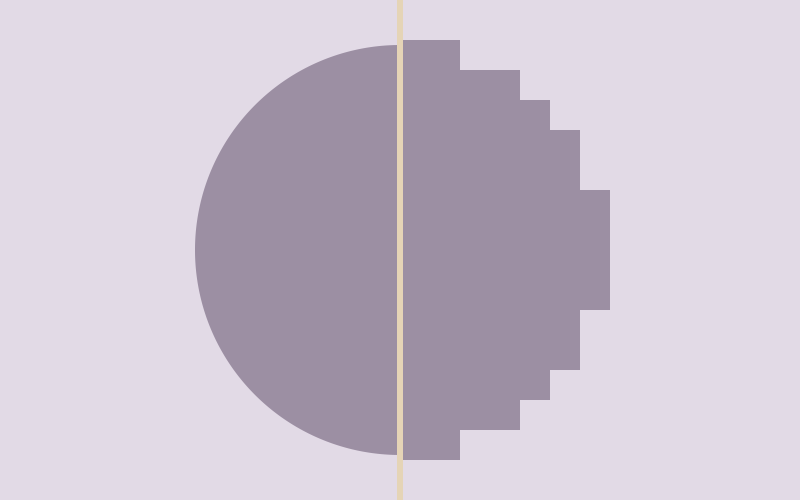
For a lot of businesses, the logo people see most often is 40 pixels wide. It sits in a circle next to a LinkedIn comment or a WhatsApp message. A full logo at that size is a smudge.
Profile picture size
Sign size
That's why the mark gets tested small from the first sketch. The Social Media Academy had a long name and a logo that would mostly live at profile-picture size, so its icon became one letter in a speech bubble. Tailor Made Israel got two words in a slanted blue box that fits in the corner of anything.
Why do I need one-color versions?
Because a lot of the places a logo ends up can only take one color:
- A white logo over a photo or a dark background.
- A single-color print job, like a rubber stamp, a receipt or a newspaper ad.
- Embroidery, screen printing and laser engraving, where every extra color costs more or isn't possible.
- Documents printed on an office printer in black and white.
A logo that only works in full color runs into a problem the first time any of these comes up.
How are variations delivered?
Every lockup comes as its own set of files, in the brand's own colors, so there's a version ready for most backgrounds in the palette. Nobody should have to crop the icon out of the main logo or retype the name next to it. That's how the spacing drifts and the logo slowly stops matching itself.
The brand guide then says which one to use where. That part gets its own post: which logo goes on which background. For which file format to send where, see logo file formats explained.
Questions people also ask
What is a submark?
A submark is a small, simplified version of the logo, often the icon alone or the initials in a shape. It's used where the full logo would be too small to read, like a profile picture or a favicon.
What is a logo lockup?
A lockup is a fixed arrangement of the logo's parts, such as the icon and the name side by side or stacked. Each lockup is saved as its own file so the spacing never has to be redone.
How many logo variations does a small business need?
Usually four to six layouts, each in a few colors: main, horizontal, stacked, icon, and sometimes a version with and without a tagline. The exact set depends on where the brand appears.
Are logo variations the same as different logos?
No. Every variation uses the same drawing, typeface and colors. Only the arrangement, size or color changes, so people still recognize the same brand.