
Mosaic
- Type:
- B2B
- Sector:
- Inclusion Consultancy
- Year:
- 2026
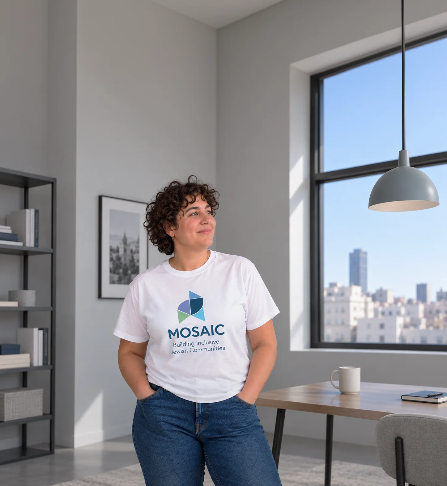
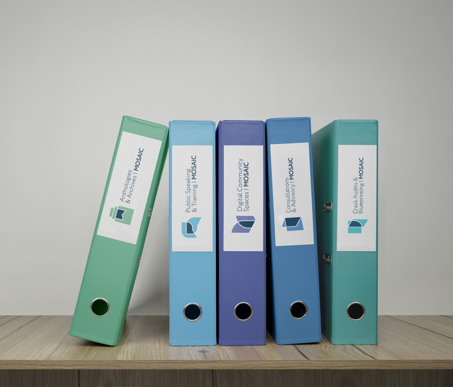
Mosaic advises Jewish organizations, schools, camps and community institutions that want to move past checkbox inclusion, across five pillars: consultations and advisory, digital community spaces, structural audits and blueprinting, community anthologies and archives, and public speaking and training. There was no previous identity to replace, so this was the practice's first visual form, and it had to hold five distinct offers without looking like five businesses.
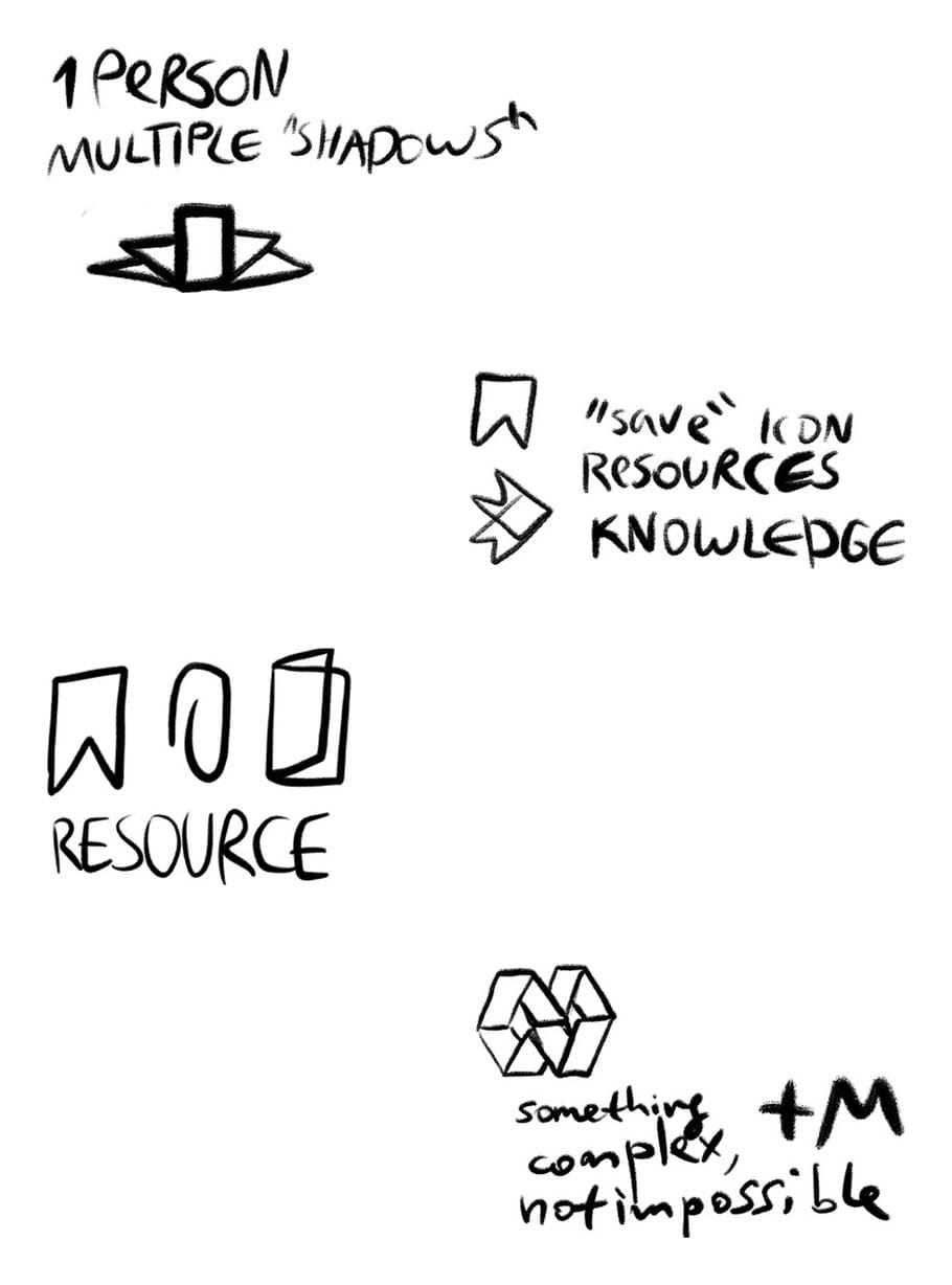
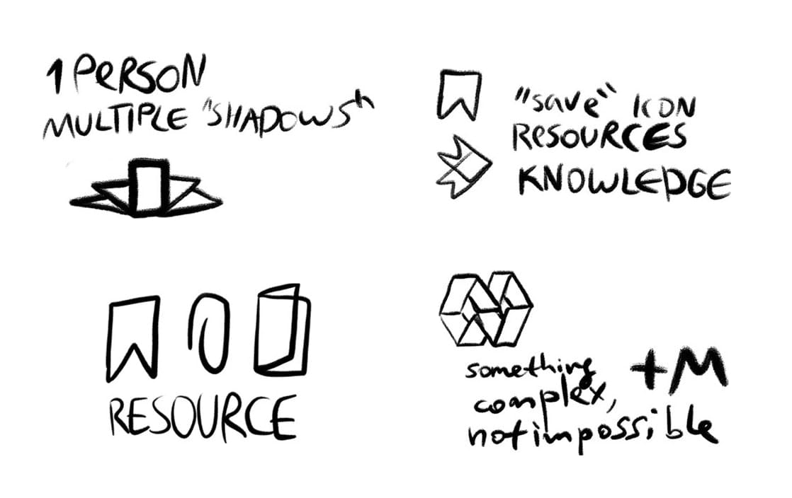
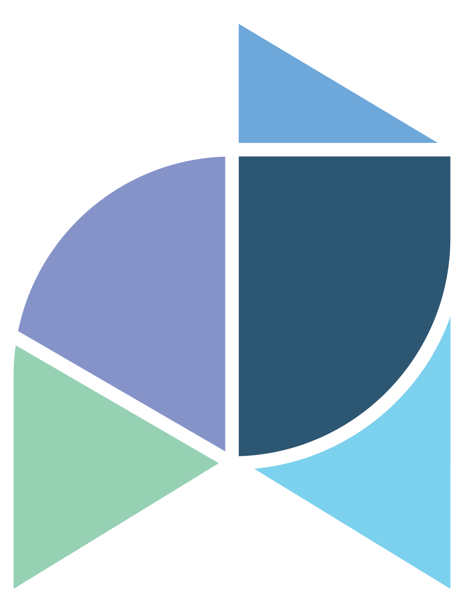
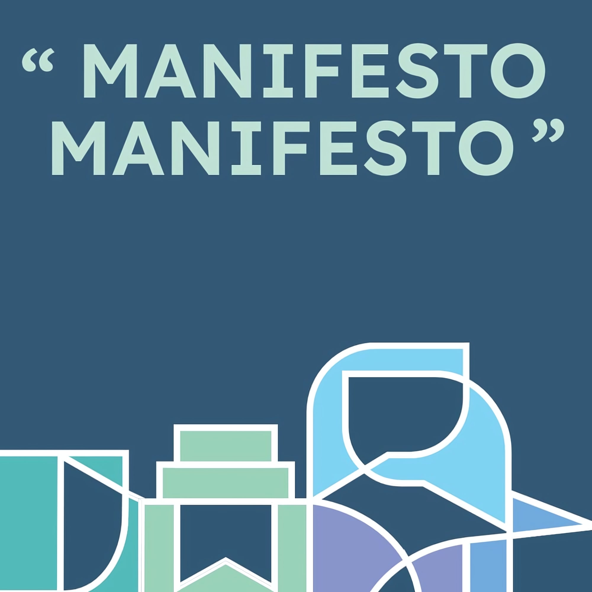
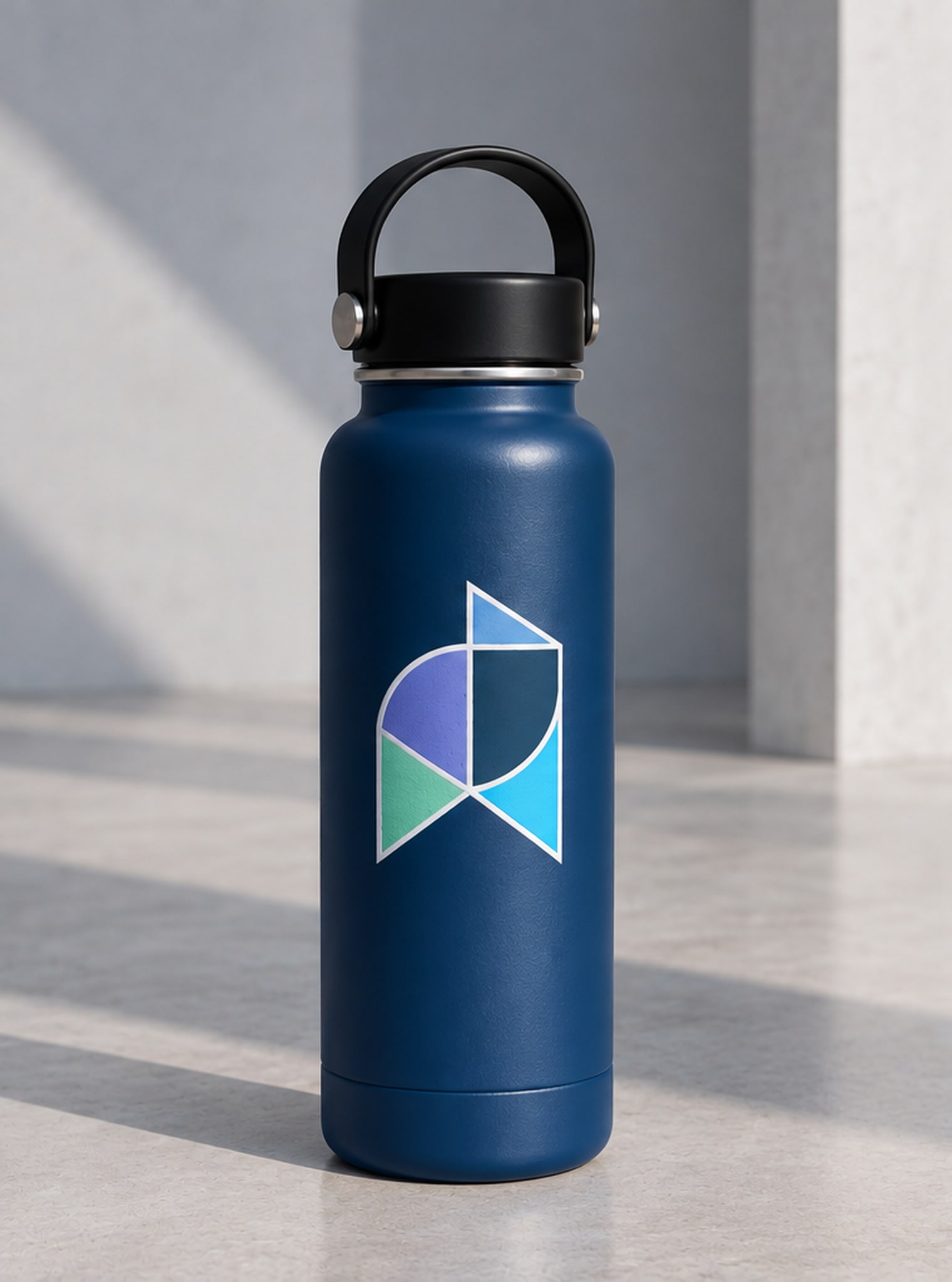
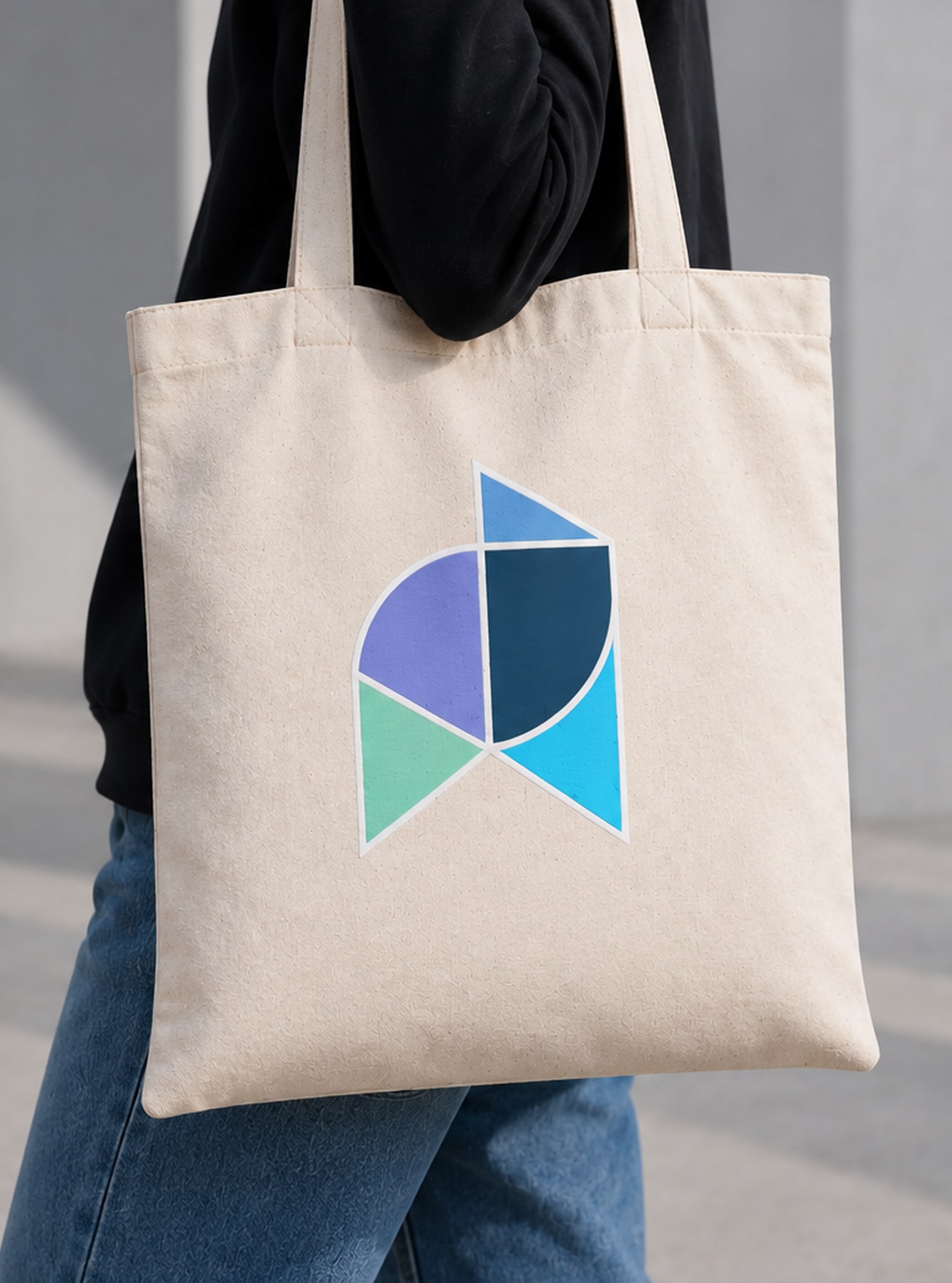
Branding Challenge: To build a symbol that works on its own, without the word next to it — one that reads gender-neutral, and isn't cutesy: no clasped hands, no puzzle pieces.

01 — From concept sketch
to vector logos


02 — System


03 — Color & type
- Navy
- Lavender
- Sky
- Cyan
- Mint
- Teal
- Yellow
- Gray


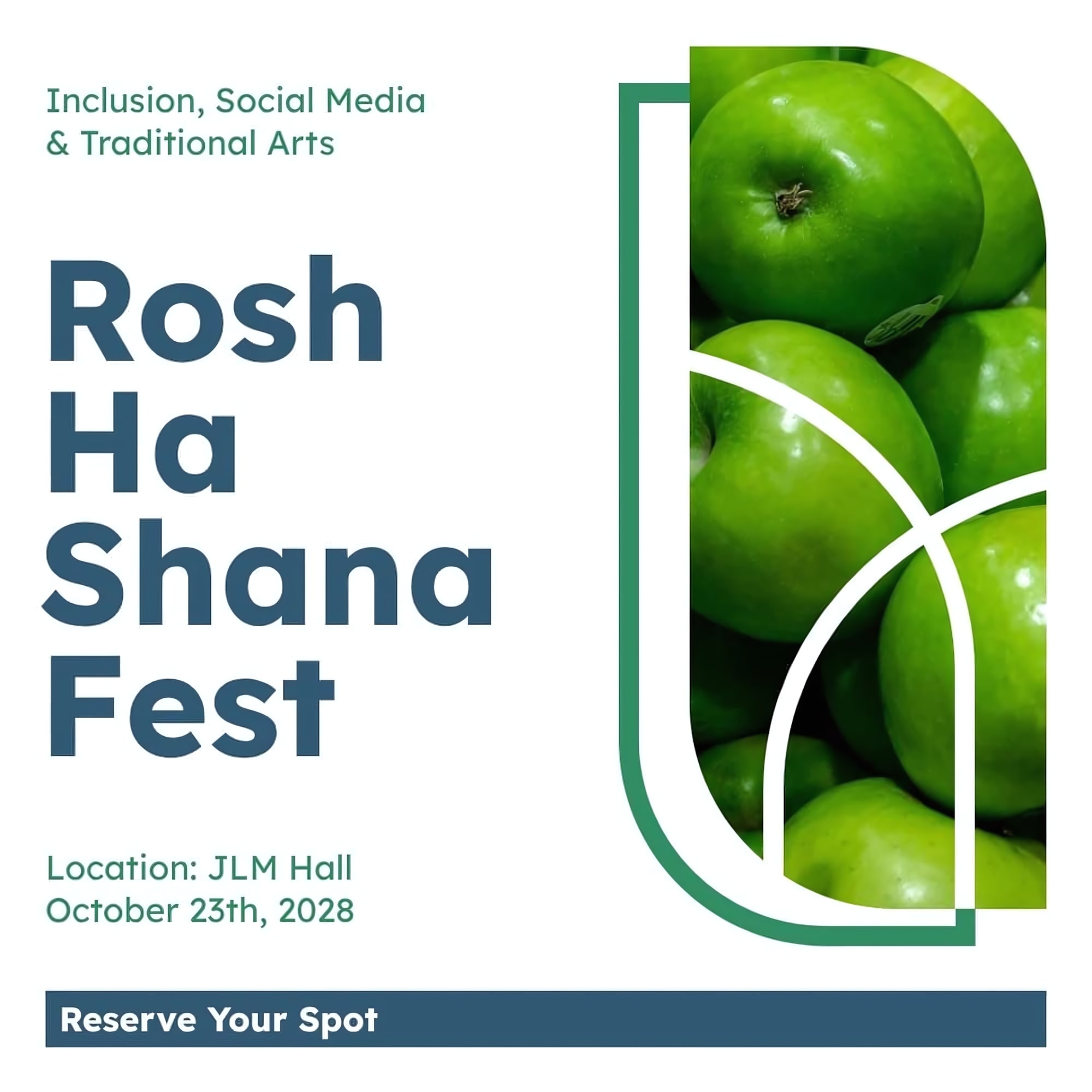
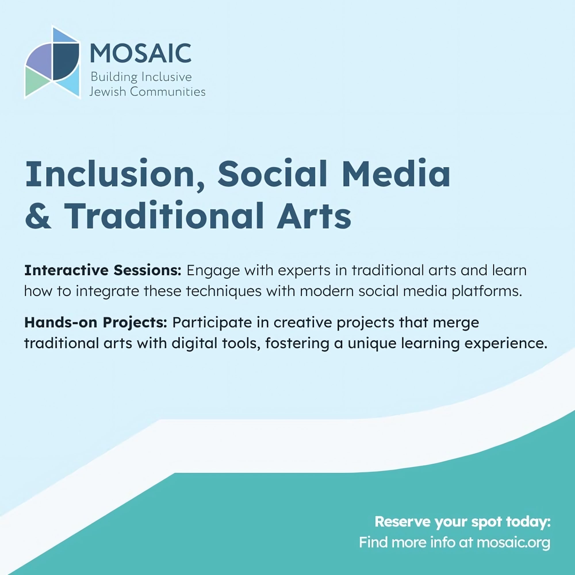
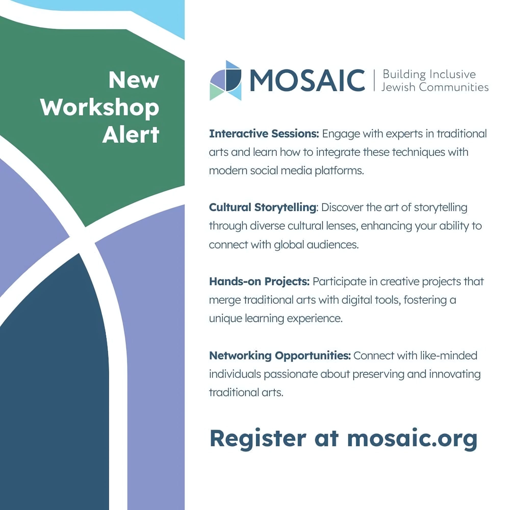
04 — Design Grid + Media Toolkit









































05 — Applied


Next case study