Thru Process
01 · The brief
Thru Process is an operations consultancy that helps businesses find their bottlenecks, fix their workflows and put in systems simple enough to grow on.
Branding Challenge: To show the move from complicated to simple without borrowing the design-process squiggle the whole field already knows, and to look as orderly as the work it sells.
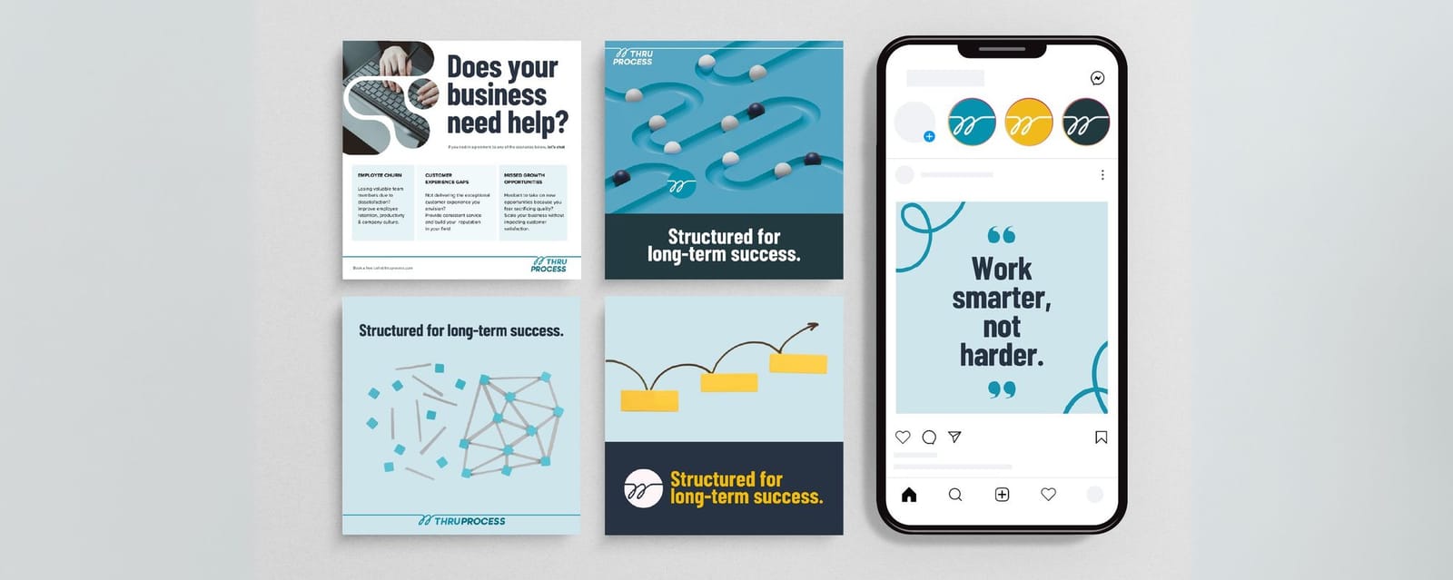
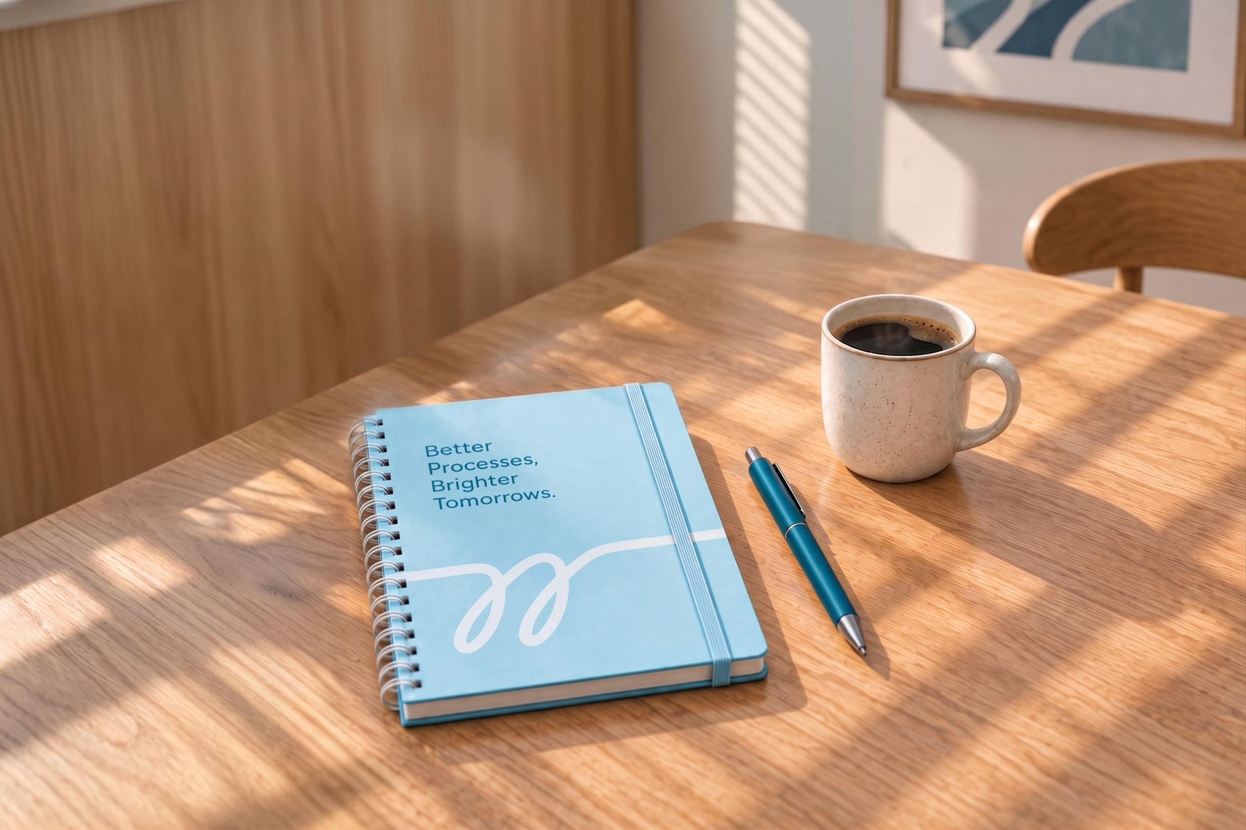
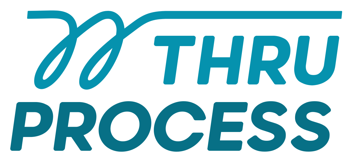
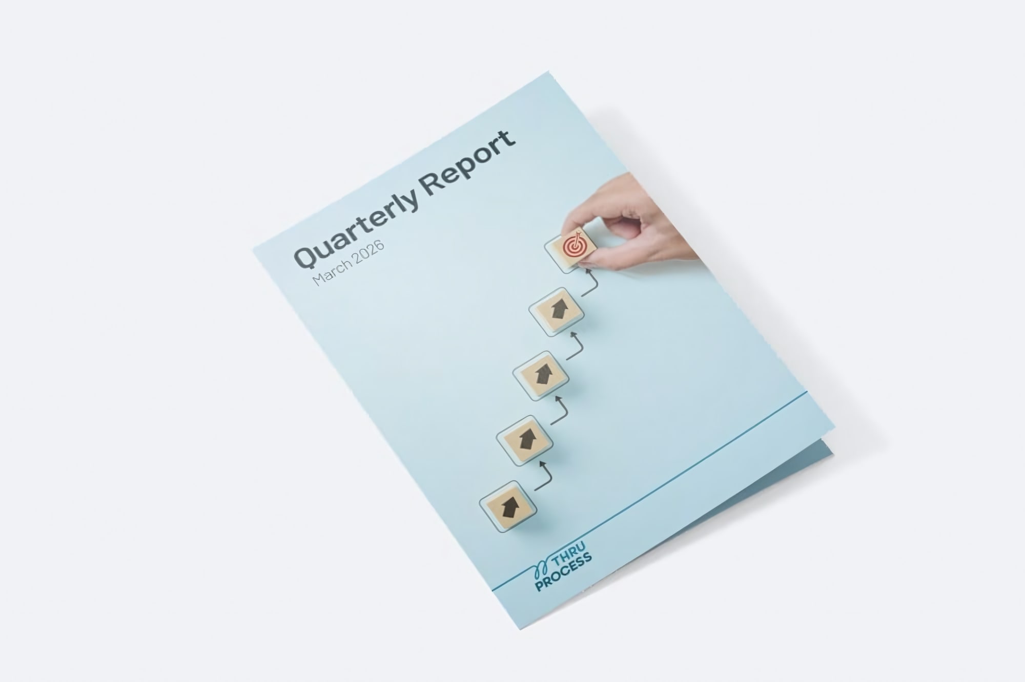
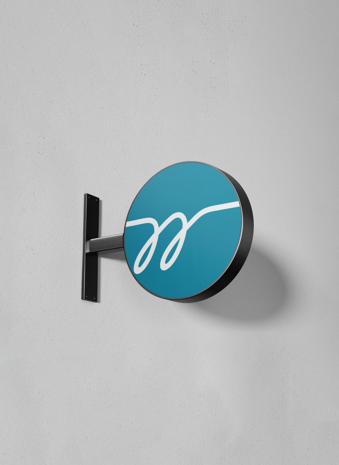
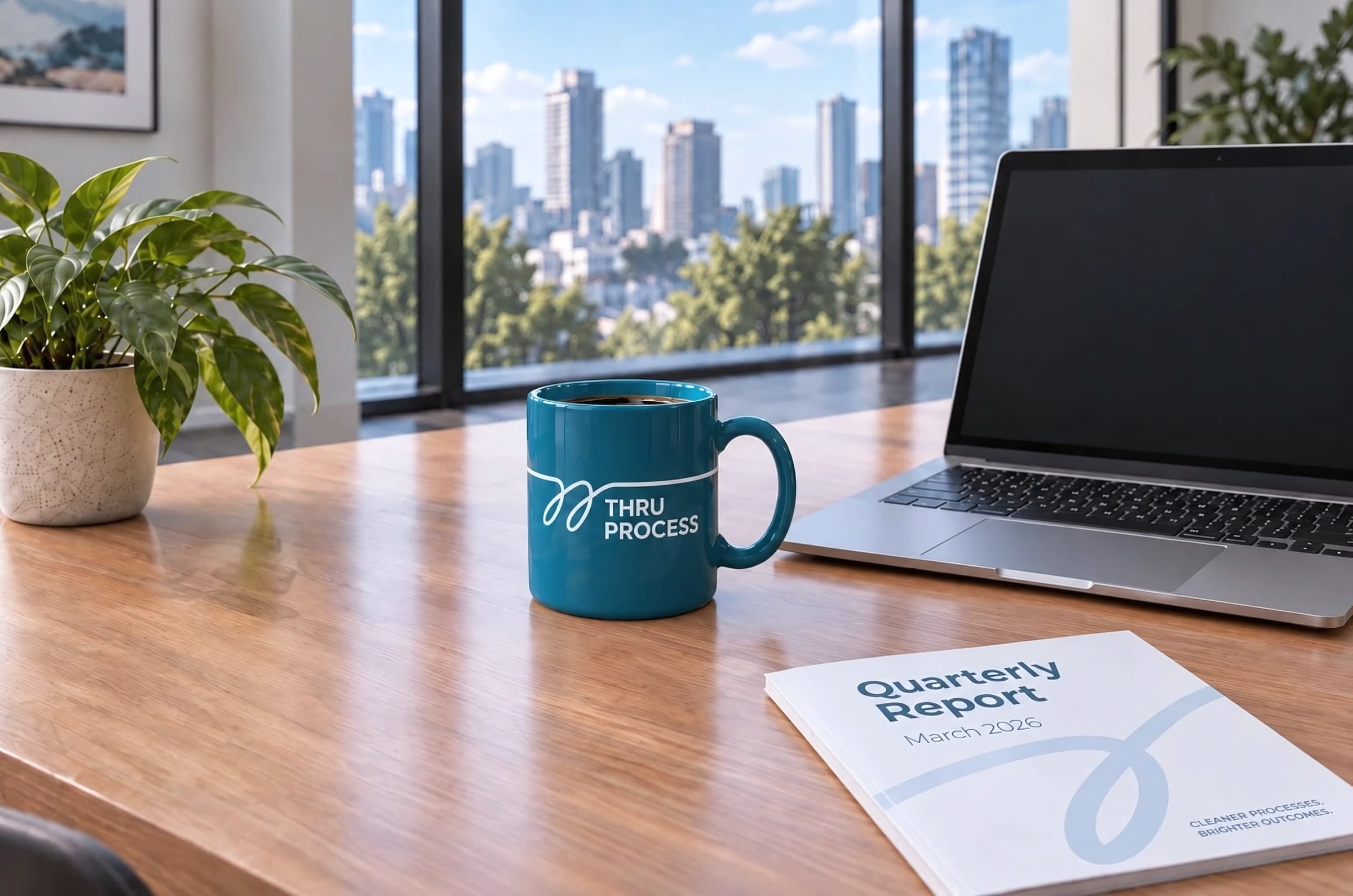
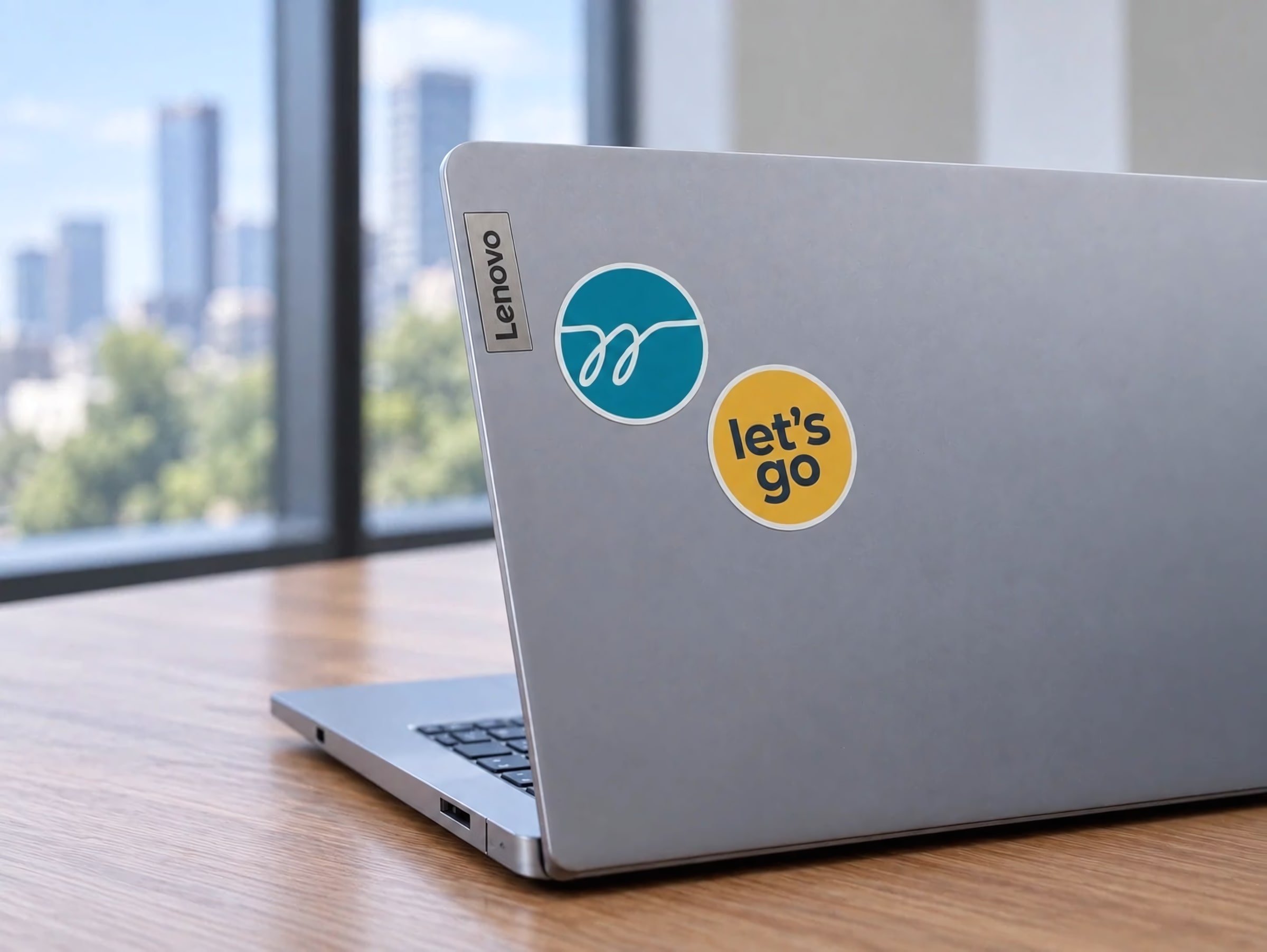
The mark is a single hand-drawn stroke that loops twice and then straightens into a line over the name, set in deep teal and pale blue, with one warm yellow kept for calls to action.
02 · Sketch
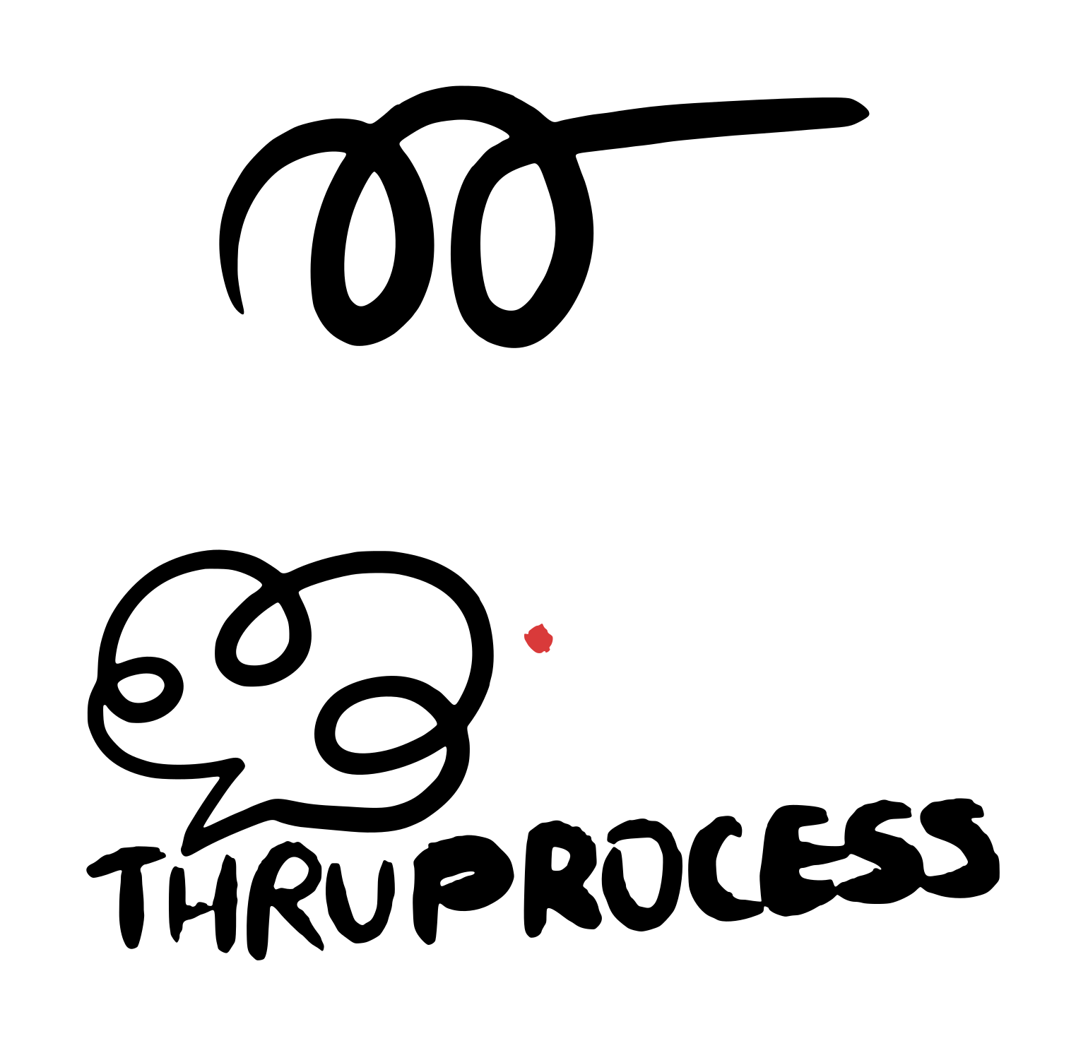
Drawn by hand first
Every Brand Kit starts here, on my iPad, before any vector work.
03 · Color & type
- Momentum Core#203A40
- Streamline Blue#077086
- Optimized Path#0592AE
- Pale Blue#CDE5EB
- Efficiency Boost#F5F4F6
- Golden Milestone#F0BA1A
04 · Media Kit




05 · In use
06 · Handover
What they left with
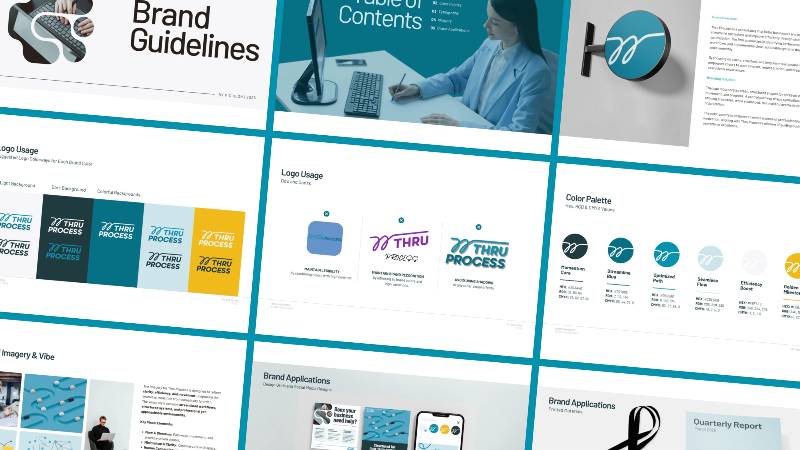
- Logo variations, colorways and recommended use
- Color palette
- Typography
- Photo direction
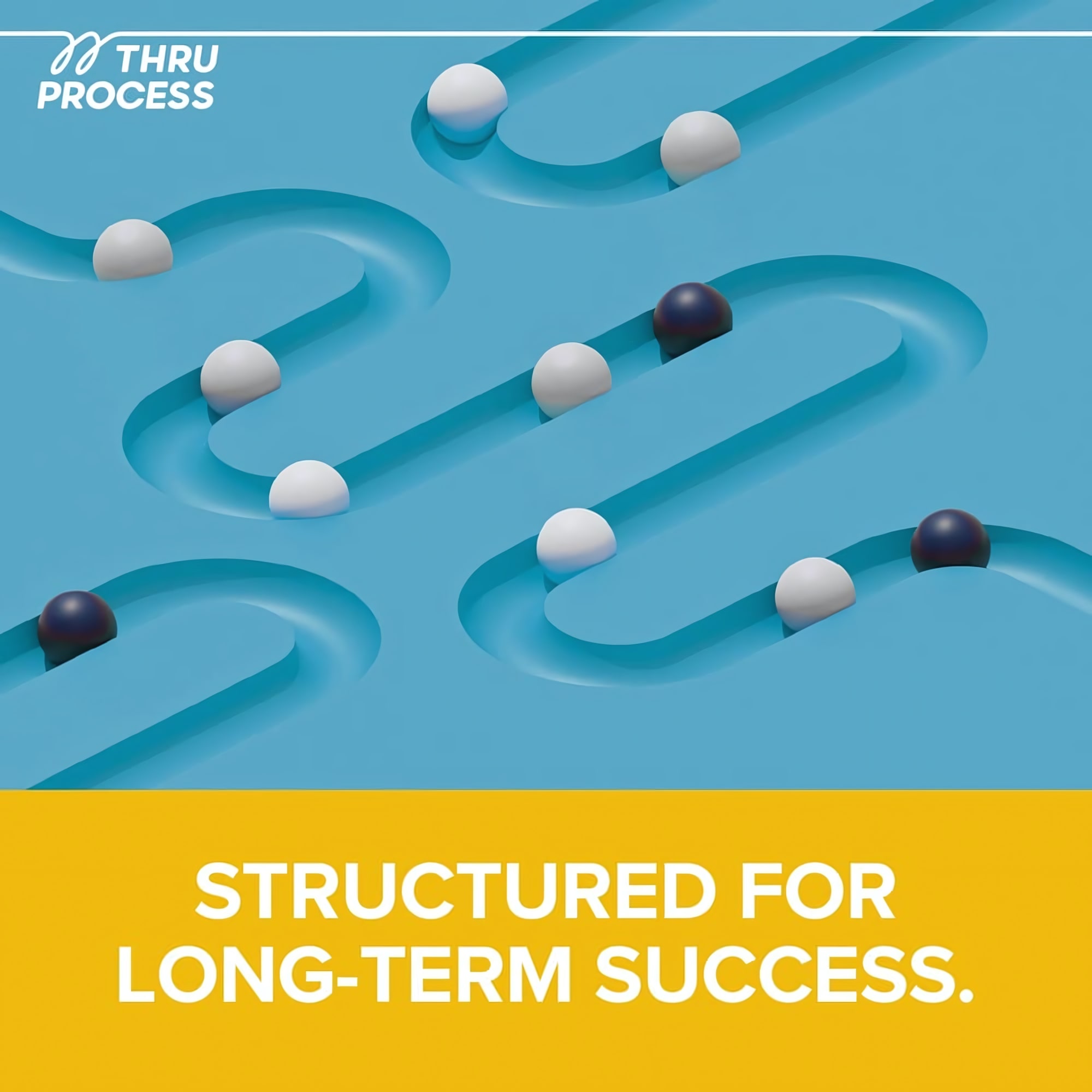
- Social and print applications
- Don'ts