Typographic vs. illustrative logos: which one fits your business
Wordmarks, monograms and lettermarks on one side, drawn symbols and characters on the other. Real examples of each, and how to tell which one your business needs.
 Vic Ulsh
Updated Oct 21, 2026 · 2 min read
The short answer
A typographic logo is built from letters: a wordmark, a monogram or a single letter. An illustrative logo is built from a drawing: a symbol, a scene or a character.
Typographic logos suit names people need to remember and businesses that want to look steady. Illustrative logos suit brands with a story to show and room to use the drawing beyond the logo.
Takeaways
- Typographic logos put the name first; illustrative logos put an idea first.
- A long name usually needs an icon, typographic or drawn, for profile-picture size.
- Many good logos are both: a drawn icon beside a set name, or a letter turned into a picture.
- Pick by what the brand has to do, not by which style is in fashion.
Every logo leans one way or the other. It's built from letters, or it's built from a drawing. Plenty sit in between, but knowing which way yours leans makes every later decision easier: the icon, the fonts, the templates, what goes on a mug.
Typographic logos: the name is the mark
A typographic logo is letters, set and adjusted until they belong to one business. Three common kinds:
- Wordmark: the whole name. Tailor Made Israel is two bold words in a slanted blue box.
- Monogram: initials combined into one shape. Brian Burns's two Bs settle into a yin-yang form, two people in one relationship.
- Letter icon: one letter pulled out to stand alone. The Social Media Academy's lowercase a sits in a speech bubble, small enough for a profile picture.
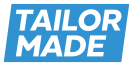
Tailor Made: wordmark
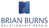
Brian Burns: monogram
Social Media Academy: letter icon
Purple Chia: script and sans
Typographic logos are good at being remembered by name, at looking steady, and at staying out of the way of the work. They suit consultants, firms and anyone whose name is the brand. The risk is blandness: a name in a free font isn't a logo yet. The craft is in the details, the slant, the custom letter, the pairing.
Illustrative logos: the idea is the mark
An illustrative logo is a drawing. It can be a symbol, a small scene or a character.
- Symbol: Equilibrio's butterfly that's also a pelvis.
- Scene: the Special Needs Toy Library's rocket taking off inside a patch of sky.
- Character: Lucy's Pet Store's dog and cat, drawn from the real Lucy and Herzel.
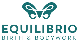
Equilibrio: symbol
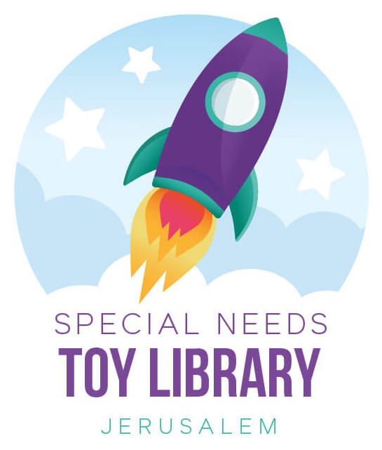
Toy library: scene
Blind cat charity: line drawing
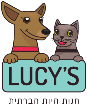
Lucy's: character
Illustrative logos are good at telling a story before anyone reads a word, and the drawing keeps paying off: the same hand can draw icons, patterns and post graphics. They suit brands with a personality to show, like pets, kids, food, wellness and community groups. The risk is detail. A drawing that looks lovely on a sign can turn to mush in a 40-pixel circle, so it needs a simplified version from day one.
The ones in between
A lot of the strongest logos are both. Gova10's 1 is also an arrow. Bowstring's arrowhead is also an A. NAIMA pairs a drawn hand and needle with a colorful set name. A letter that becomes a picture, or a picture that becomes a letter, gets the memorability of one and the story of the other.
How to choose
Three questions settle most of it:
- Is the name long? Then it needs an icon for small sizes, whatever the style.
- Is there a story people should see? A real dog, a method, a place. That leans illustrative.
- Does the client need to see restraint first? Legal, finance, executive work. That leans typographic.
And if you're torn, the sketch stage is where it gets settled. Seeing both directions drawn side by side usually makes the answer obvious. More in why logos start as sketches.
A Brand Kit builds that comparison in: three logo concepts drawn from your questionnaire, one of which you choose and refine.
Questions people also ask
A wordmark sets the whole name in a specific typeface, like Tailor Made's two words in a slanted box. A lettermark or monogram uses initials, like Brian Burns's two Bs.
They can be, if they're detailed. A good illustrative logo comes with a simplified icon for small sizes and one-color versions for stamps and embroidery.
Yes. A wordmark can grow a drawn icon later, as long as the type was chosen with that in mind. It's harder to go the other way.