Equilibrio

Type:
B2C
Sector:
Wellness
Year:
2021

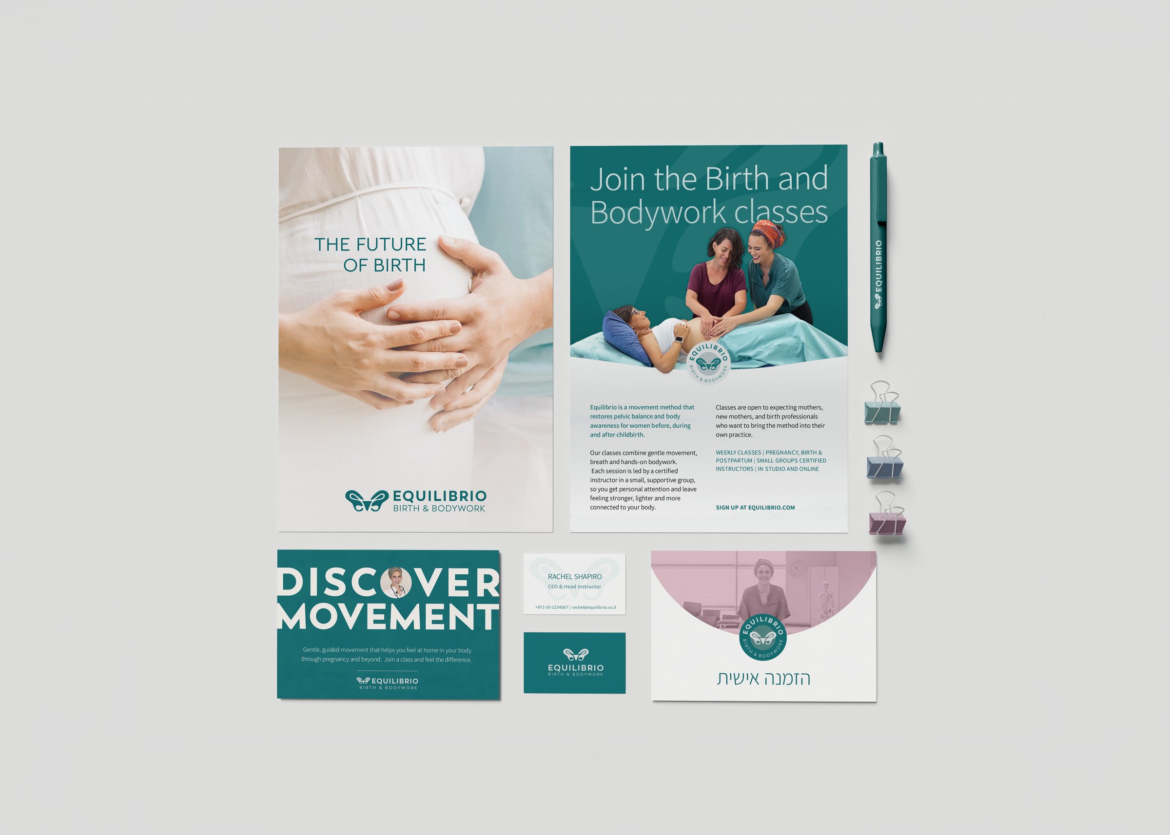
Equilibrio is a movement method that restores pelvic balance and body awareness for women around childbirth.

Branding Challenge: To move away from generic “mom & baby” aesthetics and reflect the depth of this movement-based method.

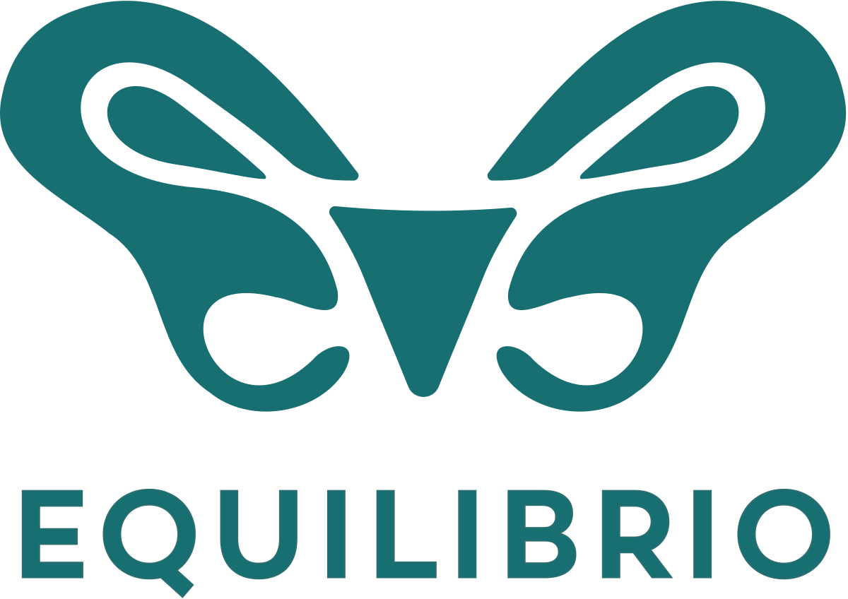
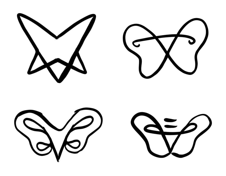
The wings curl in at the bottom the way the rim of a pelvis does. Most people see a butterfly; her students see the pelvis.
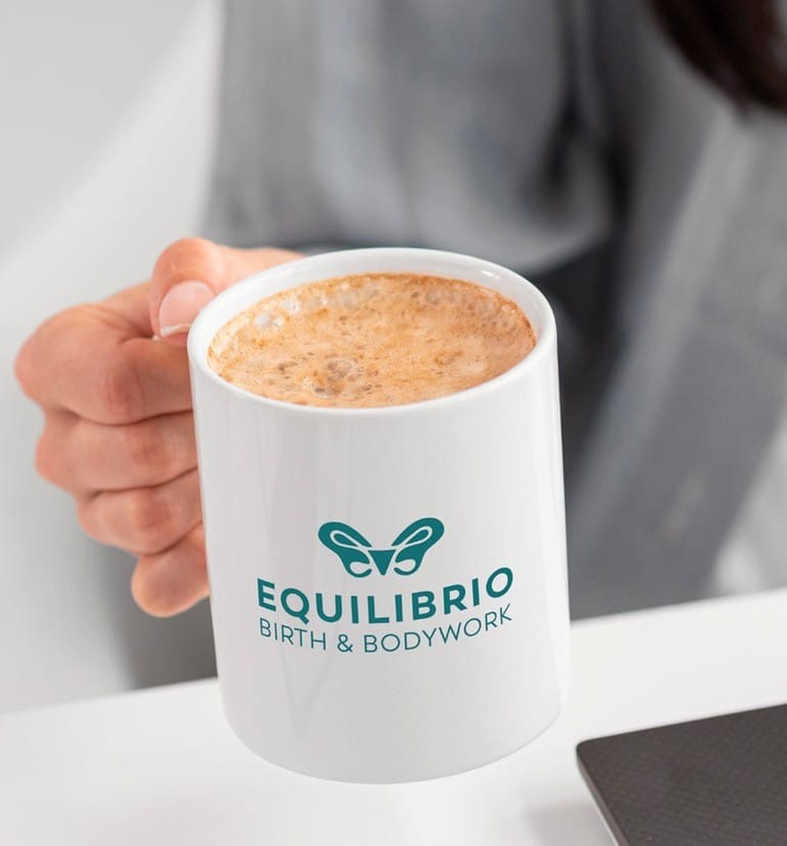
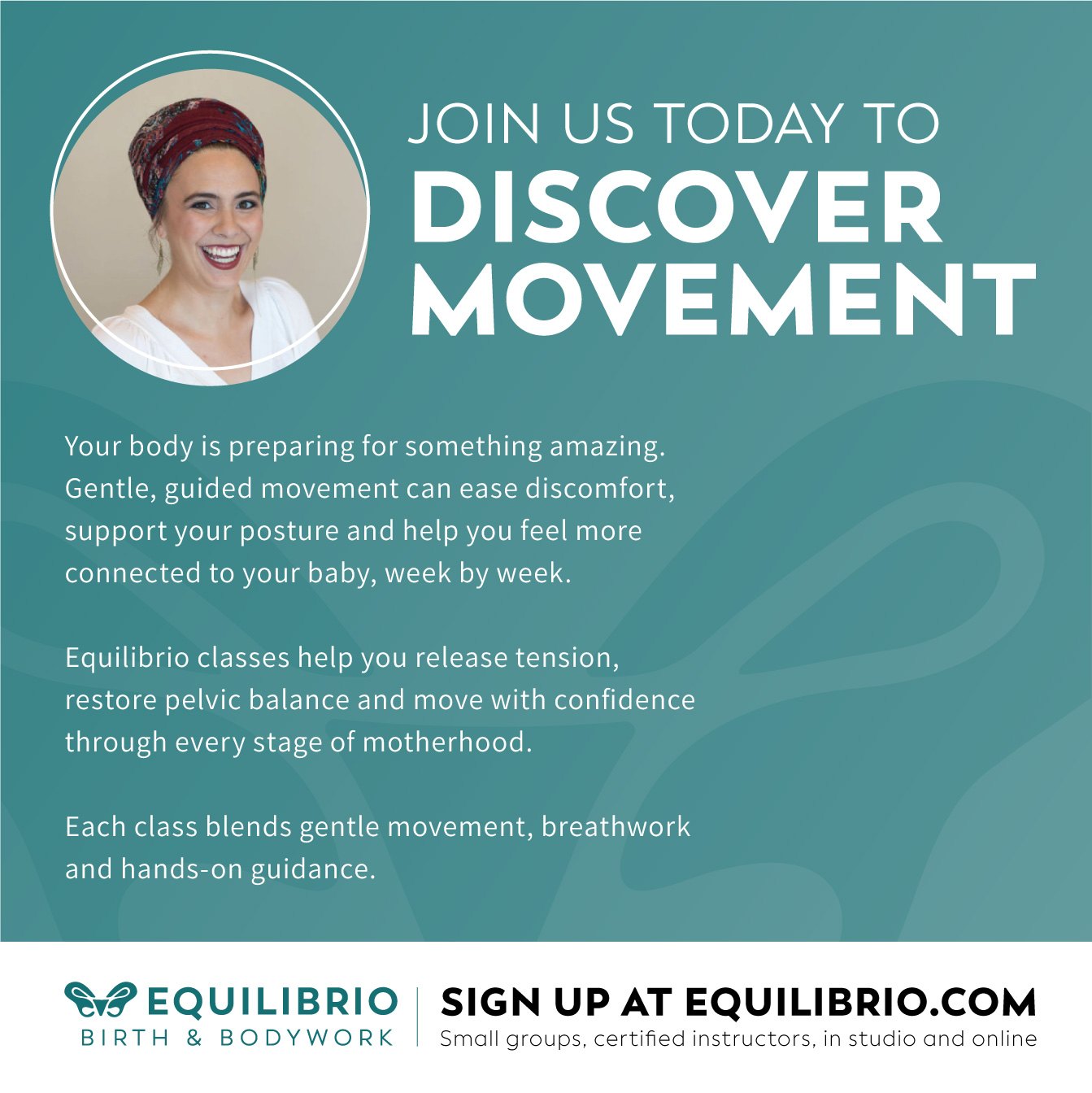
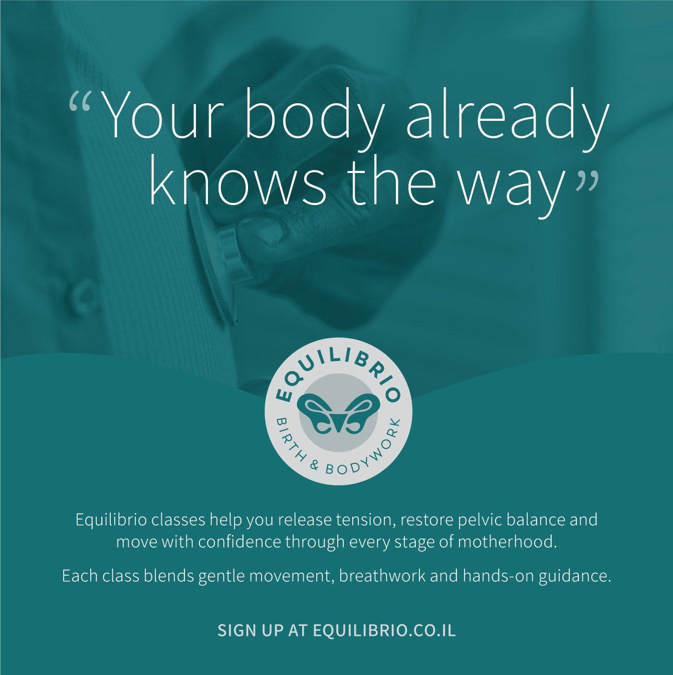
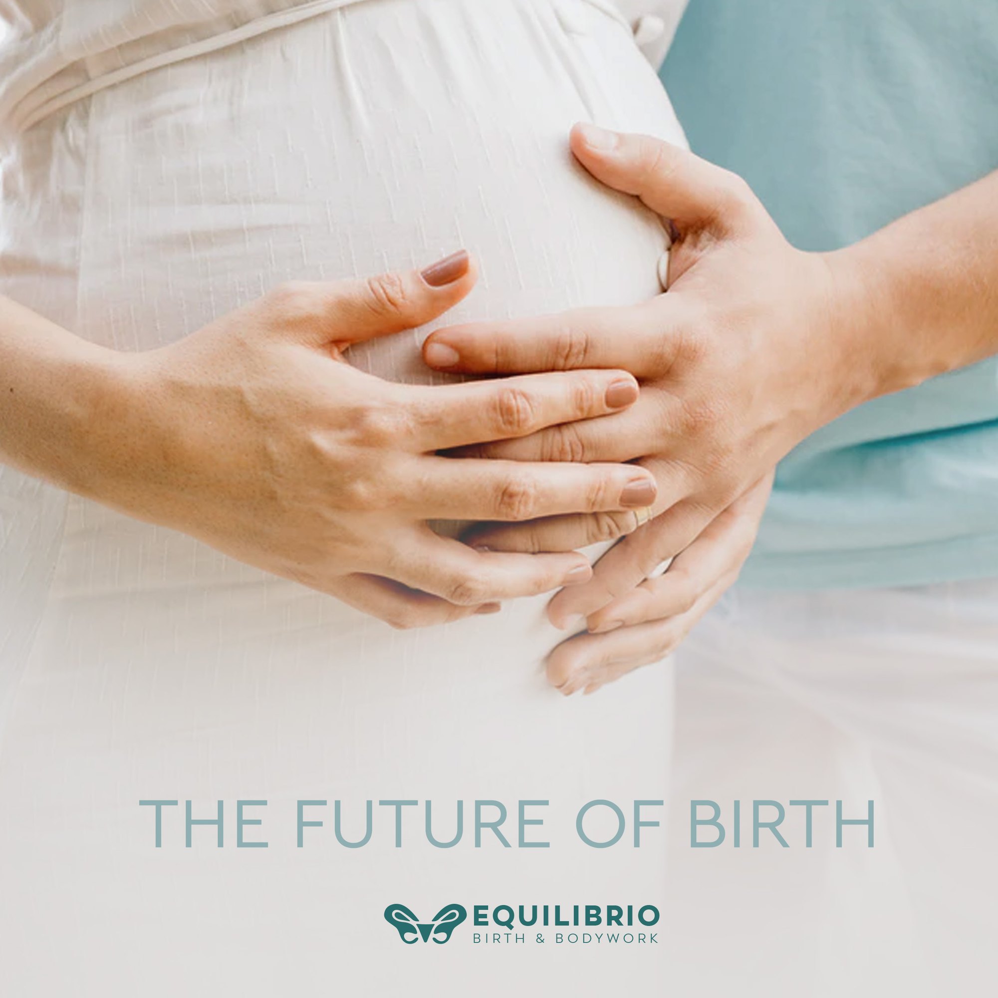
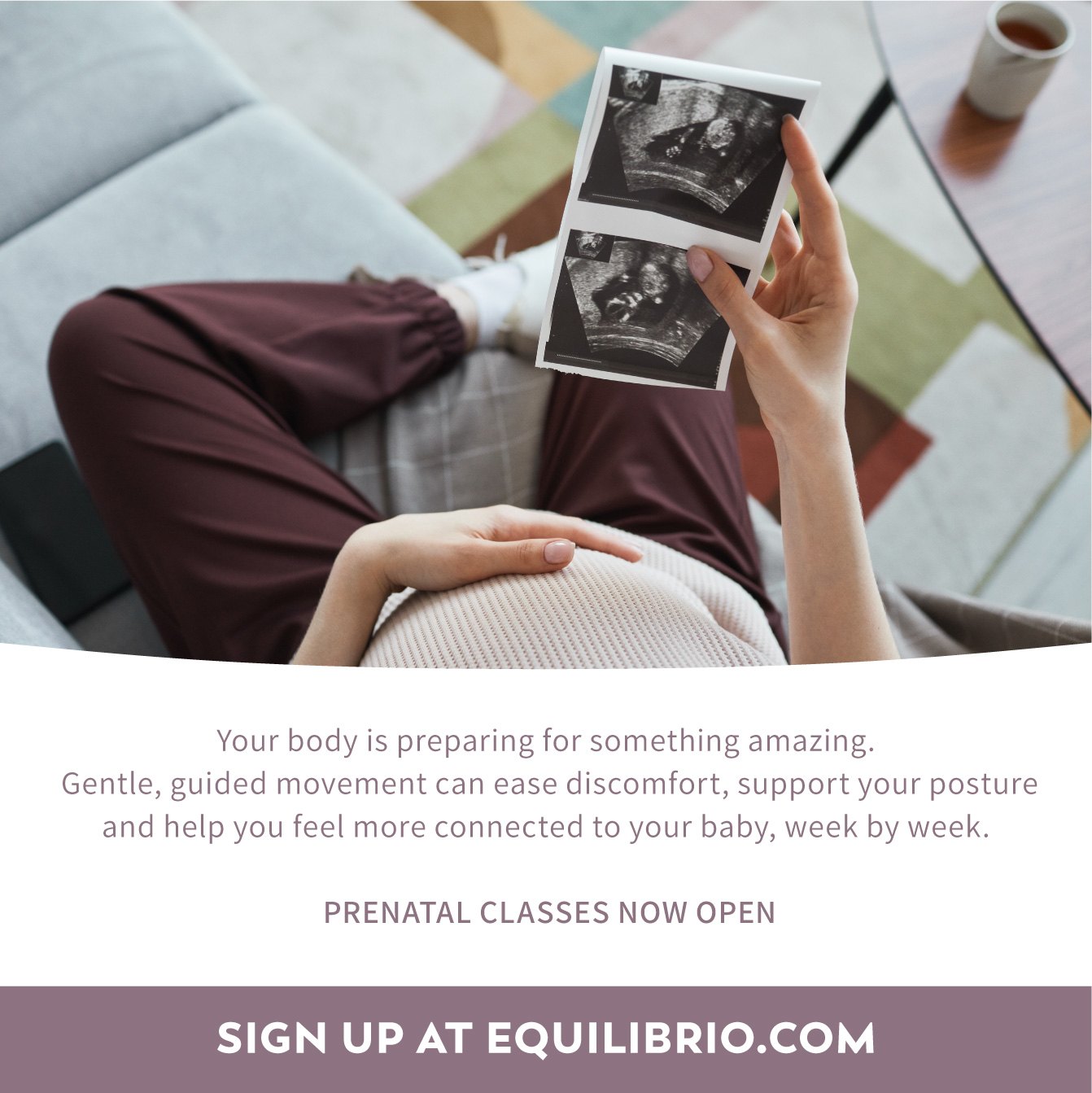
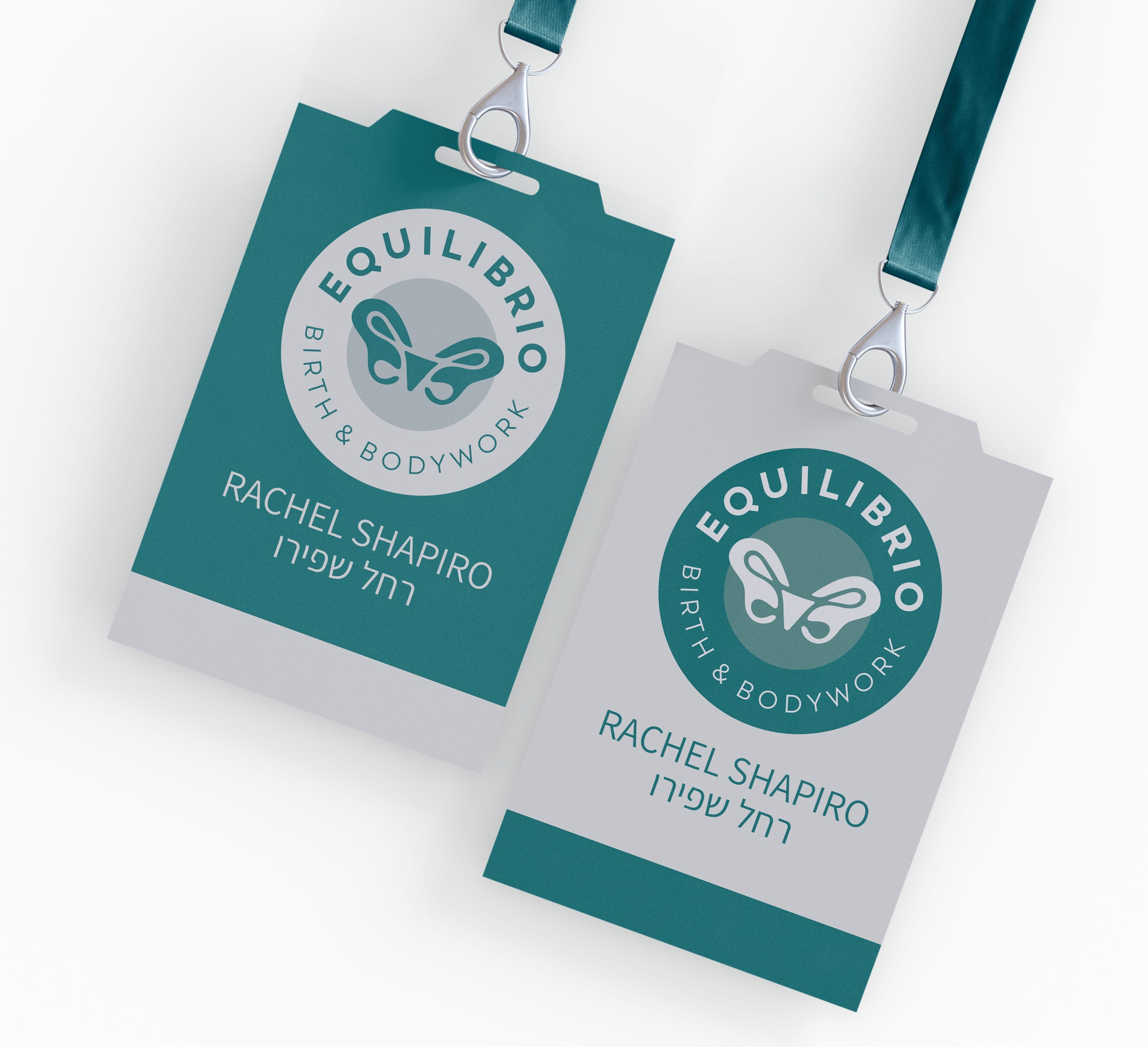
Equilibrio brand identity applied

01 — From concept sketch
to vector logos
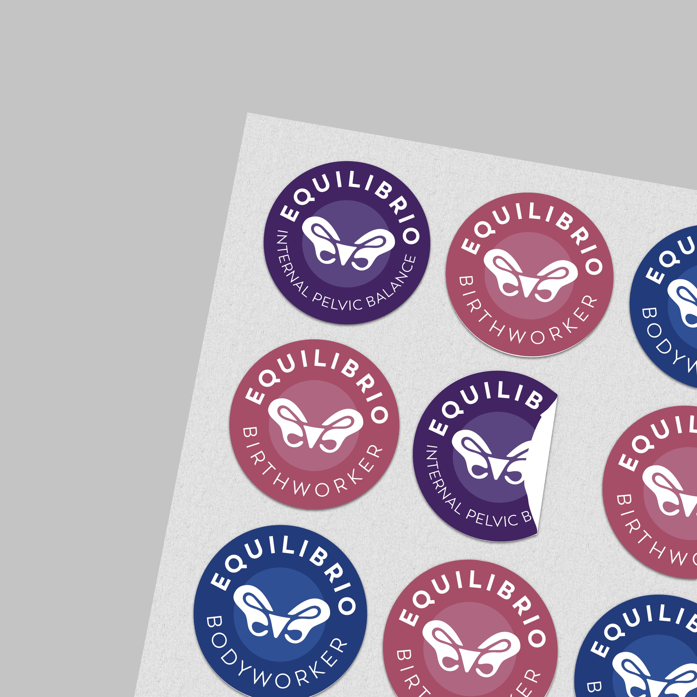
02 — Badges
03 — Color & type

  • Main colors
  • Light Teal
    Hex
    #67A4A7
    RGB
    103 164 167
    CMYK
    61 22 34 4
  • Deep Teal
    Hex
    #176F71
    RGB
    23 111 113
    CMYK
    84 33 47 22
  • Gray
    Hex
    #D7DBDE
    RGB
    215 219 222
    CMYK
    19 12 14 0
  • Dark Teal
    Hex
    #193F42
    RGB
    25 63 66
    CMYK
    87 51 54 55
  • Slate
    Hex
    #374253
    RGB
    55 66 83
    CMYK
    80 64 44 41
  • Blue Gray
    Hex
    #627083
    RGB
    98 112 131
    CMYK
    64 47 33 17
  • Mauve
    Hex
    #8D7381
    RGB
    141 115 129
    CMYK
    45 52 33 17
  • Rose
    Hex
    #BE899B
    RGB
    190 137 155
    CMYK
    26 51 24 5

04 — Design Grid + Media Toolkit
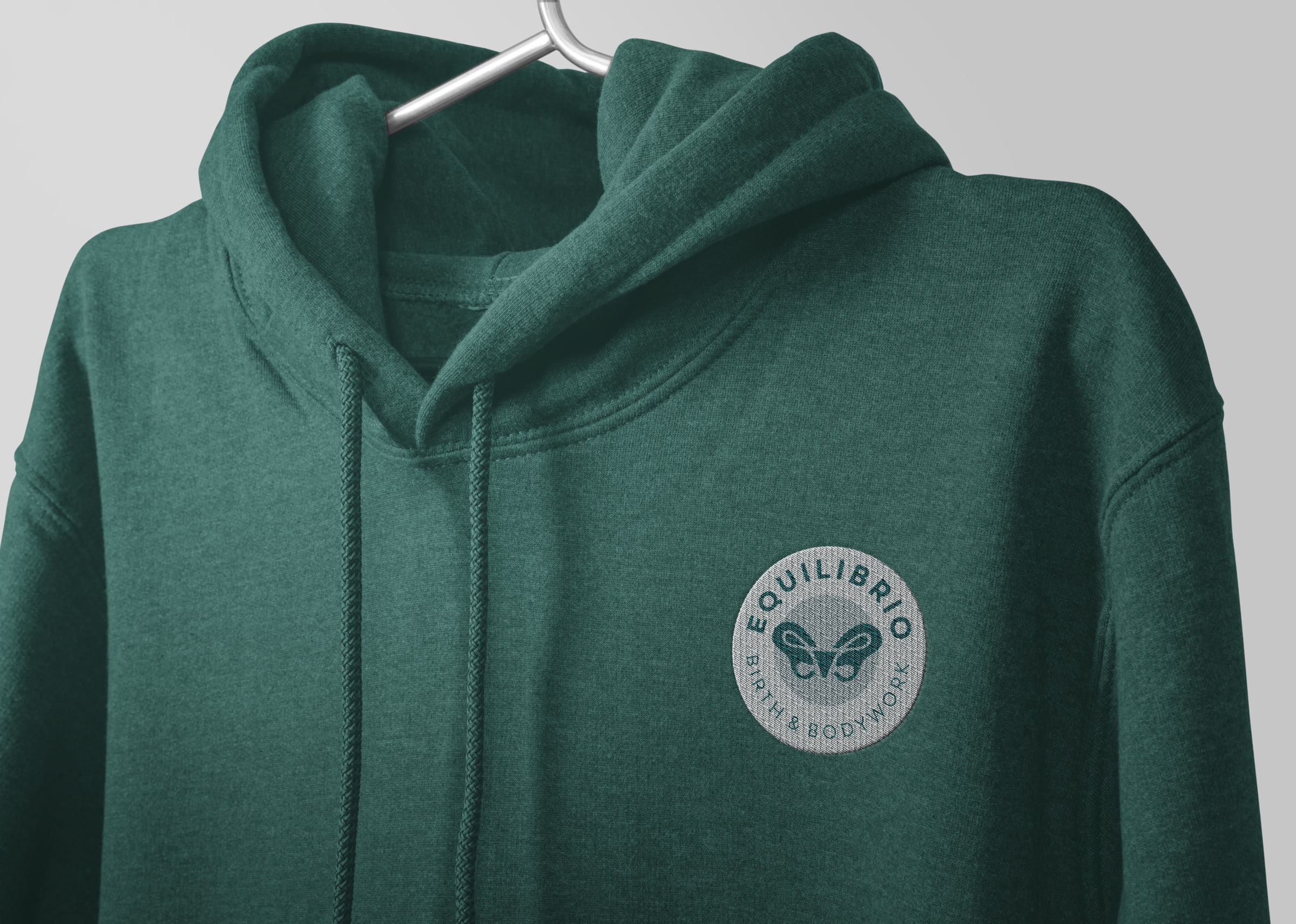
05 — Applied
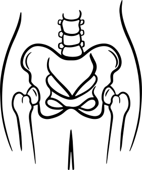
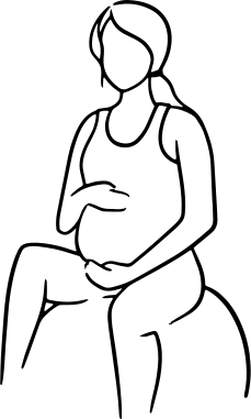
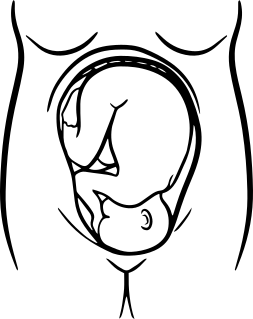
06 — Icons