Brand mascots: when your logo should have a face
A pet store fronted by a real dog and cat, and a charity's calm blind cat. When a mascot is right for a small business, and what it does that a symbol can't.
 Vic Ulsh
Updated Oct 21, 2026 · 2 min read

The short answer
A mascot makes sense when the business is personal, playful or built around a real character, and when it will post often enough to give that character things to do.
Lucy's Pet Store is the clearest case: the logo is the co-founder's adopted dog, Lucy, and her sidekick Herzel the cat, and the two front every post, product and holiday.
Takeaways
- A mascot is a logo that can act: wave, wear a hat, hold a sale sign.
- It works best when there's a real story behind it, like an actual dog.
- It needs a simple version for small sizes; a detailed character turns to mush at 40 pixels.
- It's a commitment: a mascot that only appears in the logo is a wasted mascot.
Most logos are symbols. They sit still and stand for the business. A mascot is different: it's a character, so it can do things. It can hold a sale sign, wear a party hat, look worried about the heat. For the right business that's a lot of free content.
Lucy's Pet Store
Lucy's Pet Store: a real dog and her sidekick
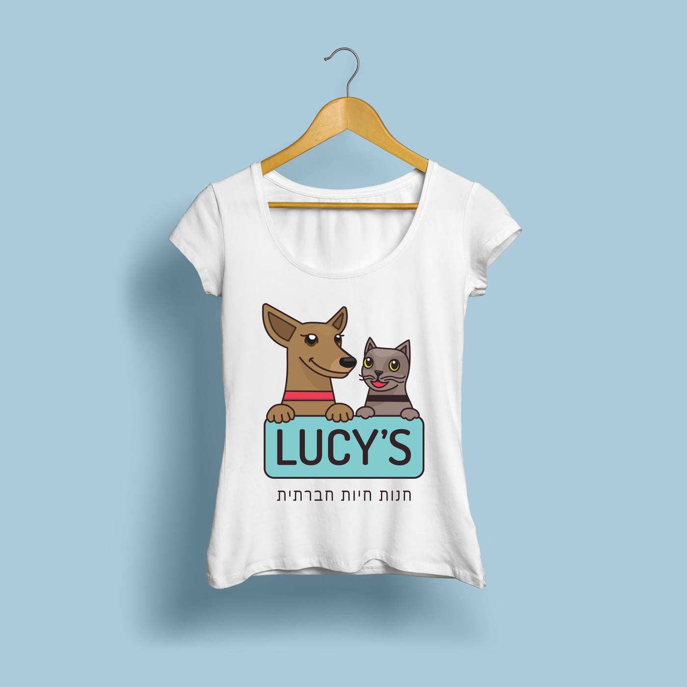
Lucy's Social Pet Store was inspired by one of the co-founders' adopted dog, Lucy, and her sidekick, Herzel the cat. So the mascots weren't invented, they were drawn from life: a brown dog with a red collar and a gray cat, peeking over the store's sign.
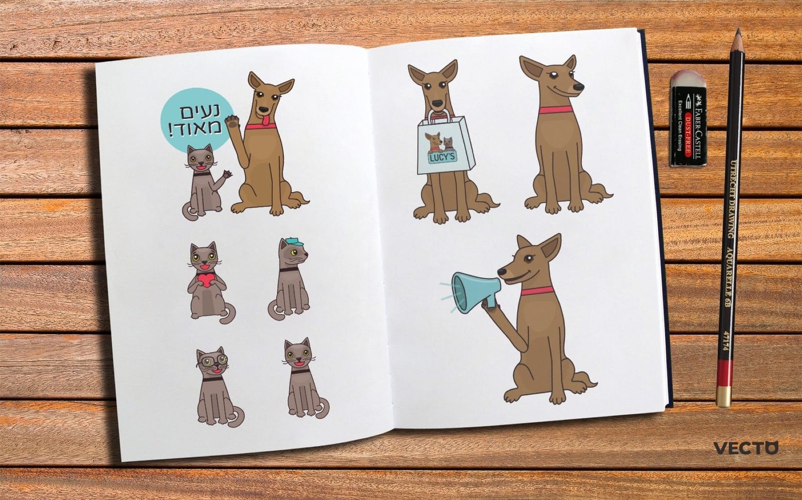
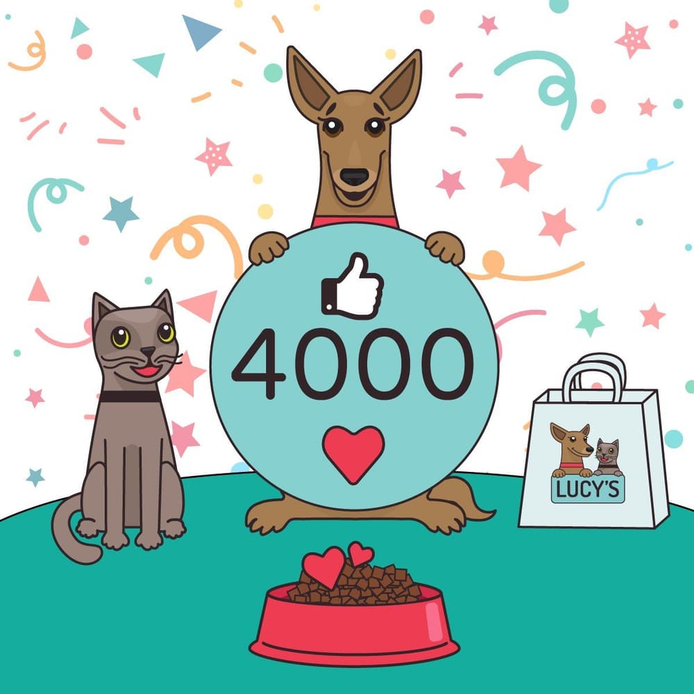
They started in a sketchbook, as a page of poses, before they went anywhere near a product. That's the part a mascot needs and a symbol doesn't: a cast of expressions. Lucy can look hot in summer, festive on a holiday, proud next to a 3,000-likes milestone. Herzel can steal the scene.
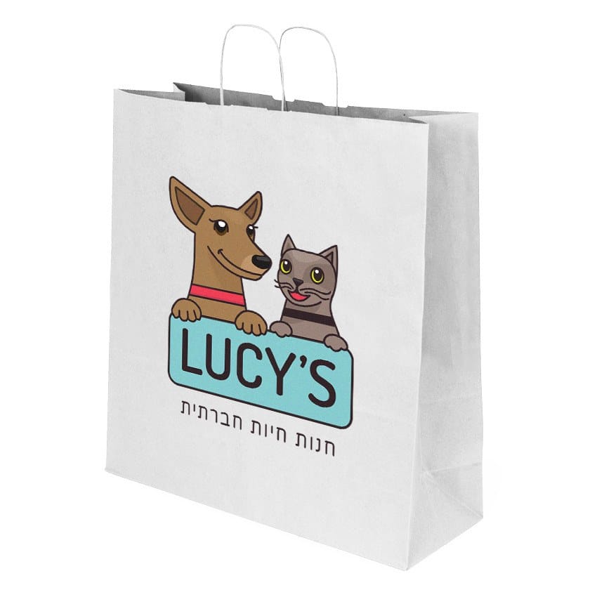
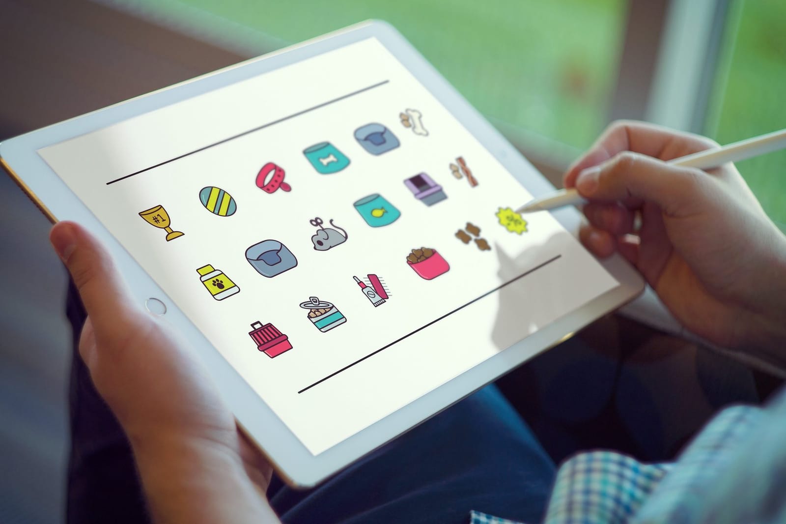
From there the characters went onto the bandana, the treat pouch, the paper bag and a T-shirt, and into a feed of posts in Hebrew where the joke lands without translation.
A cat that's blind and fine with it
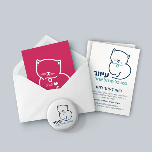
Not every character needs a cast. The pro bono logo for a blind-cat rescue is one cat, sitting comfortably, drawn in one dark line with its eyes closed, above a Hebrew line that says blind, like any other cat. No cane, no sad face: the drawing does the persuading.

When a mascot is the right call
A mascot fits when:
- The business is personal. A real pet, a founder's nickname, a family story.
- The audience is relaxed. Pets, food, kids, hobbies, community groups.
- The brand posts often. A character needs things to do, or it's just a drawing in a corner.
It's the wrong call when the client needs to see restraint first: legal, finance, medical, executive consulting. There, a character can read as not taking the work seriously, however charming it is.
What it takes to design one
A logo version, simple enough to read at profile-picture size. A set of poses and expressions. A short list of what the character does and doesn't do, so whoever makes the next post keeps it consistent. And colors that hold up next to photos, since a mascot usually shares the feed with real pictures.
If you're weighing a character against a cleaner mark, typographic vs. illustrative logos walks through the tradeoffs. In a Brand Kit, the three logo concepts are where that choice gets drawn out instead of argued about.
Questions people also ask
Usually not as the main logo. A consultant or a law firm is better served by a mark that reads as steady. A mascot can still appear in content, like a recurring illustrated helper in posts.
A few poses and expressions, a simplified version for small sizes, and rules about what it does and doesn't do. Lucy's characters came with a sketchbook of poses before they went near the social feed.
That's one of its strengths. A character needs no translation, and Lucy's posts run in Hebrew with the same dog and cat English speakers recognize.