Pro bono logos: a blind-cat rescue, a toy library and a shield
Three free logos for causes in Israel, from a charity for blind cats to Magen. What a nonprofit needs from a logo when there's no budget behind it.
 Vic Ulsh
Updated Oct 21, 2026 · 2 min read

The short answer
A small nonprofit's logo has to work harder than most, because there's rarely a budget for anything else: no ads, no agency, just a logo on a donation page, a flyer and a WhatsApp group.
The three pro bono logos below each carry their message in the mark itself, so the cause is clear even when the logo appears alone.
Takeaways
- A nonprofit logo often appears with no explanation next to it, so the mark has to say what the cause is.
- Warmth matters more than polish when the audience is volunteers and donors.
- Hebrew and English versions should be planned together, not translated after.
- Pro bono work gets the same process: questionnaire, sketches, final files.
Some of the logos I'm fondest of were never invoiced. Small causes in Israel tend to run on volunteers and a WhatsApp group, and their logo is often the only designed thing they have. It goes on the donation page, the flyer at the vet, the sticker on a collection box. It has to explain the cause on its own.
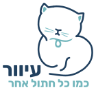
Blind cat charity
Special Needs Toy Library
Magen
A cat that's blind and fine with it
The charity finds homes for blind cats. Its Hebrew line says it plainly: blind, like any other cat. So the cat in the mark is just a cat, sitting comfortably, drawn in one dark line, with its eyes closed. No cane, no sad face. The illustration does the persuading. It's the cat you'd want to adopt.
A toy library that launches
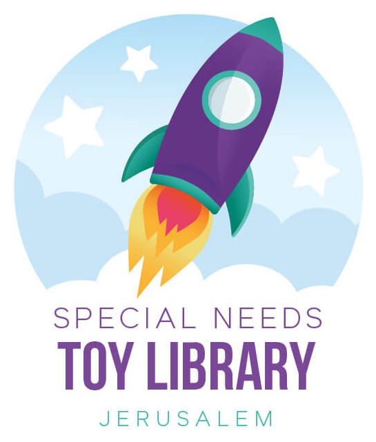
The Special Needs Toy Library in Jerusalem lends toys to families of children with special needs. The mark is a rocket taking off inside a round patch of sky, with stars and clouds. It's playful enough for the kids, and it gives the parents something hopeful to look at. The name sits under it in a friendly, condensed type that stays readable small.
A shield that speaks up
Magen means shield, and the mark is one, in teal, beside the name in bold Hebrew letters. Under it runs the hashtag #לא_תשתוק, don't stay silent. A shield alone would read as protection. The hashtag turns it into a call to speak up, which is the whole point of the organization.
What pro bono work taught me about logos
When there's no marketing budget, the logo is the marketing. It has to carry the message, feel warm to volunteers and still look credible to donors. That's a useful brief for any small business too, because most of them are in the same position: one logo, very little else, and a few seconds of attention.
For another illustrated approach, see brand mascots.
A business in the same position, with one logo and very little else, can start with a Brand Kit: the logo in every file it needs, plus the colors, fonts and a guide.
Questions people also ask
A few, for causes close to home. Each one goes through the same process as a paid project, from the questionnaire to the final files.
A logo in a few versions, a short palette and one or two fonts. That's enough for a donation page, a flyer and social posts. Templates are worth adding once volunteers start making materials themselves.
Yes, if both are planned from the start. The icon carries most of the recognition, and the Hebrew and English names are set as two lockups that share it.