#Templates
What is a design grid, and why do templates need one?
A design grid fixes where the logo, type and photos go, so a post can change its words and still look like the brand. What a grid holds and leaves open.
Open any template marketplace and the posts look finished. Swap in your logo and colors, and something is usually still off: the type is the size the original business needed, the photo sits in a shape that meant something to them. What's missing is the grid under it.
What is a design grid?
It's the part of a layout that doesn't move. On a social post that usually means:
- where the logo goes, and how much room it gets
- the size of the headline and of the text under it
- the margins, so nothing crowds the edge
- the frame a photo sits in
- where a button or a call to action goes, when there is one
A brand guide shows these as sample layouts. The brand guide records the rules; the templates are those rules, ready to edit.
What stays fixed, and what changes
Here is one set built on one grid. Bowstring is a digital marketing agency, and its posts run on a large triangle taken from the logo, with the logo in the same corner every time.
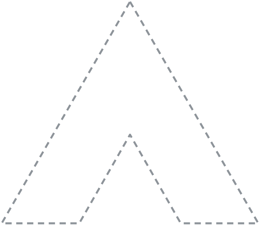

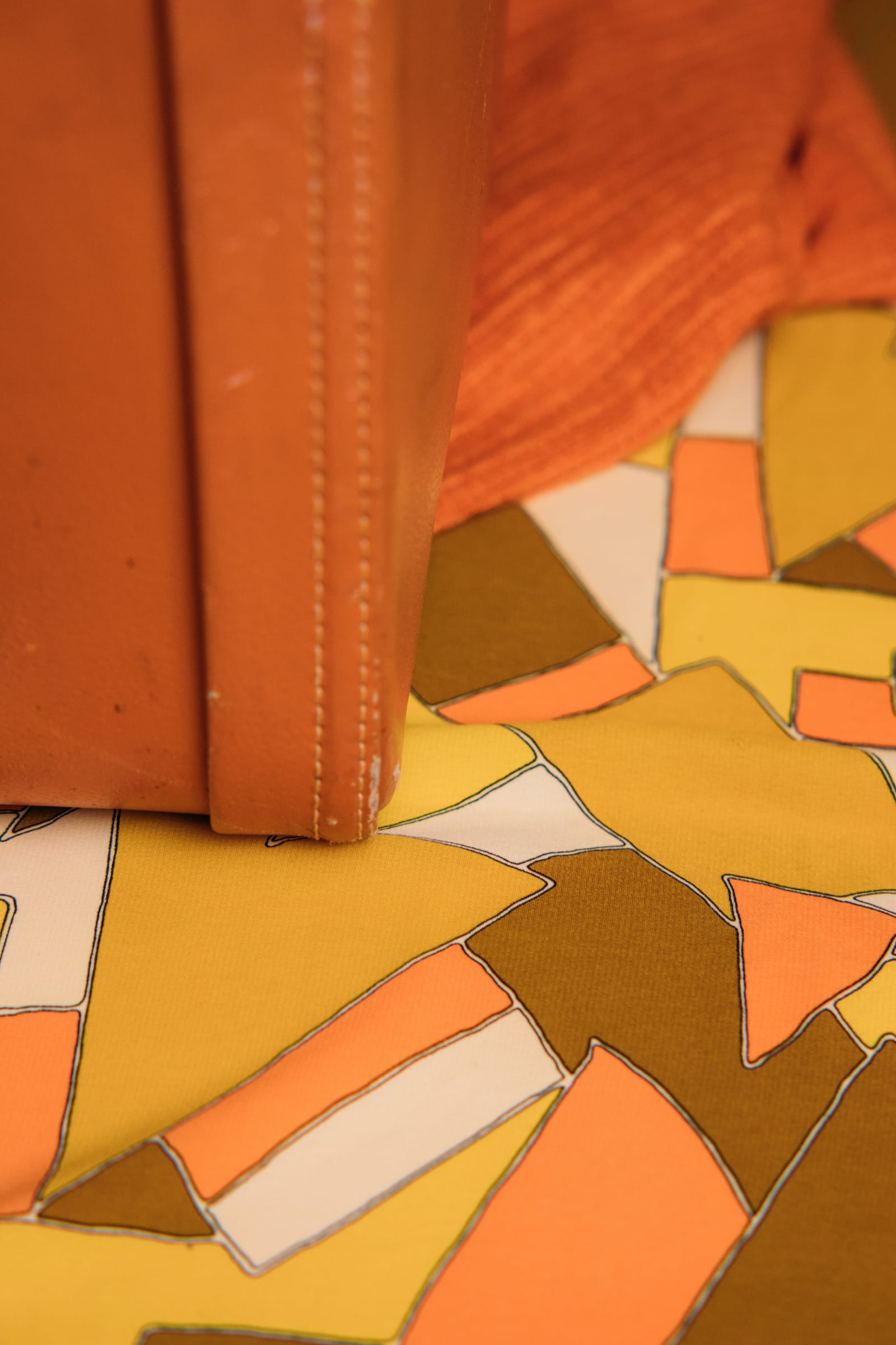







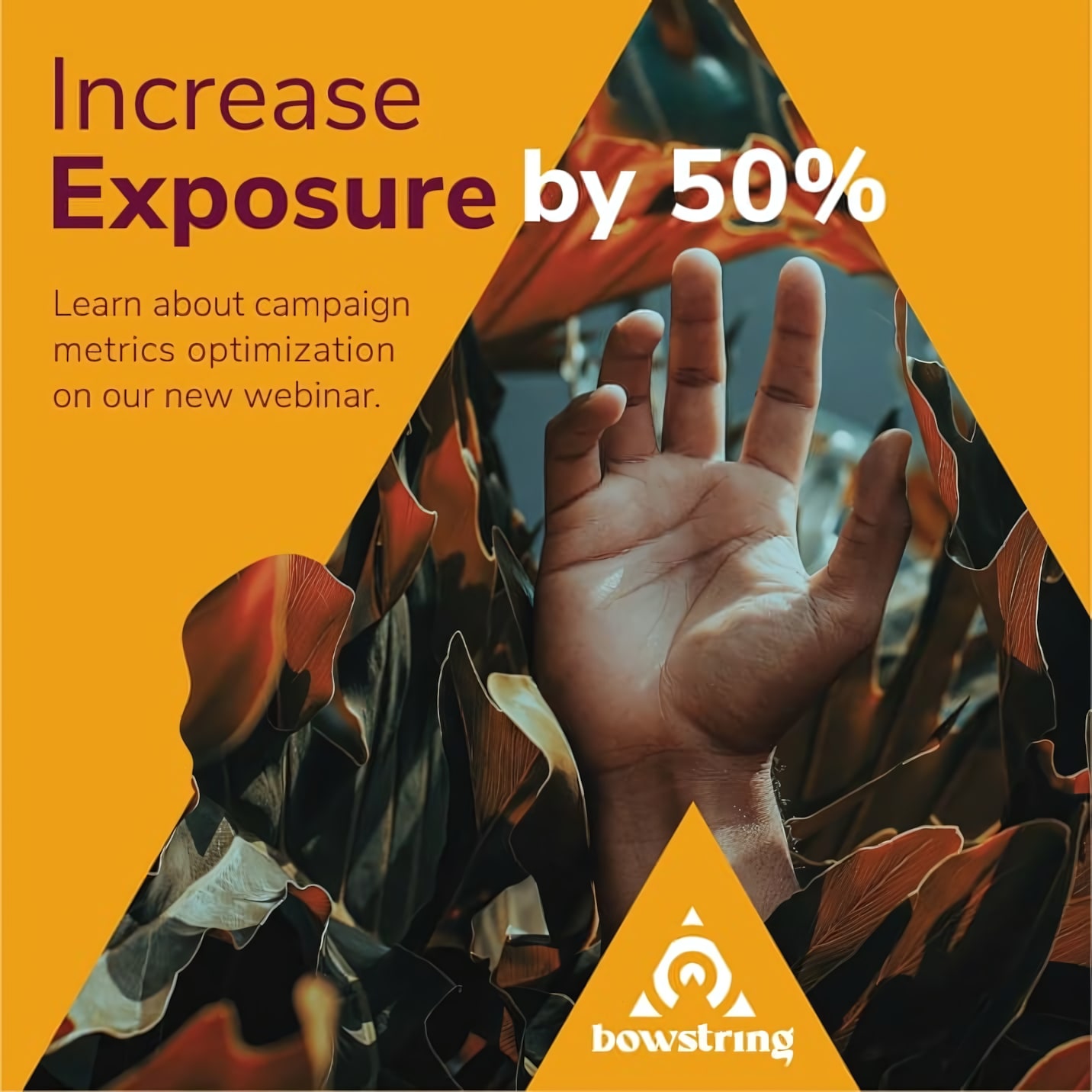
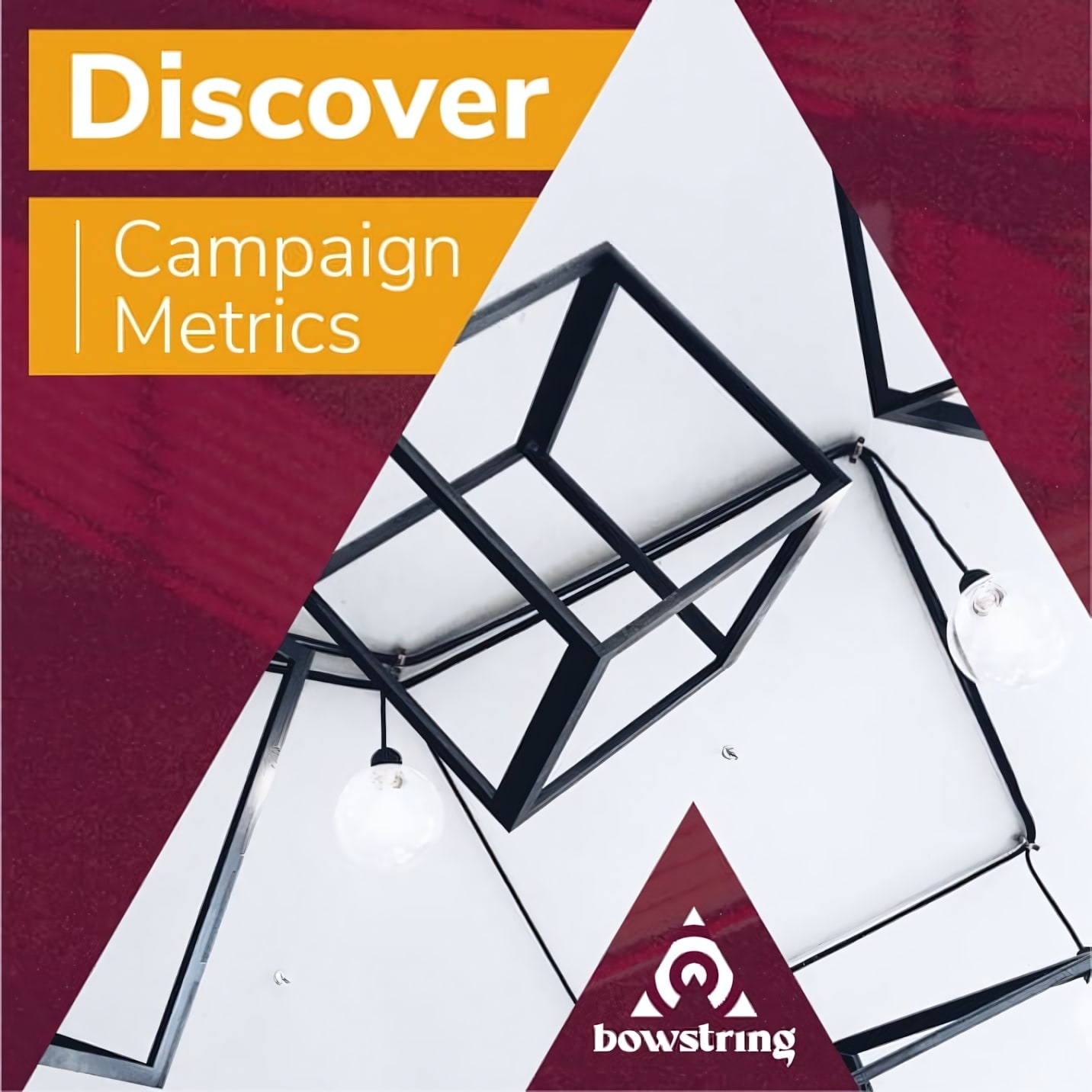
The four posts do four different jobs, with different photos, different colors from the palette and different amounts of text. The triangle, the logo corner and the type sizes stay put. The photo pile beside the post is the other half of the system: stock chosen for the brand, plus room for the client's own photos, all cut to the same frame.
Why not design each post from scratch?
You can, and each one might look good on its own. The trouble shows up on the profile page, where every post sits next to every other one. Posts made one at a time drift: the logo moves, the headline grows, a new font gets tried. A grid decides those things once, so the next post starts where the last one ended instead of from a blank page.
It also saves the part of the week that goes into judging by eye. Is the headline too big? Is the logo in the right place? On a grid, those questions have already been answered.
Where does the grid come from?
It's drawn with the identity. In a Brand Kit, design grid recommendations for social media, presentations and print are one of the deliverables, and the brand guide shows them in use.
A Media Kit takes the next step: it builds those grids into Canva templates in your own account, so changing a post means changing the words and the photo. The layout is already done.
Questions people also ask
What is a design grid in branding?
The layout rules a brand's posts, slides and print pieces are built on: logo position, type sizes, margins and image frames. A brand guide usually shows them as sample layouts.
Is a design grid the same as a template?
No. The grid is the set of decisions; a template is one piece built on them, ready to edit. One grid can carry many templates.
Do I need a design grid if I use Canva?
Canva templates made for someone else come with someone else's grid. Templates built on your own grid start with your logo, type and frames already in place.