
Tri-State Surgical
- Client:
- Tri-State Surgical Supply & Equipment
- Niche:
- Medical Supply Distribution
- Year:
- 2025
Tri-State Surgical Supply & Equipment has distributed medical supplies out of Brooklyn since 1976, to nursing homes and hospitals across the US. It moves more than 20,000 products a day.
The logo had carried the company a long way: three columns with a swoosh through them, in blue and orange. With the 50th anniversary coming up, they wanted an identity that looked ready for the next fifty years without losing what customers already recognized.
The challenge
- Carry the legacy and credibility of the past 50 years with the new, updated look.
- Just as dependable as the big distributors, with the personal service a smaller company can actually give.
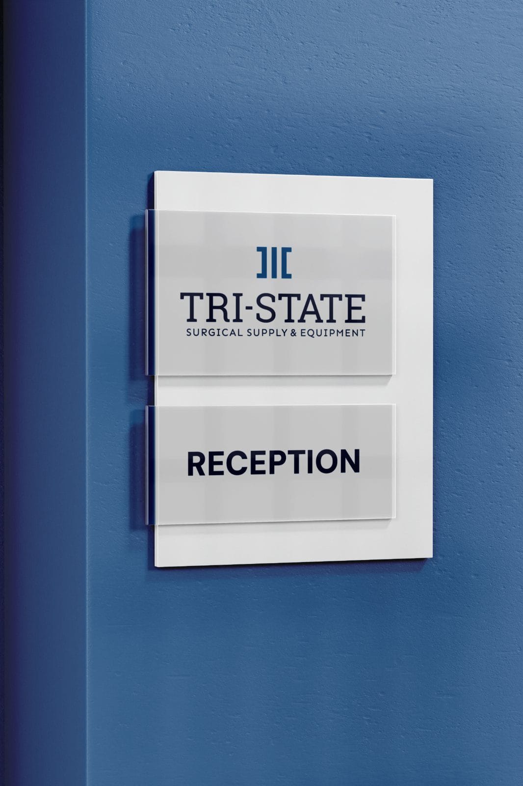
01 — From concept sketch
to vector logos




 BeforeThe original
- Three classical columns with a swoosh cutting through
- Bright blue and orange
- TRI-STATE in heavy sans-serif capitals
 2025The refresh
- Three columns as flat strokes, the outer two squared into brackets
- Trust Blue and Caring Navy, with Healing Sand as the accent
- A slab serif wordmark over SURGICAL SUPPLY & EQUIPMENT
02 — Color & type
- Soothing Mist
- Hex
- #D3E6ED
- RGB
- 211 230 237
- CMYK
- 16 3 4 0
- Trust Blue
- Hex
- #1072A3
- RGB
- 16 114 163
- CMYK
- 89 50 17 1
- Caring Navy
- Hex
- #1D3456
- RGB
- 29 52 86
- CMYK
- 96 82 40 33
- Healing Sand
- Hex
- #F68E46
- RGB
- 246 142 70
- CMYK
- 0 54 80 0
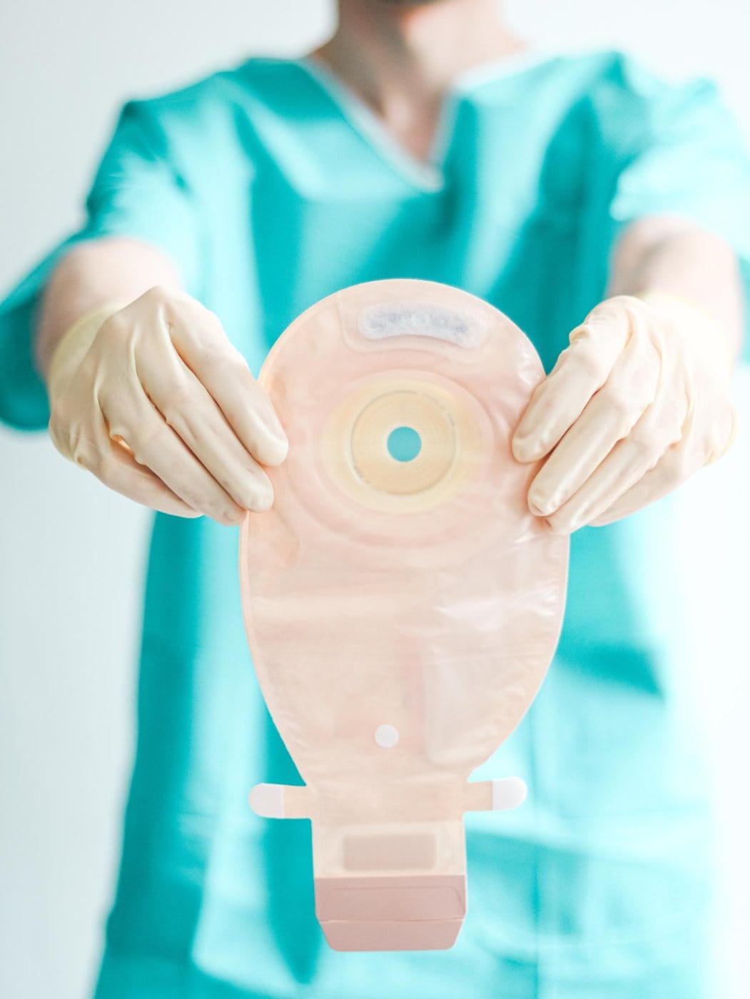
03 — Imagery



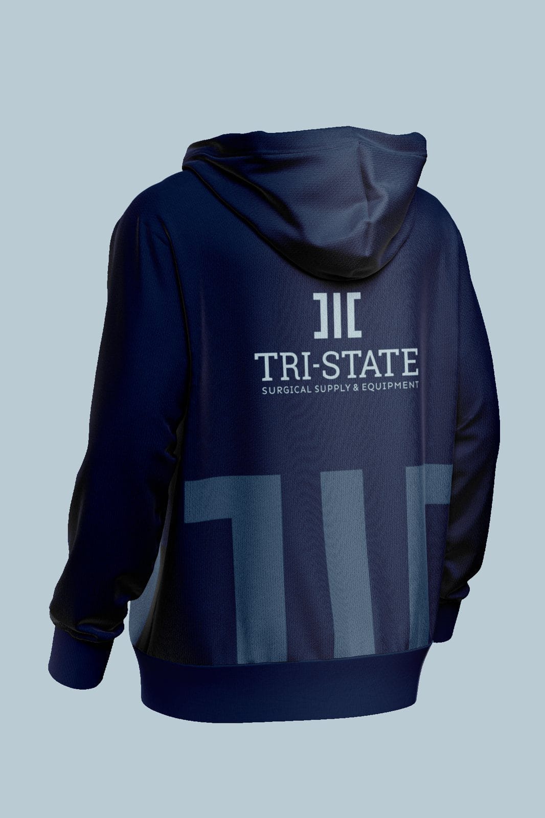
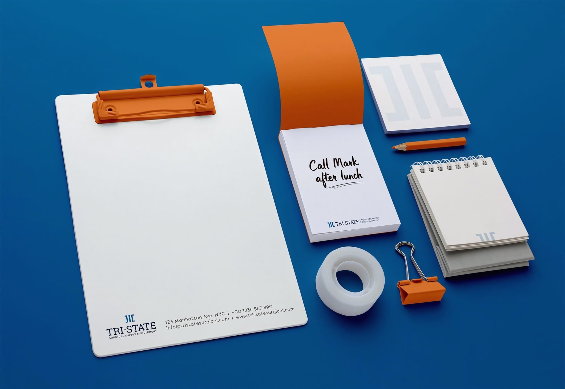
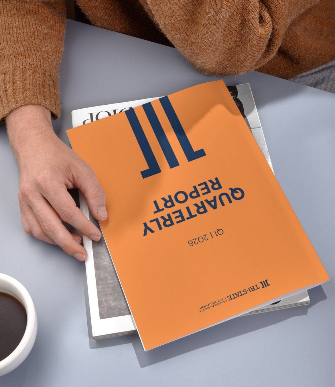
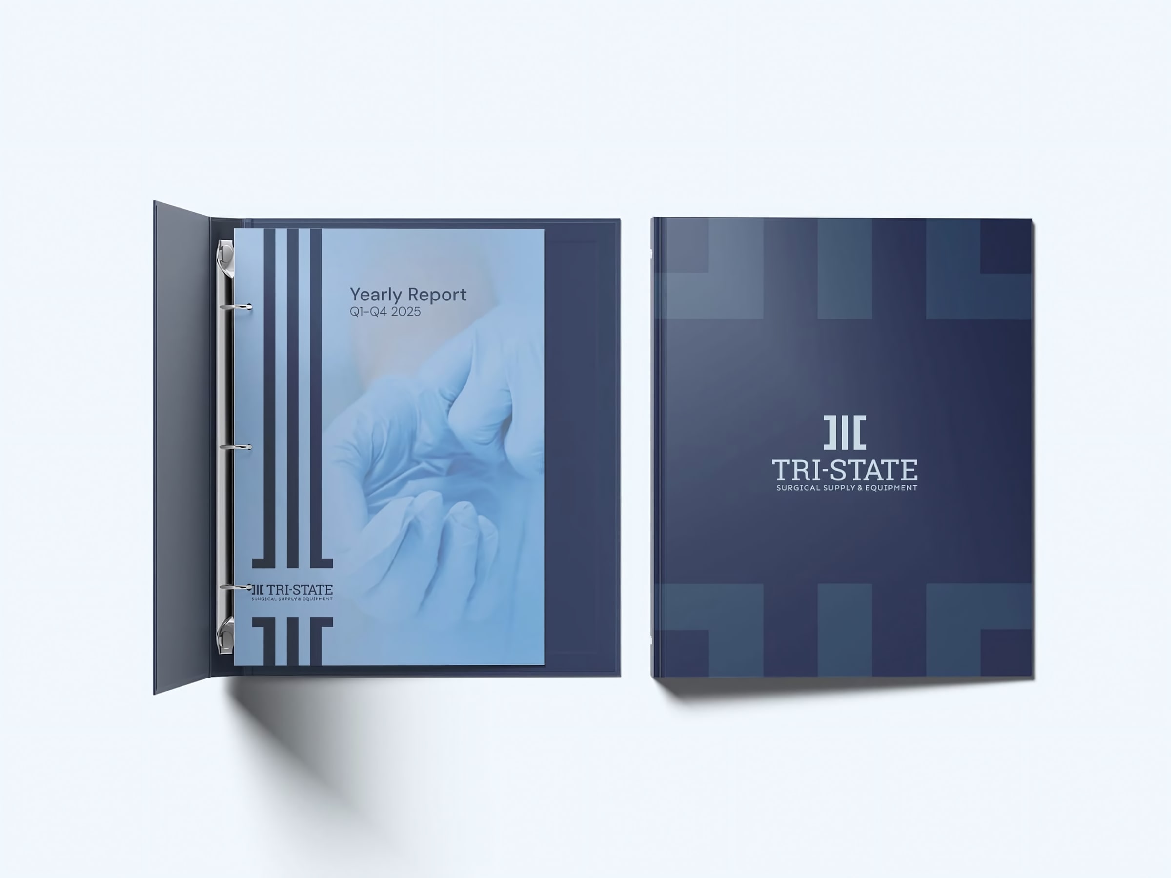
04 — Applied


Next case study