The Nourished Women’s Circle
01 · The brief
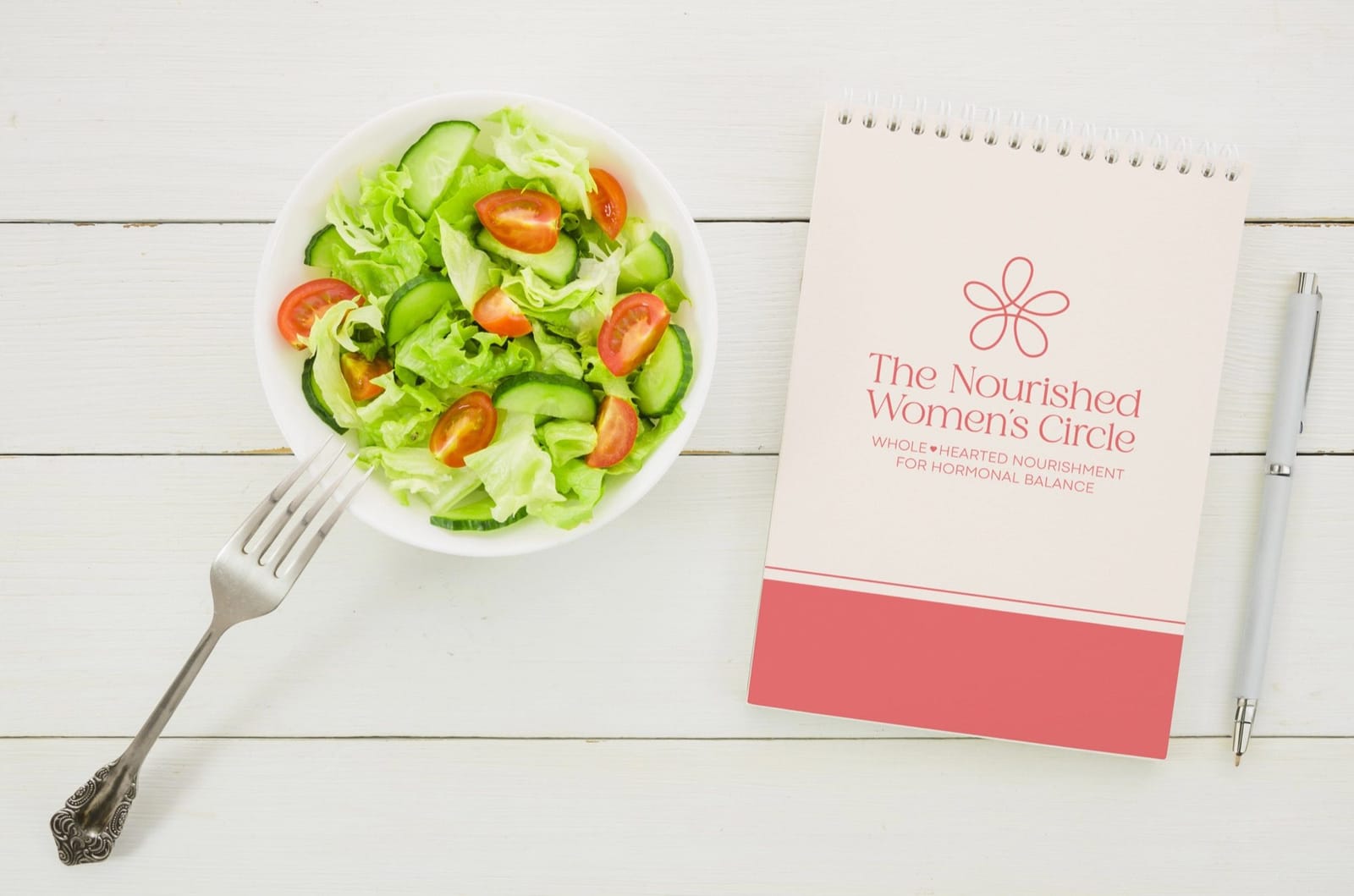
The Nourished Women's Circle is a year-long program empowering women to achieve hormonal balance through personalized nutrition, natural medicine, and community support.
Branding Challenge: To create a brand that conveys trust, clarity, and warmth.
The visual identity features a soft, earthy palette and a delicate floral logo that symbolizes growth, connection, and natural wellness.
02 · Sketch
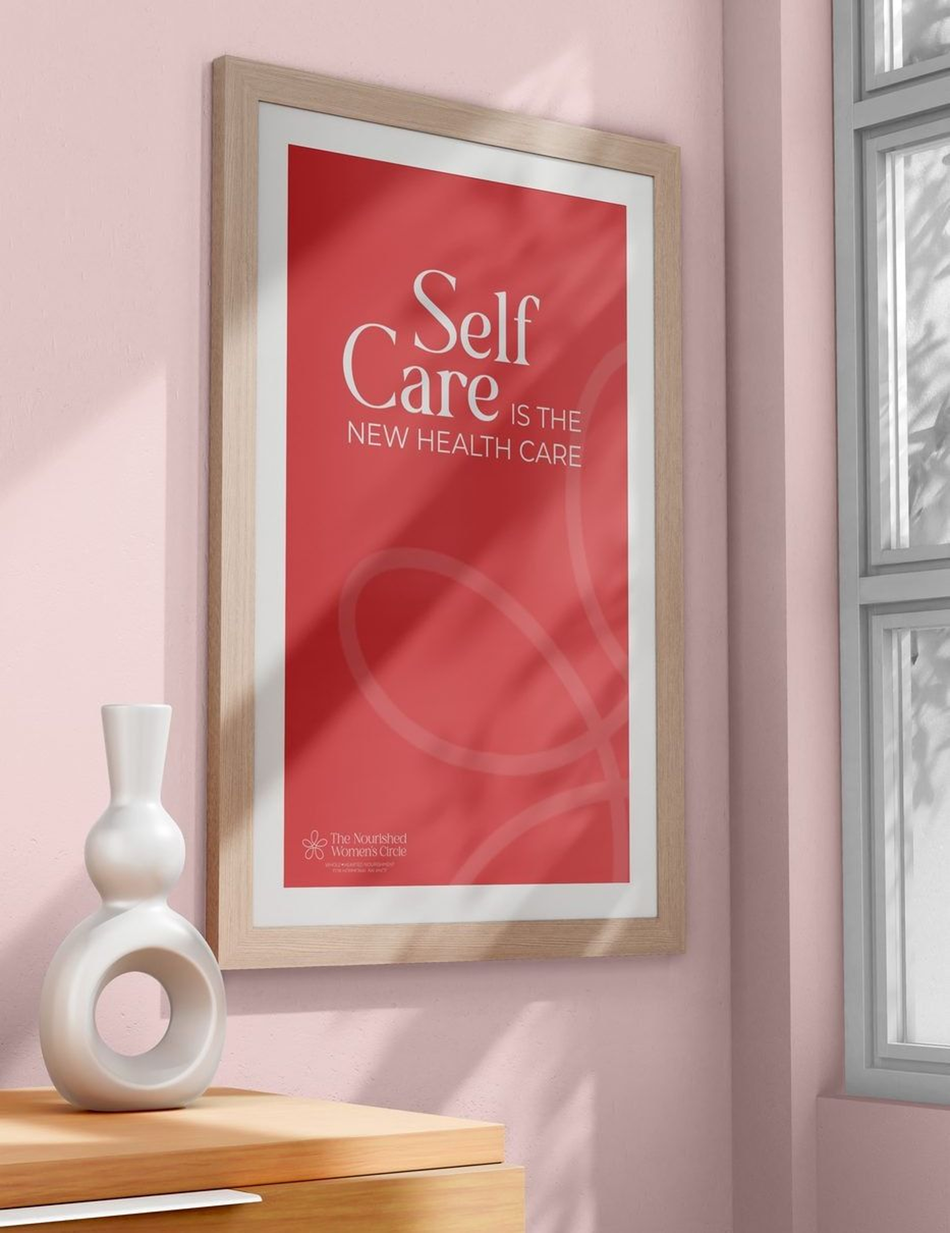
Drawn by hand first
Every Brand Kit starts here, on my iPad, before any vector work.
03 · Color & type
- Coral Red#F27678
- Salmon Pink#F49481
- Peach Pink#ECD1D0
- Soft Pink#FCF6F4
- Light Sage#94B5AB
- Teal Green#427565
04 · Media Kit

05 · In use
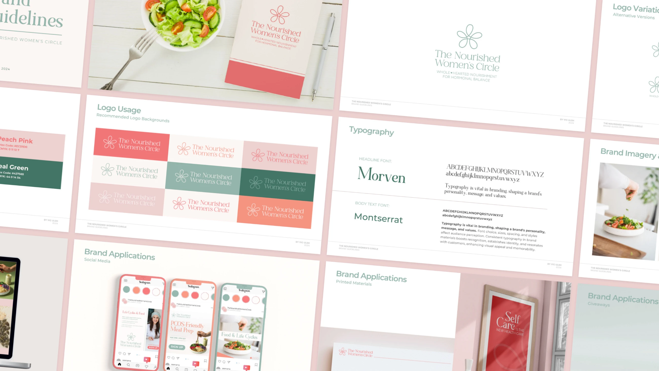
06 · Handover
What they left with
- Logo variations, colorways and recommended use
- Do's and don'ts
- Color palette and pairings
- Typography
- Imagery direction
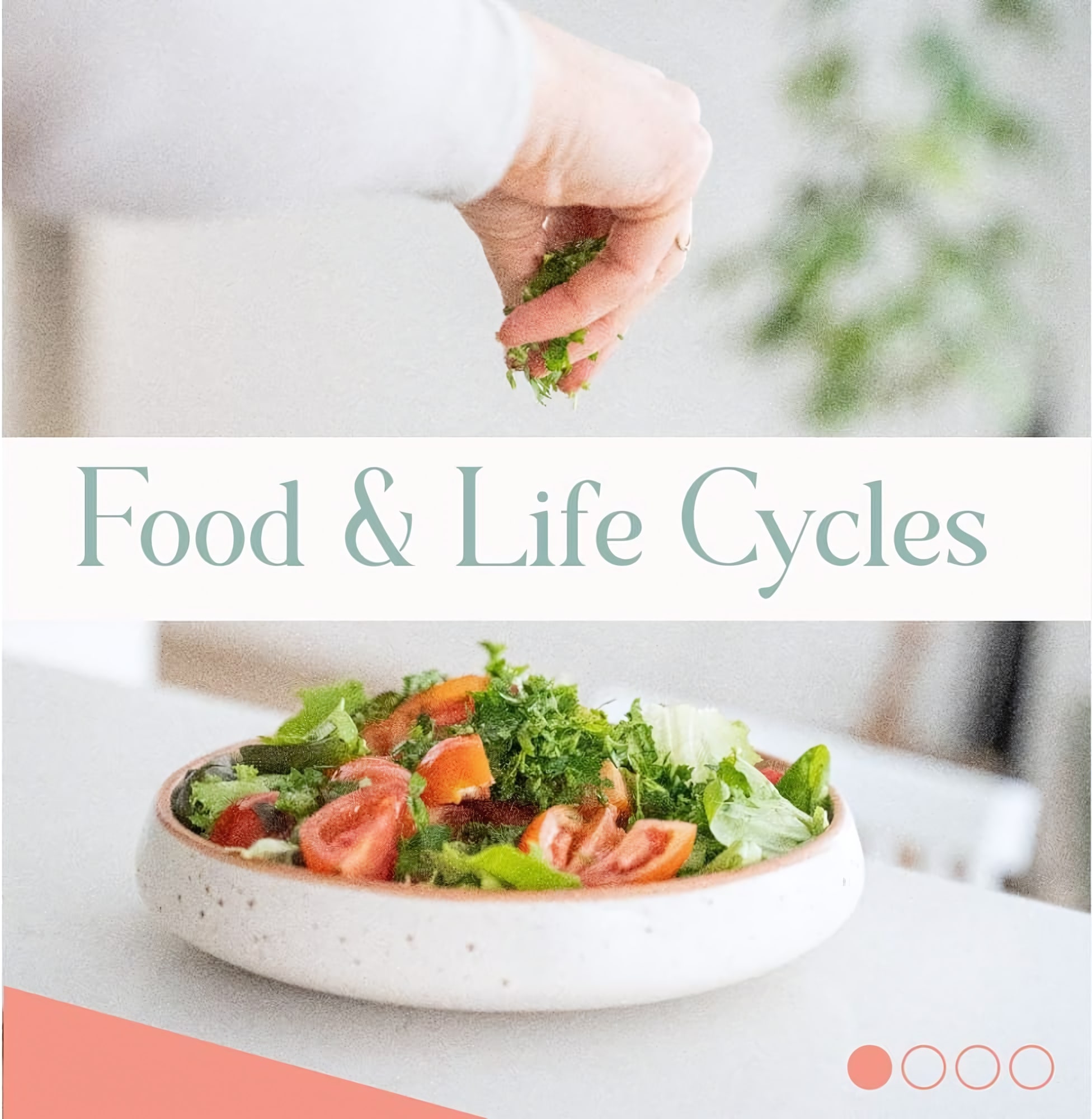
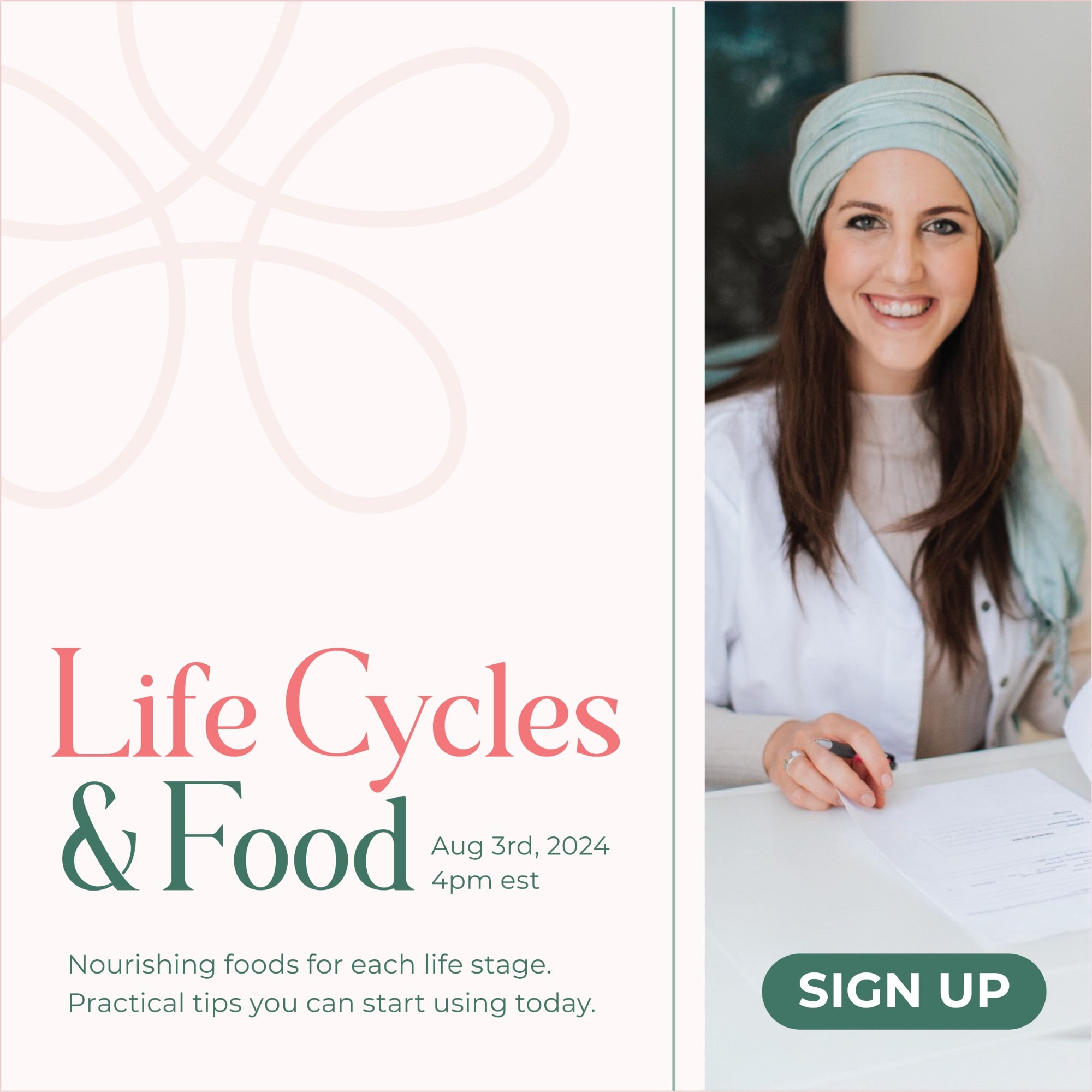
- Banners and social posts
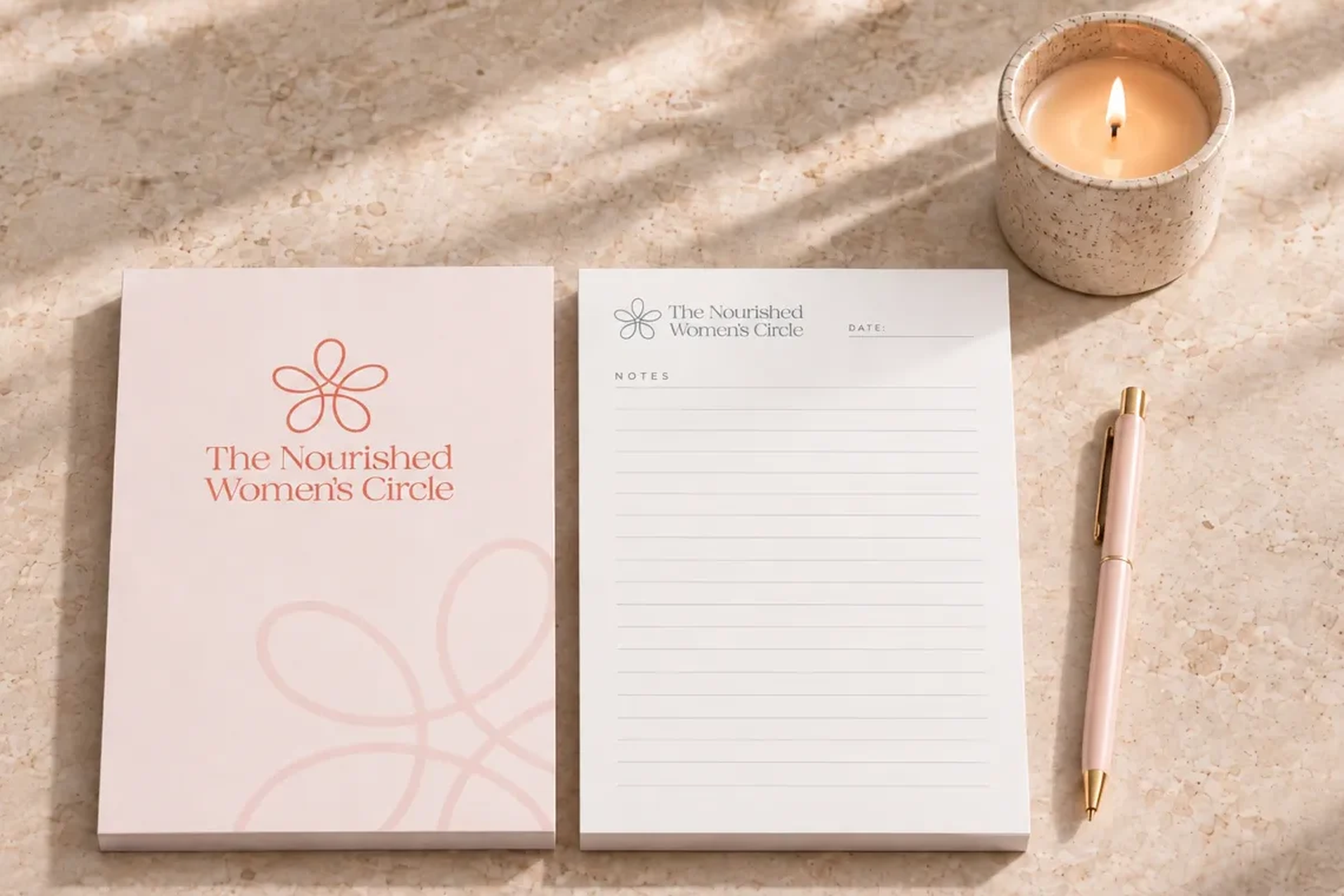
- Branded mockups
- SVG
- PNG
- JPG